I have a simple rule for Shopify merchandising work: if shoppers need to think too hard about variants, I usually made the store harder to buy from than it needed to be.
Color swatches are one of those small changes that look cosmetic until you watch a product grid. The difference shows up fast: fewer misclicks, cleaner collection pages, better variant discovery, and less friction on product pages. In my tests, the stores that did this well were not the ones with the fanciest theme. They were the ones that made the choice obvious.
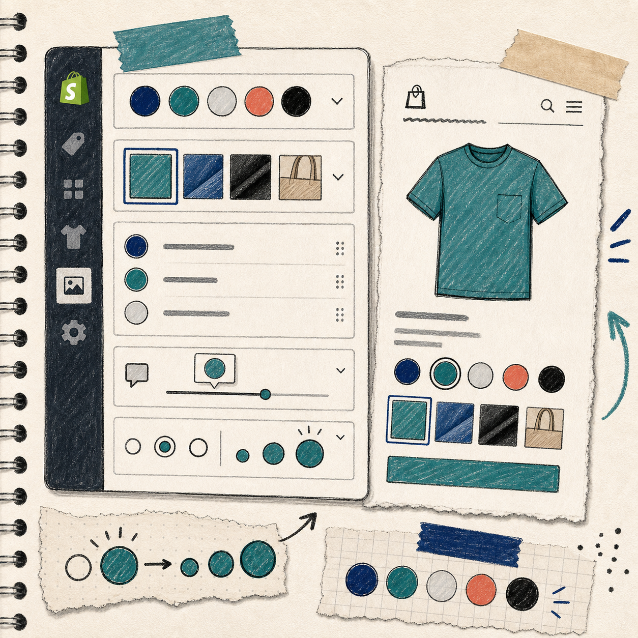
For that reason, I like Supra Swatch Colors for the boring-but-important version of the job: add swatches, link products, support collection pages, and keep it out of the theme code where possible.
What I look for before I add swatches
I do not start with design settings. I start with the catalog structure.
- Do variants already exist inside one product, or are they split across separate product pages?
- Do I need swatches on product pages only, or on collection pages too?
- Do I need image swatches, color swatches, or both?
- Does the store serve more than one language?
- Do I want the result to work across themes without a developer cleanup pass?
That checklist matters because not every swatch tool solves the same problem. Some tools only dress up variants. Others help connect related products. A few can do both, which is usually the better choice when a store has real merchandising complexity.
Supra Swatch Colors is built for that middle ground. It supports linked products and built-in variants, and it works on both product pages and collection pages. That means you can make the browsing experience cleaner without forcing the same setup everywhere.

The setup path I would use again
The setup is not interesting because it is clever. It is useful because it is direct.
1. Decide what should become a swatch
Start with the items shoppers actually compare.
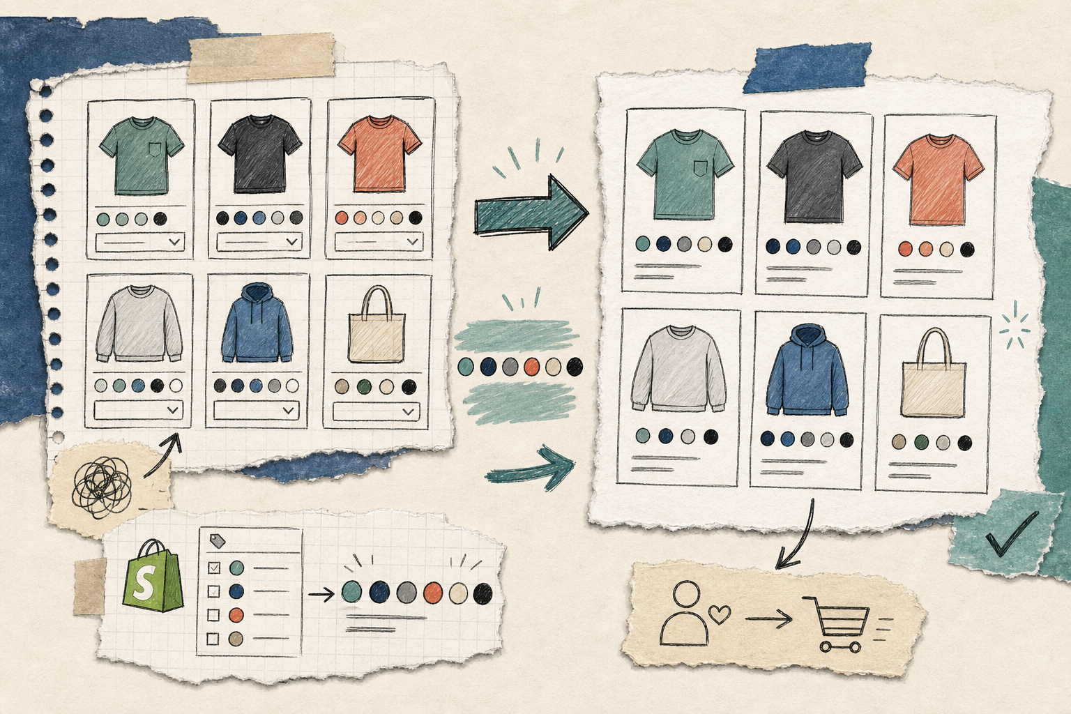
If the store sells T-shirts in Black, Navy, and Olive, the swatch is obvious. If the store sells a product line where finishes matter, image swatches may be better than color dots. If the variants are really separate products in disguise, link them instead of forcing everything into one product.
That distinction keeps the catalog easier to manage later.
2. Choose where the swatches should appear
Product pages are the obvious place. Collection pages are where the merchandising payoff gets better.
A collection grid with clear swatches helps a shopper understand the range without opening every product in a new tab. That is especially useful when the visual difference between options is the main reason to buy.
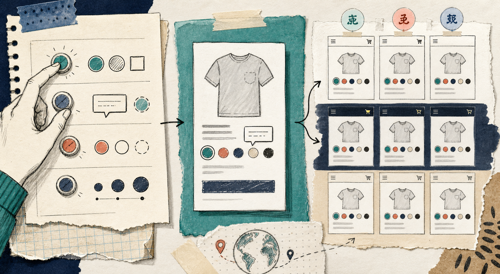
3. Match the store’s visual language
This is where a lot of teams overdo it.
A swatch style should disappear into the site when it needs to, not dominate it. Size, shape, tooltip style, and label treatment should support the theme rather than compete with it. That is also why I care about apps that offer more than one default style. If I can tune the presentation, I can keep the catalog readable without making it loud.
Supra Swatch Colors advertises 20+ customizable styles, which is useful because different stores need different levels of visual emphasis.
4. Keep multilingual stores from turning into a maintenance problem
Swatches are not just a visual concern in multilingual shops. They are a consistency concern.
If a merchant has to rebuild the same variant logic for every language, the setup becomes a maintenance tax. That is why multilingual support matters. It does not make the storefront prettier, but it keeps the setup from becoming a chore later.
5. Test the collection page first
I would rather catch a swatch issue in a collection grid than after launch.
Look for three things:
- Does the swatch render quickly?
- Does it fit naturally with the card layout?
- Does it still make sense on mobile?
If the answer is yes, the rest is usually just refinement.
Where this app fits best
I would recommend this kind of setup when a store has one or more of these needs:
- A large catalog with visual variants that shoppers compare quickly
- Separate product pages that should behave like a family of options
- Collection pages that need a cleaner browsing path
- A theme team that does not want to maintain code tweaks for every merchandising change
- A multilingual store that needs the same configuration to stay sane
It is less about fashion and more about reducing friction. The store is easier to scan, and the shopper gets to the right item faster.
That is also why I would not treat swatches as an isolated feature. They sit inside the broader merchandising system. If the category structure is messy, swatches will only make the mess prettier. If the catalog is coherent, they help the store feel sharper immediately.
A few related reads from the same workflow
If you are building a broader store ops stack, these earlier posts are useful context:
- How to Add Color Swatches to Shopify Collection Pages Without Code
- How To Add Color Swatches To Shopify Collection Pages
- How to Automate a Shopify Blog Without Generic AI Drafts
- How to Keep a Shopify Blog Publishing Without Generic AI Drafts
The practical takeaway
If your store needs color swatches, start with the merchant problem, not the visual effect. Decide whether you are solving variant clarity, product linking, or collection-page browsing. Then configure the swatches so they support that one job cleanly.
If you want a no-code path for that setup, Supra Swatch Colors is the app I would use first.
For a quick start, open the app, map the products or variants you want to present as swatches, and test the collection page before you move on to styling.
One next step
Pick one high-traffic collection and make the variant choice visually obvious there first. If that page gets easier to shop, the rest of the catalog usually follows.