
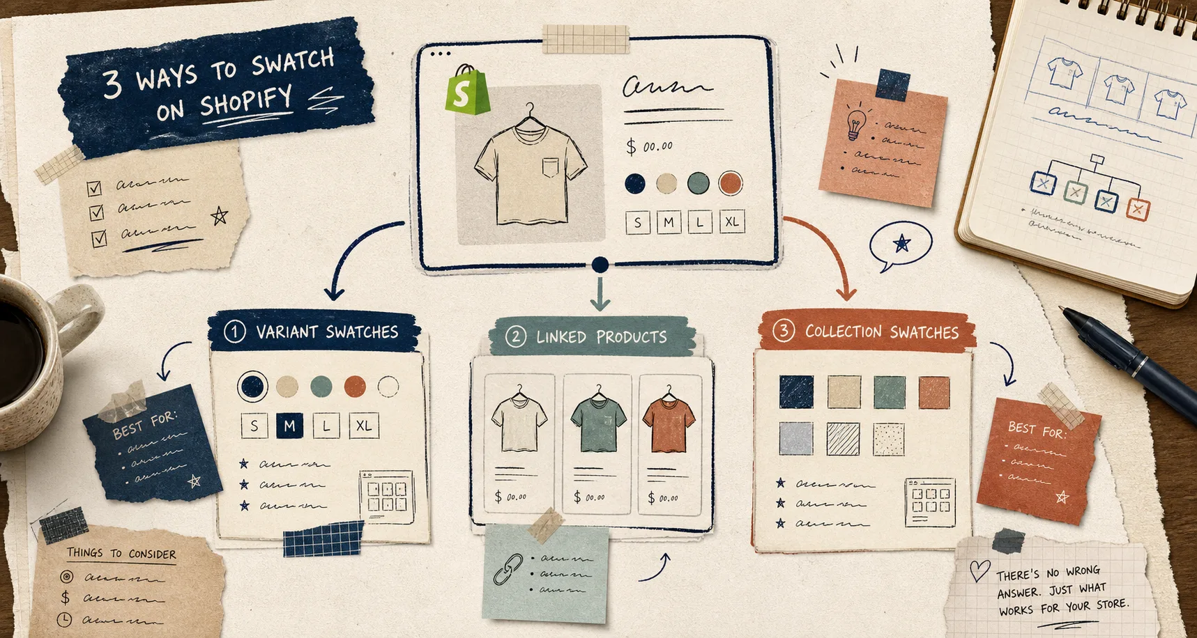
I keep seeing the same Shopify problem: a store wants swatches everywhere, but the swatches are trying to do three different jobs.
The clean fix is to decide what should happen when a shopper clicks a swatch before you start styling anything. In practice, that means choosing between variant swatches, linked products, and collection-page swatches. Supra Swatch Colors is built for all three, and it does it without code on product pages and collection pages.
If you want the fast version, here it is:
- Use variant swatches when the shopper is staying on the same product and only changing an option like color or size.
- Use linked products when each swatch should open a separate product page with its own SKU, description, or inventory.
- Use collection swatches when the goal is browsing and filtering across a collection, not changing a single product detail page.
The three swatch jobs are not the same
I think people get stuck because they call all of these things “swatches” and then expect one setup to solve every store layout.
That usually leads to one of two bad outcomes: the swatch feels wrong because it changes the page in a way the customer does not expect, or the store owner forces a workaround that makes maintenance annoying later.
Supra Swatch Colors is useful because it lets you match the setup to the job. It supports color and image swatches, product groupings, variant colors, linked products, and collection pages. It also works across all Shopify themes, supports multilingual shops, and includes 20+ customizable styles, so the result can feel native instead of bolted on.
A setup that feels native usually does three things well:
- It keeps the customer on the right path.
- It makes the next click obvious.
- It does not ask you to rebuild the theme just to show a different color chip.
If you already know you want the basic implementation path, the companion walkthrough How to Set Up Shopify Swatches From Product Images and Variants is the practical step-by-step version.
My rule for deciding where the swatch belongs
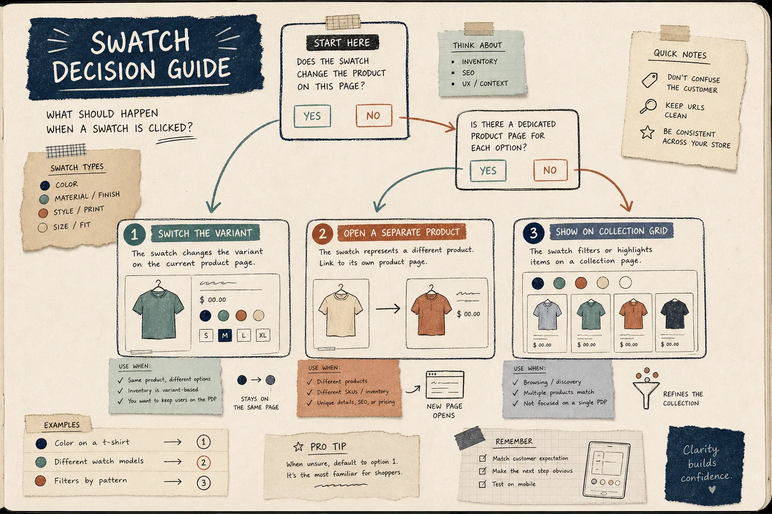
I use a simple question first: does the click change the current product, or does it move the shopper to another product?
If the click only changes a variant, keep the customer on the product page. That is the most familiar pattern and the easiest to scan on mobile. It also fits products where the difference is mostly color, size, or finish.
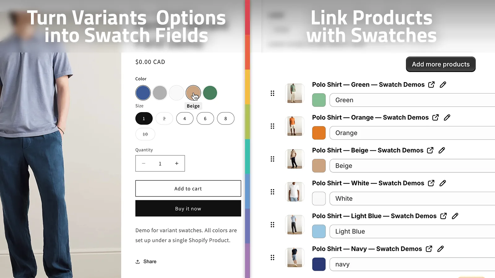
If the click should open a separate listing, use linked products. That is the better choice when the options have different photos, different copy, different pricing, or different inventory you actually want to keep separate. I prefer that pattern when the customer would be confused if a variant switch silently changed too much behind the scenes.
If the swatch is mainly for browsing, use collection-page swatches. That works well when a collection is doing discovery work and you want shoppers to move through visual choices without drilling into each product first.
For the broader tradeoff, How I Choose Between Variant Swatches and Linked Products in Shopify is still the cleanest companion read. If you want the collection-page angle, How to Add Color Swatches to Shopify Collection Pages Without Code covers that path well.
What I check before I pick a style
Once the behavior is clear, I look at the visual details.
That is where a lot of stores make the setup feel generic. A swatch can be technically correct and still look like it belongs to a different theme.
I usually check these things:
- swatch shape: round, square, or pill
- swatch size: small enough for mobile, large enough to read
- tooltip and label behavior
- whether color swatches should use pure colors or product images
- whether the collection page needs the same treatment as the product page
- whether the store needs multilingual support
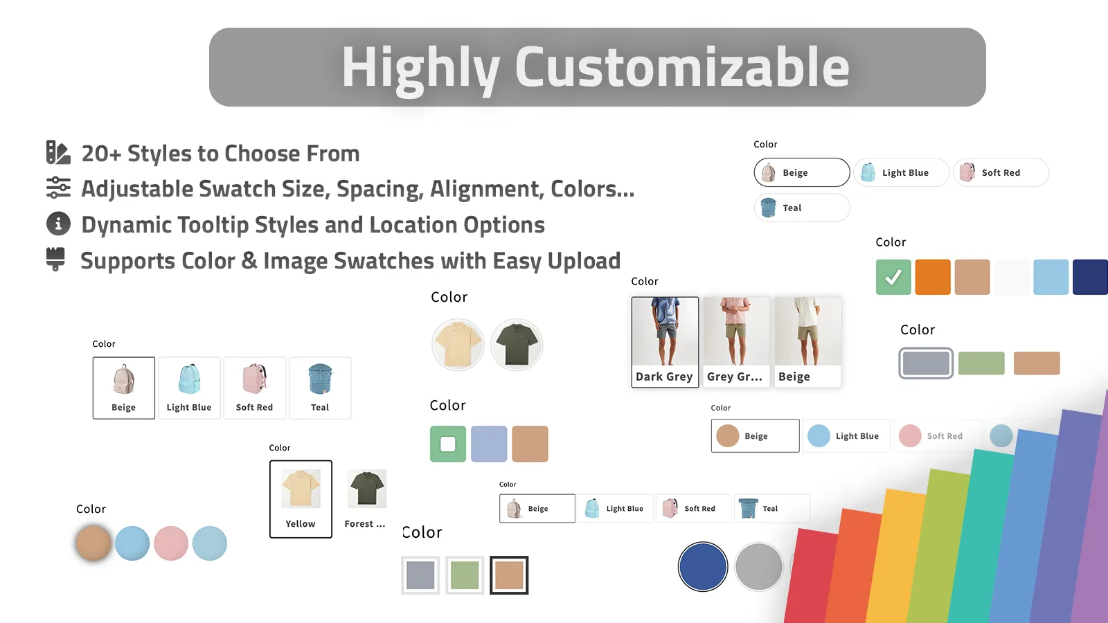
Supra Swatch Colors is handy here because it gives you more than a yes-or-no toggle. The app can auto-detect colors in the store or use product images to set up swatches faster, which matters if you are dealing with a large catalog or a product group that needs to stay consistent.
I also like that the app says it can handle thousands of swatches and product groups. That is the part that matters when the store grows past the easy cases.
If you want a stronger overall app-selection lens, How I Chose a Shopify Swatch App for Variants, Linked Products, and Collections is the right comparison post to read next.
A simple setup workflow that stays sane
When I am setting this up from scratch, I keep the workflow boring on purpose.
- Decide the swatch job first.
- Decide whether the data lives in one product or many products.
- Choose the swatch style that matches the store, not the app demo.
- Test the result on a product page and a collection page.
- Check the mobile version before you call it done.
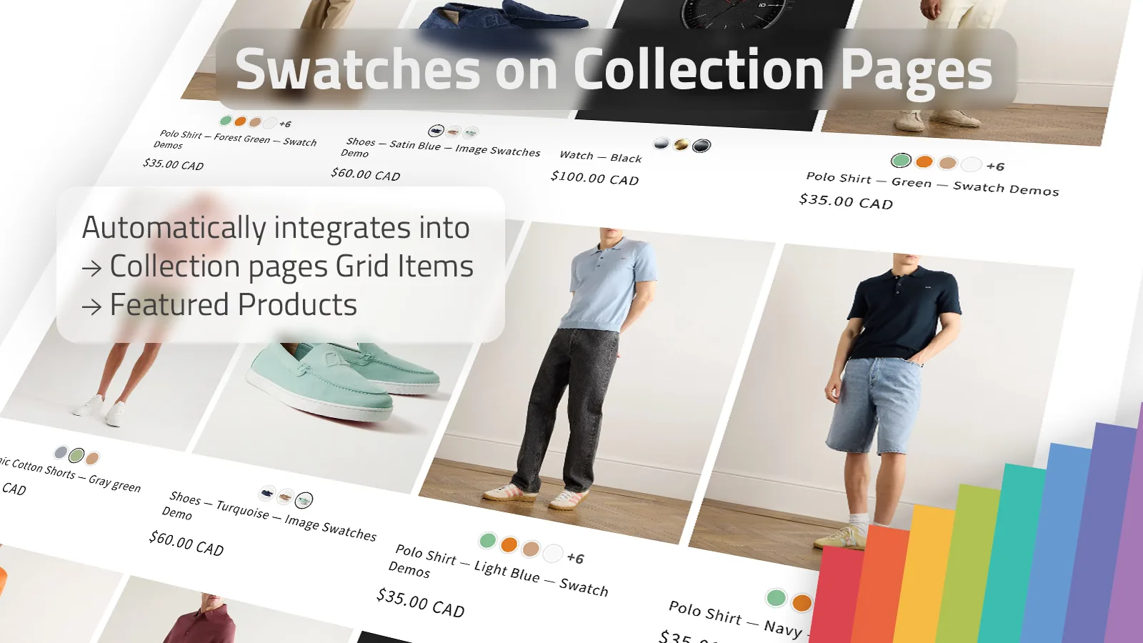
The part I would not skip is the mobile check. Swatches that look fine on desktop can get cramped fast on a smaller screen, and that is where the wrong size or label choice becomes obvious.
If your store uses several visual systems at once, I would rather keep the setup a little conservative and easy to interpret than try to pack every option into one giant control.
Common mistakes I still see
The mistakes are usually not technical. They are expectation problems.
- Using variant swatches when the shopper really needs a separate product page.
- Linking products when the only thing that changes is color.
- Styling collection swatches differently from product-page swatches, so the store feels inconsistent.
- Making swatches too small to tap comfortably.
- Choosing a style that matches the theme screenshot but not the actual brand.
If you want to keep the store easy to maintain, the best habit is to decide the behavior first and the style second.
Where Supra Swatch Colors fits
Supra Swatch Colors is the app I would use when I want one swatch system that can handle variants, linked products, and collection pages without asking me to write code. The install link is here: Shopify App Store. The product site is here: Supra Swatch Colors.
If you want a walkthrough after you choose your setup, these two videos are the quickest next step:
The practical conclusion is simple: do not start by asking what swatches look like. Start by asking what the click should do. Once that is clear, the rest of the setup gets a lot easier.
If you are between variant swatches, linked products, and collection-page swatches, I would pick the simplest setup that matches the customer’s expectation and then style it to feel native to the store.