
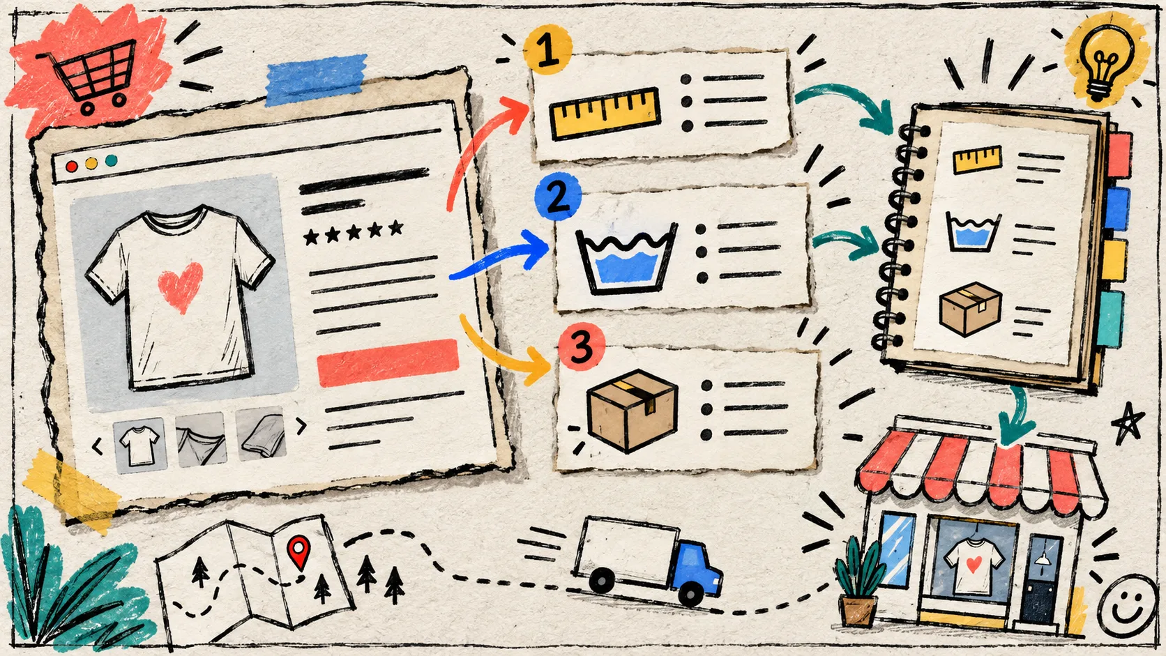
My product pages used to collect useful information the way a workbench collects screws: specs in one description, care instructions copied into another, delivery detail patched in just before a launch. Nothing was technically missing. It was simply hard to find, harder to keep current, and almost impossible to reuse without making a fresh mess.
The fix that survived contact with a growing catalog was not a giant rewrite. I separated the content from its presentation, then gave shoppers a predictable place to scan it. Here is the field-note version of that system.
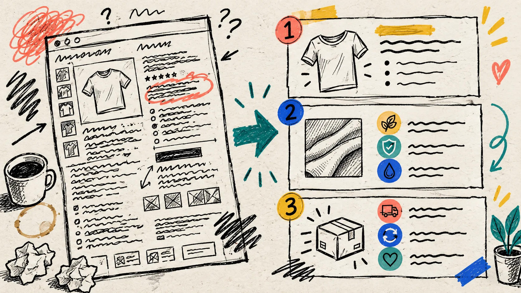
Start with the questions shoppers ask after the title
Before choosing a layout, I make a tiny inventory of the questions a customer needs answered before buying. For most physical products, the recurring set is familiar:
- What is it made of, and what are the important dimensions or compatibility details?
- How should I care for it, install it, or use it?
- When will it arrive, and what happens if it does not fit?
- Is there anything product-specific that changes the answer?
This sounds obvious, but it keeps the page architecture anchored to a shopper task instead of a theme feature. A clothing collection may need fit, fabric, and care. Electronics may need compatibility, setup, and warranty. The labels can change; the pattern does not.
I keep the product description for the short story: what the product is, who it is for, and why it matters. The repeatable reference material gets its own named sections. That keeps the first scroll from becoming a wall of policy copy.
Sketch the content sources before you draw tabs
The useful distinction is between content that changes product by product and content that should stay shared. Specifications might come from a per-product field. A care guide can be reused across an entire fabric family. A delivery note can point to one store policy. Shopify’s metafield documentation is a helpful reference when you need structured, product-specific data instead of more copy-paste.
My rough map looks like this:
| Shopper section | Best source | Why it stays sane |
|---|---|---|
| Specifications | Product metafield | Each SKU can keep its own factual details |
| Care or setup | Shared page or reusable text | One update reaches every matching product |
| Materials, ingredients, compatibility | Metafield or metaobject field | Structured data is easier to review |
| Delivery, returns, warranty | Shared page or downloadable file | Policy language has one home |
That separation is the part that makes later changes boring—in the best way. It is the same reasoning behind my earlier note on structuring Shopify product specs without editing every description: put the source of truth somewhere you can update once.

Build one tab set around a real product family
I use Supra Tabs & Accordions when I want that content system to appear as desktop tabs and mobile-friendly accordions without reworking each product template. It is free, with no trial or tiers, and it changes the organization of the information rather than replacing the underlying Shopify content.
The setup I reach for is deliberately small:
- Create a tab set with three to five labels a shopper can scan quickly: “Details,” “Care,” “Delivery,” and, when relevant, “Fit” or “Compatibility.”
- Connect each label to the right source: description, product metafield, store page, metaobject field, file, image, or written content.
- Target the set to a collection, product type, vendor, tag, or selected products.
- Check the live preview and overlap warnings before assigning it broadly.
- Add the theme app block once to the product template.
The small but important detail: empty sections can stay out of the way. If a product has no applicable compatibility note, a blank panel should not make the page look unfinished. That means one tab set can cover a real collection without forcing every SKU into the same copy.
Use labels that survive a frantic launch day
I avoid clever labels. “The Fine Print” may sound friendly, but it makes a rushed shopper work harder. Plain labels also make internal reviews faster because everyone knows which source belongs where.
For color-heavy catalogs, this structure pairs nicely with a clean swatch system; I wrote about keeping that naming consistent in my Shopify swatch naming field note. The same rule applies here: a label should mean the same thing from one product to the next.
Check the narrow product column, not just the desktop screenshot
Tabs can work beautifully in a wide product column, but a phone needs an easier path. Accordions give each section a generous tap target and let a shopper open only the answer they need. Supra Tabs & Accordions responds to the product-page column itself and offers overflow options such as scrolling, wrapping, a More control, or stacked sections.

My pre-publish check is short:
- Can I reach every section with a keyboard?
- Are the labels clear without opening the panel?
- Does the narrow layout stay calm when a product has several sections?
- Does a product with missing optional content still look intentional?
- Can a customer link directly to a useful section when support needs to point them there?
This is also where I make sure the organization does not hide the substance. Headed content should remain meaningful for screen readers and search engines; tabs are a presentation decision, not a reason to make product information disappear.
Make it reusable, then let it earn its place
A reusable system should reduce repetition without flattening the product page into generic boilerplate. Keep the product-specific bits genuinely specific, and reuse the policy, care, or process material that does not change. If your next launch needs a richer visual explanation, the same clear section structure can support a focused video—like the product-page question I turned into a 30-second Shopify UGC explainer.
For a wider systems view, this recent guide on building a reusable Shopify product-page content system is a useful companion.
My next action would be simple: pick one collection with recurring specs, care, and delivery questions; build a single tab set for it; then review three unlike products on desktop and mobile. If the labels still make sense and the content stays accurate, you have a system worth rolling out.
Try Supra Tabs & Accordions free in the Shopify App Store and start with the smallest product family that keeps making you rewrite the same answer.