

A collection page can make a color-heavy catalog feel easy to browse, or it can turn every click into a tiny mystery. I learned to stop treating swatches as a product-page-only detail after watching shoppers land on a collection, scan six nearly identical thumbnails, and leave before they found the color they actually wanted.
The fix was not a theme rewrite. It was a small planning pass: decide what a color means in the catalog, then make product-page and collection-page behavior agree. Supra Swatch Colors is useful here because it can turn variant options into color or image swatches, link separate products, and show swatches on collection pages without code. But the app only looks thoughtful when the catalog decision underneath it is thoughtful.
Start With the Catalog Question, Not the Swatch Style
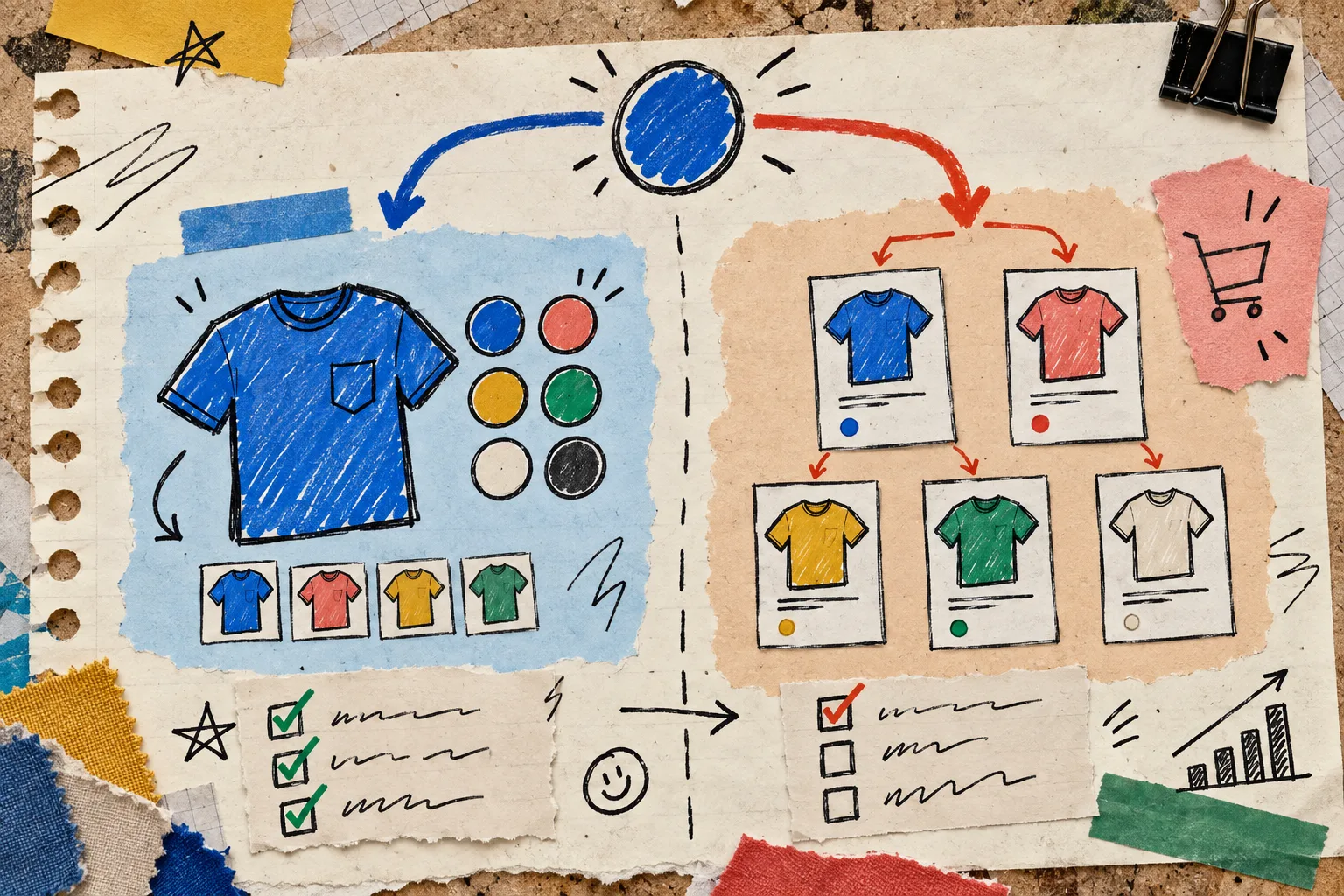
My first note is brutally simple: does this color keep the same purchasable product, or does it become a different product page?
If Blue, Moss, and Sand are variants of the same tee—with the same description, price logic, fit notes, and inventory story—I keep them as variants. The shopper can choose a color without losing context. If each colorway is really its own product because it has different imagery, merchandising, price, or inventory, I link separate products instead.
That choice changes what a collection page should communicate. Variant swatches say, “this card has more colors.” Linked-product swatches say, “this family has neighboring products.” I use this variants-versus-linked-products guide as a sanity check whenever a color group starts behaving like a merchandising collection.
Make the Collection Page Answer One Fast Question
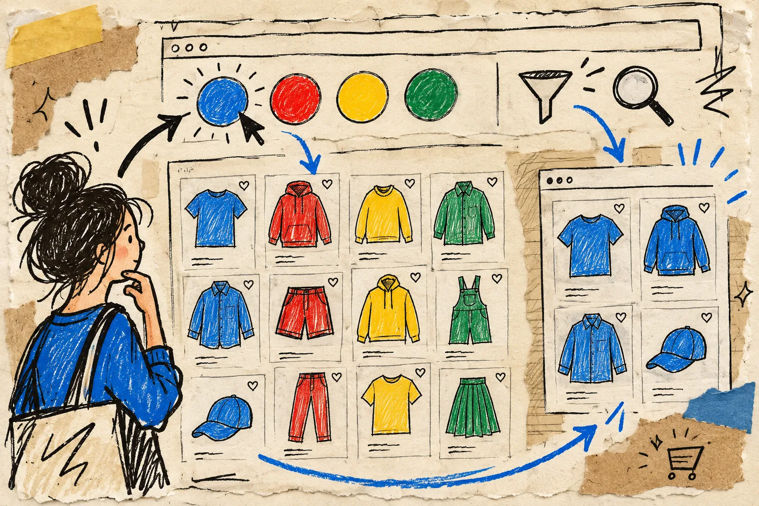
On a product page, a swatch can support close comparison. On a collection page, it has a more urgent job: help someone decide whether a card is worth opening. That is why I only expose the colors that are real choices a shopper can act on. Decorative “available in many colors” dots that do not correspond to a visible option are just catalog noise.
Before enabling collection swatches, I make a quick three-column scratch list:
- Show now: colors that are in stock and purchasable in the displayed market.
- Group together: alternate colors that belong to one product family.
- Keep separate: finishes, bundle differences, or products whose copy and imagery genuinely need their own card.
Then I look at the first twelve products in the collection. If the color dots make it easier to distinguish items at a glance, they stay. If every card gains six tiny dots and the actual product silhouettes disappear, I simplify. The useful detail is not the biggest number of swatches; it is the first useful decision.
Build a Tiny Naming System Before You Automate Anything
Color swatches amplify inconsistent names very efficiently. A catalog with “Navy,” “Midnight,” and “Deep Blue” might be correct editorially, but it is hard to scan and harder to maintain. I pick a source of truth for each family—usually the option value—and normalize names before I worry about shape, tooltip, or hover effect.
This is where a swatch app’s color detection or product-image option can speed up setup, but I still inspect the output. The color needs to represent the item, not merely the loudest pixel in its photo. For a deeper audit pass, I reuse the checklist from How to Audit Shopify Swatch Labels Before a Color Launch.
A compact rule set has held up well for me:
- Use one customer-facing name per actual color.
- Reuse that exact name across product and collection pages.
- Reserve image swatches for patterns, materials, and finishes where a flat color would mislead.
- Let the displayed swatch match the variant or linked product that will actually open.
Test the Whole Browse Loop
I do not call collection-page swatches finished after one desktop screenshot. I click through the loop that a shopper will actually use: collection card, chosen swatch, destination product, selected color, back to collection. Supra Swatch Colors supports product and collection pages across Shopify themes, plus multilingual shops, so this is also the moment to check the markets and languages that matter to the store—not just the admin’s default view.

My pre-launch pass takes about ten minutes:
- Check mobile first; a wrap of swatches can change the whole card height.
- Open every color in a small representative sample.
- Confirm out-of-stock behavior is deliberate.
- Compare collection cards with the product-page options.
- Switch storefront language if the store is multilingual.
- Test a product with an image swatch and one with a standard color swatch.
I also compare the collection grid with the product-page information architecture. A clean product page needs equally clear supporting details, which is why I keep this guide to organizing Shopify product information nearby when a collection refresh expands into a broader merchandising pass.
Let the Collection Do Less Work
The best collection-page swatches make the next click more confident. They do not need to explain sizing, materials, shipping, or every distinction between related products. Give them one job: reveal the meaningful color choices without making the grid feel denser than the product catalog itself.
If you want a more visual reference for what useful swatch detail looks like, 7 Détails Qui Rendent un Nuancier Shopify Vraiment Utile is a good companion read.
My next step is always the same: choose one collection, define whether its colors are variants or linked products, and test twelve cards on a phone. Then install Supra Swatch Colors and set up the swatches around that real catalog decision—not around whatever layout happens to look busy in the theme editor.