
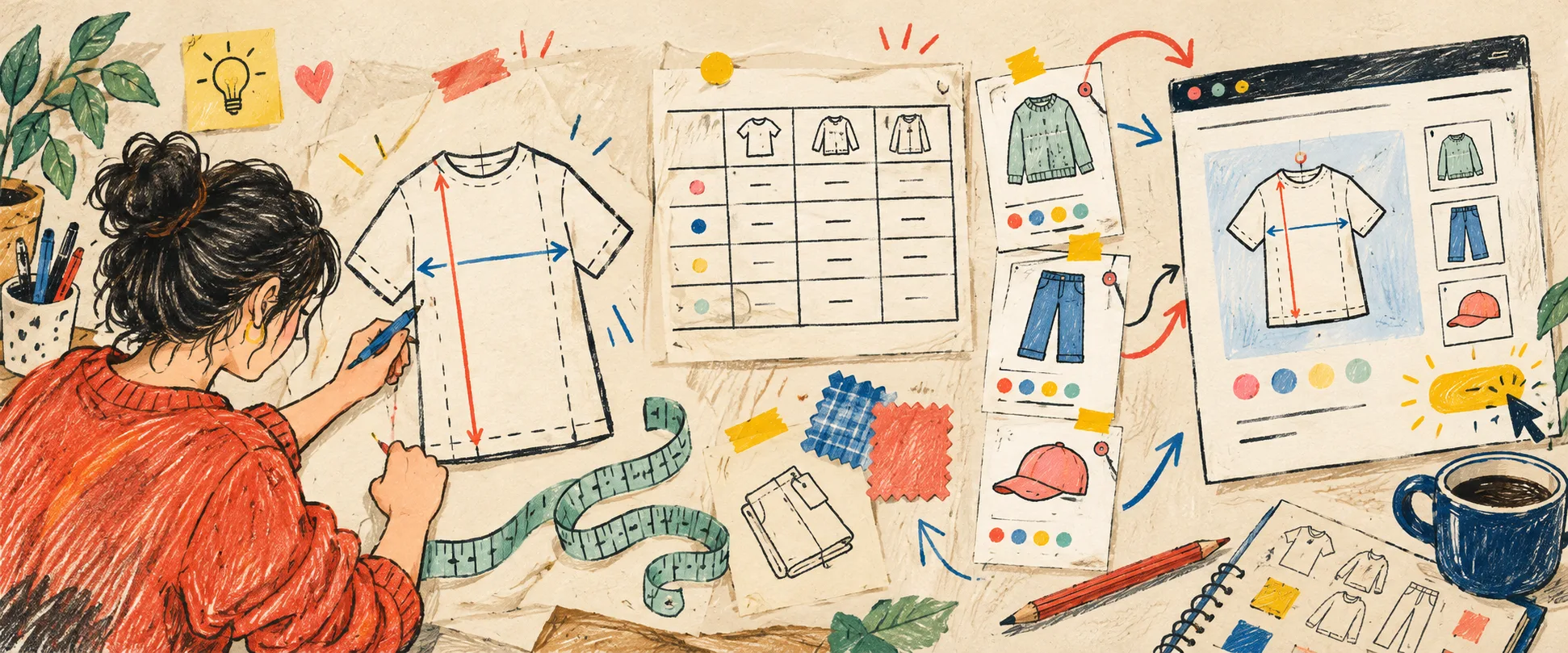
I noticed the problem while adding what should have been an easy new tee. The product copy was done. Photos were ready. Then I went hunting for the size table: one version lived in an older product description, another in a spreadsheet, and neither told a customer where the tape measure belonged.
That is when I stopped treating sizing as a little block of page content and sketched it as a system. The system does not need to be grand. It needs a clear source of truth, a few honest decisions about fit, and a way to reach the right products without recreating the work.
Start With the Question the Chart Is Answering
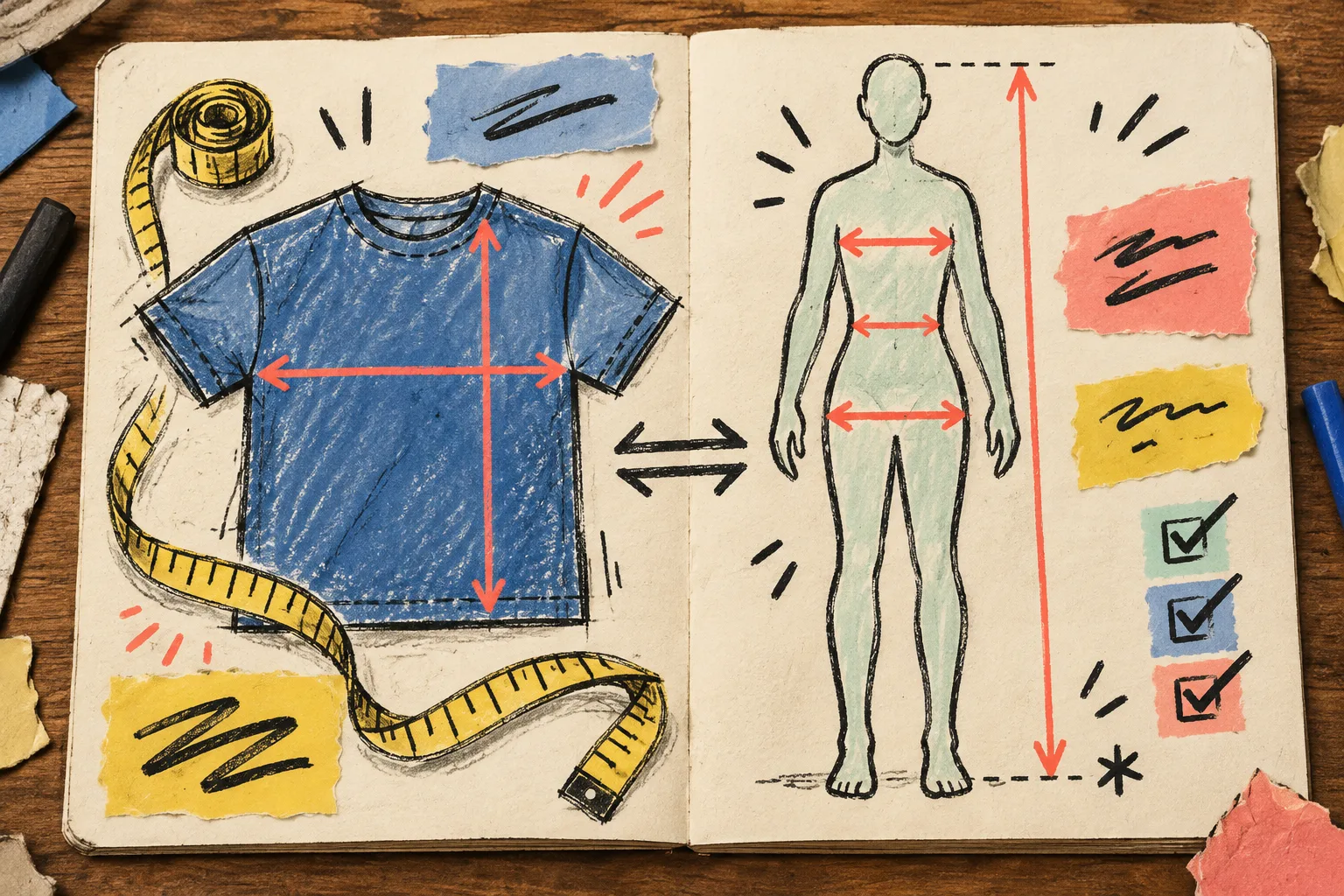
The most useful first fork is simple: are the values body measurements or garment measurements? A shopper cannot use the table confidently if that distinction is hidden in a footnote.
For a relaxed cotton tee, I normally give garment measurements: chest width measured flat, body length, and sleeve length. I say that width is measured across the garment and that a similar item they own is the easiest comparison. For fitted leggings, body measurements may be more useful, provided the page states where to measure waist, hip, and inseam.
This is also where a small measurement guide earns its space. A labelled silhouette can show the exact line used for chest, waist, rise, or length. It is a more useful answer than a dense paragraph beside a number grid. The point is not to promise a perfect fit; it is to make the shopper’s comparison method obvious.
Draw the Smallest Useful Chart
I now begin each product family with a deliberately boring worksheet:
- What garment or body measurements decide the purchase?
- Is the cut regular, relaxed, cropped, oversized, or fitted?
- Does the fabric stretch enough to deserve a note?
- Which region or unit will the audience expect?
- Does this family genuinely share a fit with another one?
A tee chart might need size, chest width, length, and sleeve length. A shoe chart needs a different map altogether; this footwear sizing guide is a good reminder that centimetres, conversion expectations, and fit notes shift with the category. A bulky outerwear piece may deserve its own chart even when it shares a collection with lighter layers.
I avoid adding columns just because the spreadsheet allows it. Every column should help someone choose. If it does not, it turns a decision tool into homework.
Turn One Good Chart Into a Catalog Rule
The scribble that changed the workflow was this: chart in the middle, product groups around it. A chart belongs to a family, not to a single pasted product description.
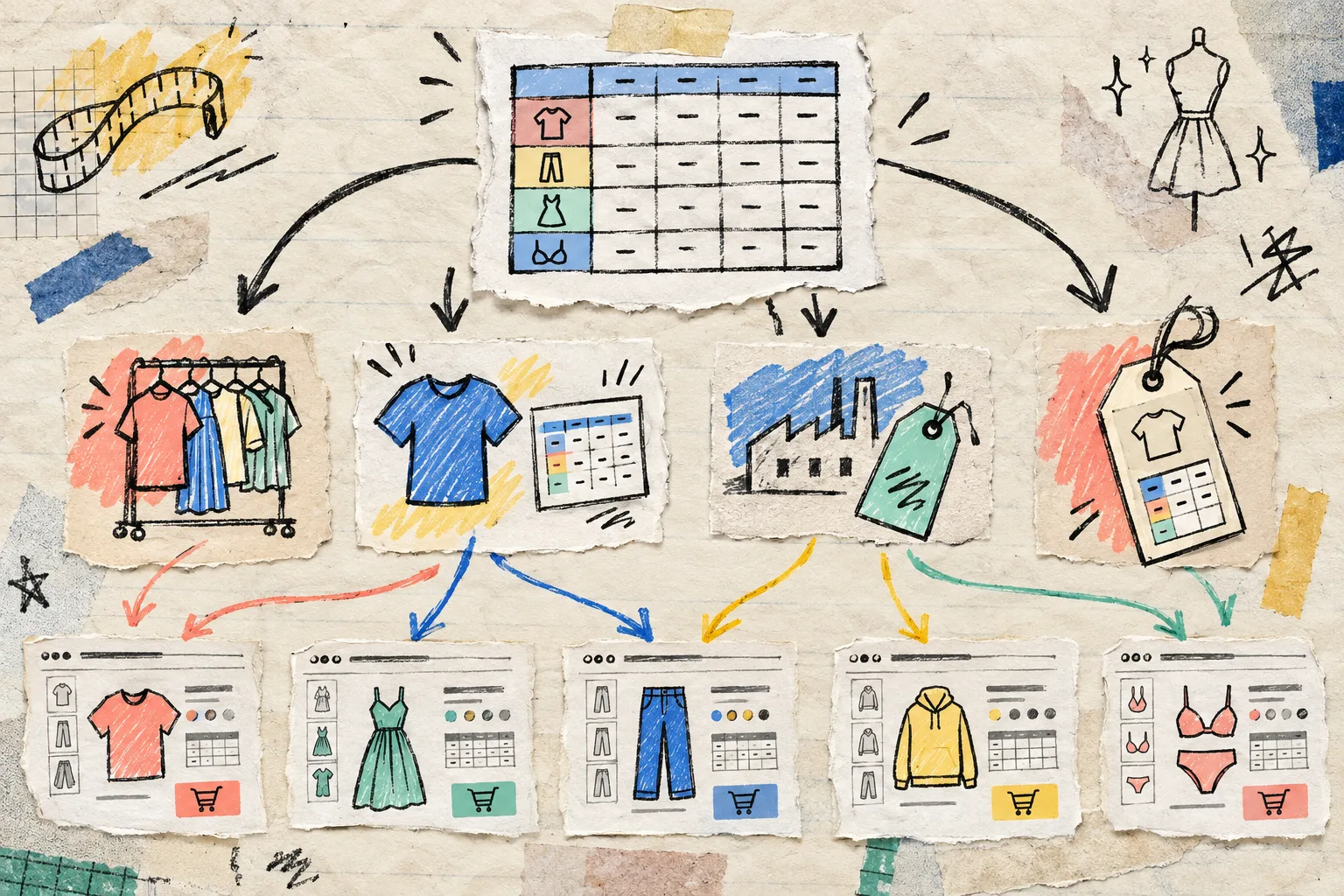
With Supra Size Chart, I can create that central chart once, pair it with a reusable measurement guide, then assign it by product, collection, product type, vendor, or tag. That matters when a new colourway arrives next month: if it enters the right collection or receives the right tag, the matching chart is already there.
I use three rule-of-thumb layers:
- Shared chart for the true product family. Core tees in the same cut can share one chart.
- Specific chart for meaningful fit changes. Cropped, heavyweight, or gender-specific cuts get their own rather than an apologetic note.
- A safe fallback. Keep a store-wide default only when it is genuinely useful; it should not mask a missing category chart.
The app resolves the most specific match on the product page, which gives the catalog structure without turning maintenance into a ticket queue. If you are still deciding which display belongs on the page, the app’s inline, accordion, and modal guide is worth reading before you lock a pattern in.
Keep the Chart Portable
A chart is operational data, not decorative HTML. I want to be able to audit it, reuse it, and move it without extracting tables from old descriptions. Supra Size Chart stores charts in the store’s Shopify metaobjects and supports CSV and JSON import and export. That gives the chart a life outside a particular product editor.
It also makes a focused audit less scary. I can look at the chart data separately from page copy, compare it against a supplier sheet, and export a clean backup. For the wider catalog check, I would pair this approach with the Shopify size-chart audit workflow: inspect representative products before a collection launch rather than discovering missing guidance through customer messages.
Test It Like a Shopper, Not a Spreadsheet
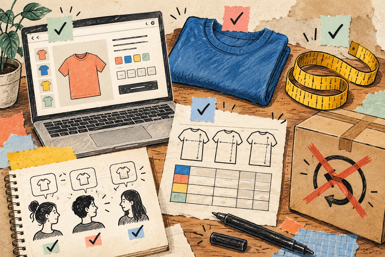
Before I call the system done, I open a few product pages on a phone and ask four unglamorous questions:
- Can I find the chart before I reach the add-to-cart decision?
- Can I tell whether I should measure myself or a garment?
- Can I understand the units without calculating in another tab?
- Does the shown chart match the item, including a new product added by a rule?
For stores selling across borders, make the unit decision visible. A shopper who thinks in inches should not have to do improvised conversion at checkout; Supra Size Chart can offer a metric/imperial toggle. And if your charts have multiplied over time, choosing the right measurements is a useful reset before you duplicate another table.
My Next-Product Rule
I no longer publish a new apparel product until I can point to its chart, its measurement guide, and its assignment rule. It takes a few minutes during merchandising, but it removes a much messier task later: finding which product descriptions inherited an outdated table.
If your size information is still scattered across descriptions, start small today. Pick one product family, decide whether customers need body or garment measurements, make one clean chart, and assign it with a rule. You can install Supra Size Chart free and build the system before the next collection forces the issue.