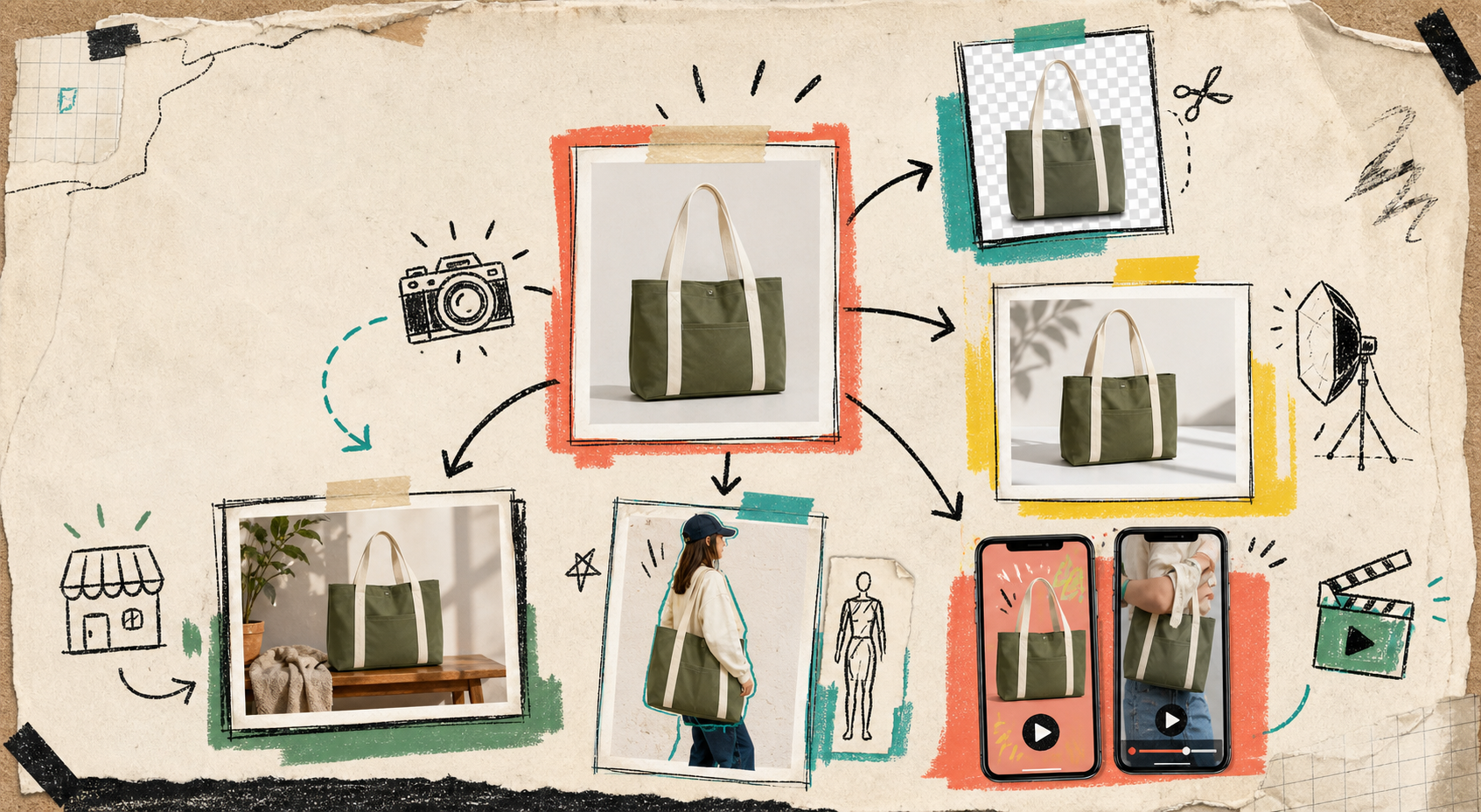
I keep running into the same failure mode on Shopify stores: the product is fine, but the image set is trying to do four jobs badly at once. The homepage wants a hero. The product page wants clarity. The ad account wants motion. The catalog wants consistency. One plain product shot can’t carry all of that without help.
That is why I keep coming back to Supra AI Photo Studio. The landing page shows the workflow in plain language, and the demo trailer is the fastest way to see how one source photo becomes a usable set. I think of it less as “an AI photo tool” and more as a way to build a small visual system from one decent image.
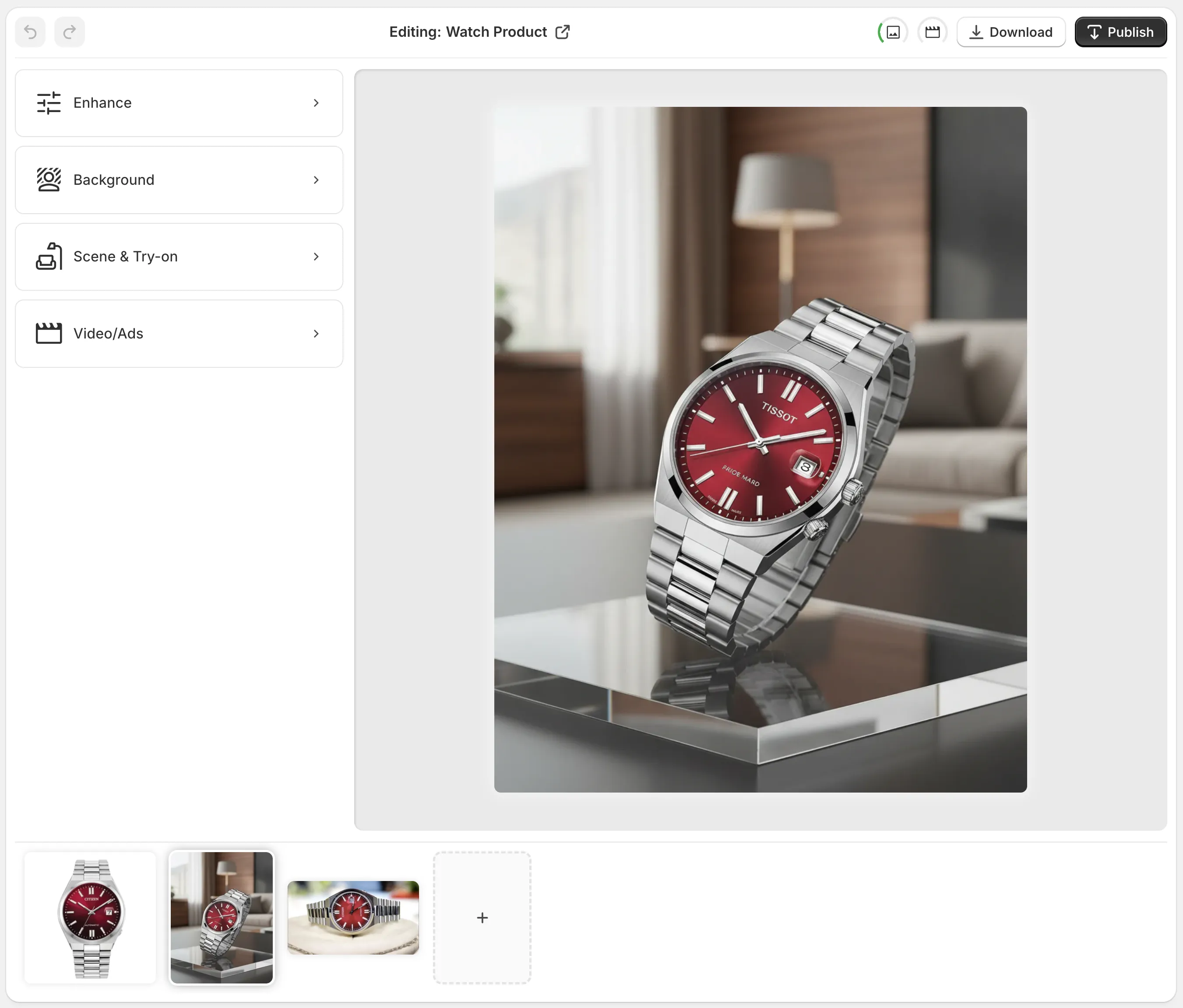
The editor layout matters more than it sounds. Top bar for undo, redo, download, and publish; tools on the left; canvas on the right; image gallery at the bottom. That is the kind of setup that keeps me moving when I am trying to turn one messy asset into something I can actually ship.
1. Clean The Source Before You Stylize It
I start with the boring pass. If the original shot is fuzzy, crooked, or stuck on a distracting background, I clean it before I ask for anything creative. Background removal, upscaling, and auto-enhance are the cheap wins here, and they make every later step less fragile.
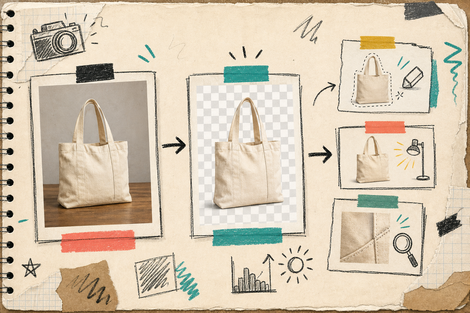
The order matters. If I stylize before I clean, every defect gets copied into the next version. If I clean first, I can reuse the same base image for a product page, a category page, and an ad test without inheriting the mess.
That is also the same principle I wrote about in How to Turn One Product Photo Into Listings, Lifestyle Shots, and Ads, How to Build a No-Shoot Shopify Photo Workflow That Still Looks Premium, and How to Keep Shopify Product Photos Consistent Across Your Catalog. Clean first. Everything else gets easier after that.
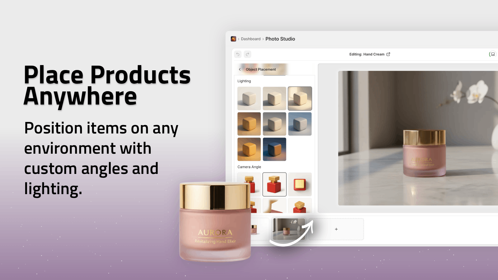
2. Pick One Scene, Not Five
I do not try to make one image satisfy every channel. If the product needs a lifestyle context, I choose one useful environment and stop. That might be a studio table, a boutique shelf, a kitchen counter, or a natural setting. The point is not to make the scene look expensive. The point is to make the product easier to understand.
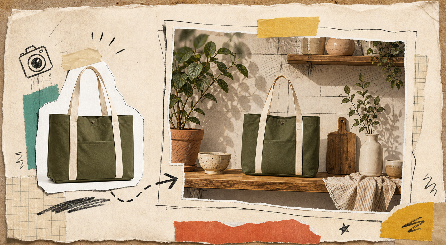
The app’s object placement feature is the piece I use here. It lets me put the product into a specific environment, choose surface type, adjust the camera angle, and keep the output aligned with the rest of the store. That is usually enough to turn a plain shot into a usable product-page asset.
If you want a simpler companion example, the same mindset shows up in How to Turn One Product Photo Into Listings, Lifestyle Shots, and Ads. One source, multiple outputs, but only one decision at a time.
3. Use Try-On Only When The Buyer Needs It
Try-on is not the default step. It is for apparel, jewelry, accessories, and anything else where the customer needs scale, fit, or styling cues. When it works, it solves a real hesitation. When it does not, it just makes the page busier.
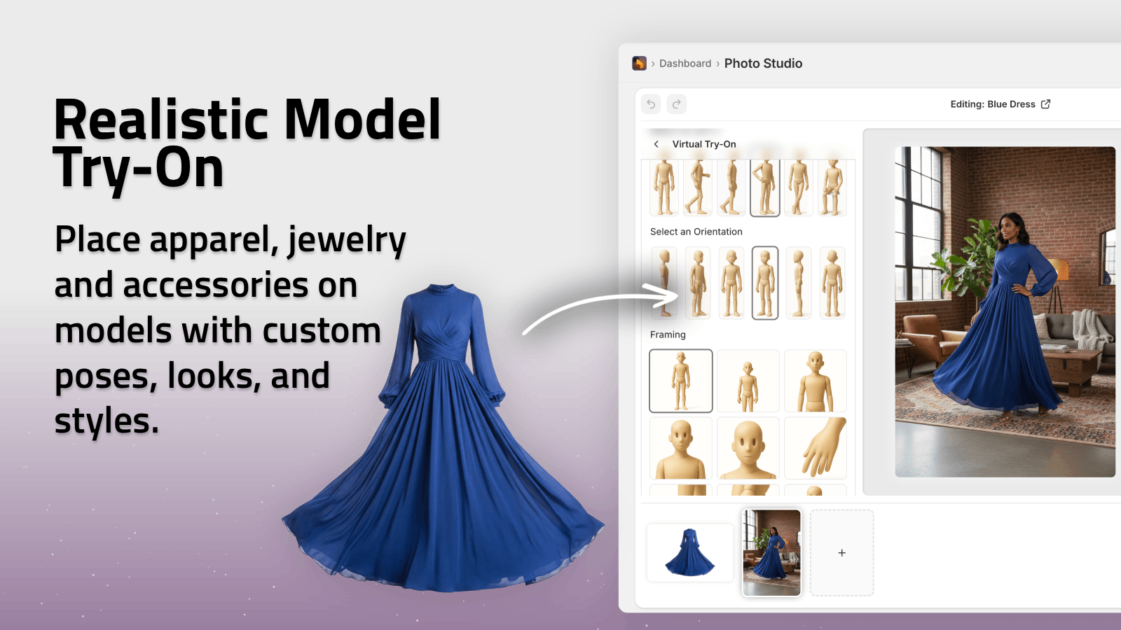
I like the try-on feature because it keeps the product the thing people notice first. The model supports the product; it does not swallow it. That is the right tradeoff for ecommerce. If I am not improving clarity, I skip the step.
This is also where consistency matters. I do not want a try-on image to feel like a separate campaign from the rest of the catalog. The same discipline I wrote about in How to Keep Shopify Product Photos Consistent Across Your Catalog applies here: same tone, same product truth, same visual logic.
4. Add Motion After The Still Set Holds Together
Only after the stills make sense do I move into motion. The b-roll and UGC video tools are useful because they let me get ad-ready clips without spinning up a new production cycle every time. I am not asking motion to fix a weak product shot. I am asking it to extend a shot that already works.
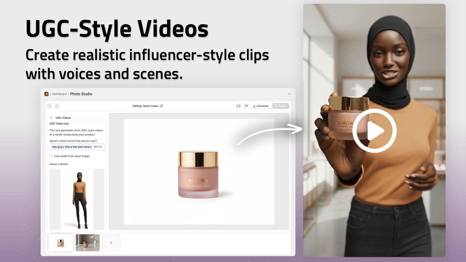
That is the part I like about the app. You can go from clean stills to short clips without changing the product story. If I need to test hooks, formats, or angles, that motion layer becomes the next cheap experiment.
Two related reads fit here: How to Create UGC-Style Product Videos for Shopify Without Hiring Influencers and How to Build a No-Shoot Shopify Photo Workflow That Still Looks Premium. The first is about the motion layer itself; the second is the broader system around it.
The Checklist I Actually Use
Before I call the workflow done, I check five things:
- The source image is clean enough to crop or reuse.
- The product still looks like the same product in every variation.
- The lifestyle scene matches the store’s tone.
- The try-on image helps the buyer understand fit or scale.
- The motion clip feels like a sibling asset, not a separate creative brief.
If one of those fails, I usually do not need a new tool. I need a smaller decision. That is the main reason I like this workflow: it narrows the problem instead of expanding it.
Bottom Line
One decent product photo can become a cleaner cutout, a scene, a try-on, and a motion asset set if the workflow stays disciplined. That is enough to make a Shopify store feel more intentional without turning every change into a reshoot.
If you want to test the workflow, start with the Shopify app listing, open the landing page, and build one small visual set from a single source image before you try to scale it across the catalog.