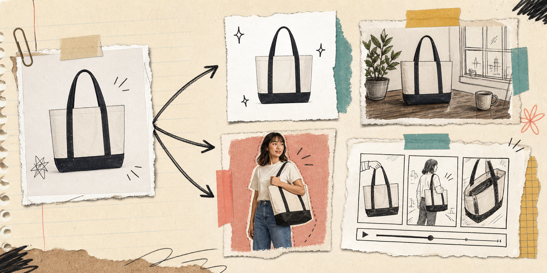
I keep running into the same failure mode on Shopify stores: one decent product photo has to do too many jobs at once. It needs to clarify the product, carry the homepage hero, support the product page, and maybe even seed ad creative. That is a lot to ask from a single shot.
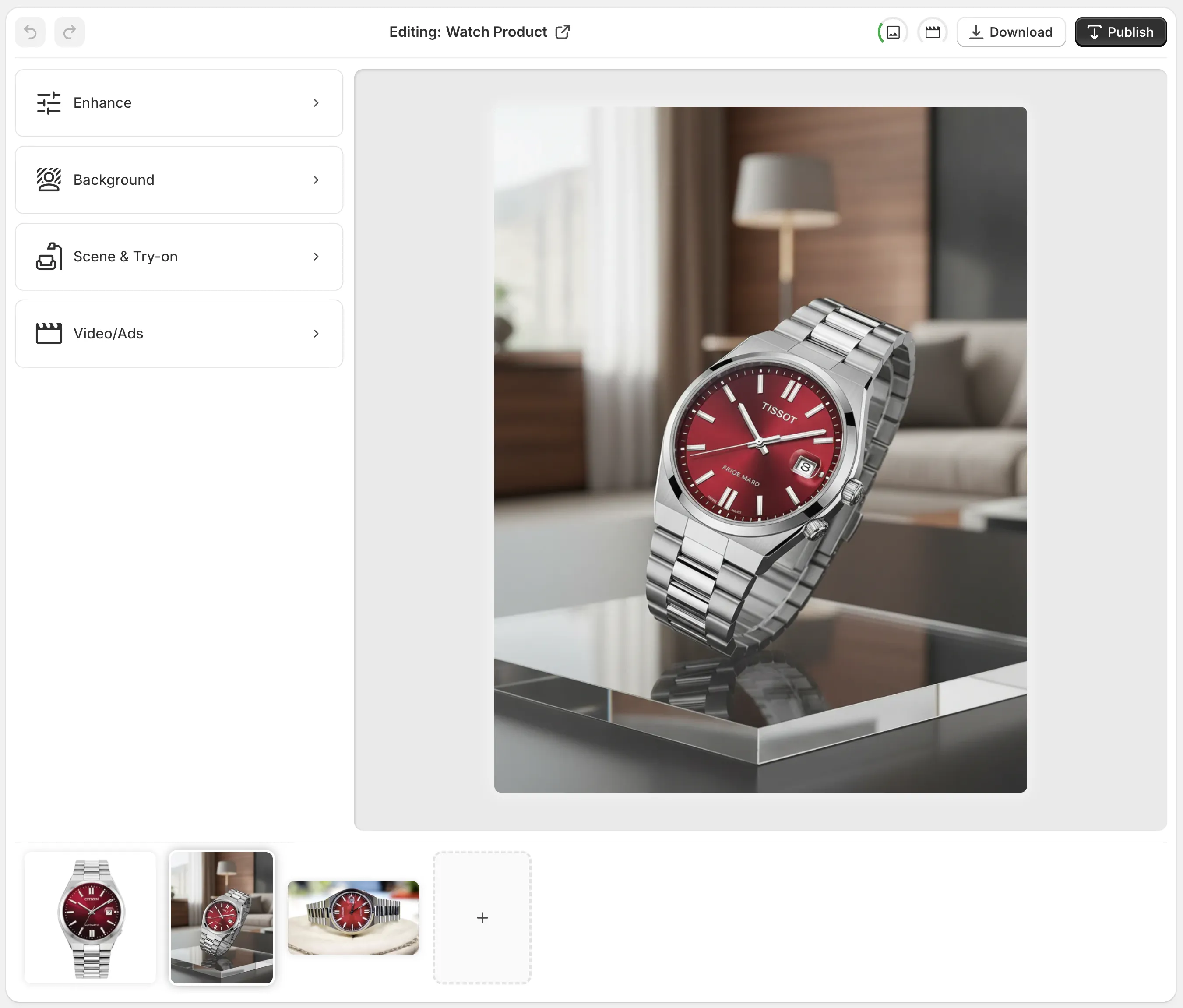
What I like about Supra AI Photo Studio is that it turns that one photo into a small asset library instead of a dead end. The landing page lays out the workflow clearly, and the demo trailer is the fastest way to see the sequence in motion. If you want the editor surface itself, the help page is useful because it shows the top bar, tools, canvas, and image gallery in one place.

The app is not trying to replace judgment. It is trying to make the handoff from one source image to multiple useful outputs a little less painful. That is the part that matters.
Clean First, Stylize Second
I always start with the least glamorous step: cleanup. If the source shot is soft, unevenly lit, or sitting on a distracting background, I do not want to stylize it yet. I want it cleaned, sharpened, and made easier to reuse.
Supra AI Photo Studio gives me the boring but important tools first: background removal, upscaling, and auto-enhance for denoise, deblur, color, and lighting. That is the right order. If I stylize too early, I just copy the flaws forward.
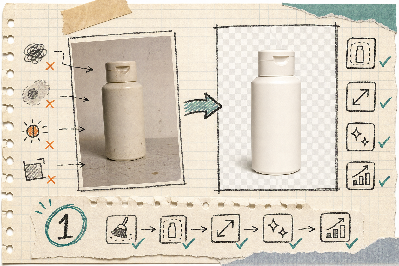
That is also the same principle I keep circling in How to Build a No-Shoot Shopify Photo Workflow That Still Looks Premium and How I Build a Shopify Visual System From One Product Photo. Clean first. Everything else gets easier after that.
Pick One Scene and Stop
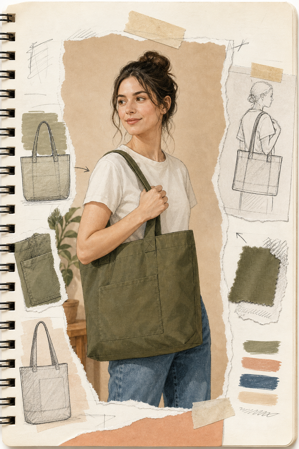
The next temptation is to make ten lifestyle scenes before I have one good one. I try not to do that. One scene that fits the product and the store tone is enough to prove the direction.
That is where the object placement workflow matters. I can put the product into a studio setup, a boutique shelf, a kitchen counter, a natural setting, or another environment that makes the item easier to understand. The point is not to make the scene look expensive. The point is to make the product easier to read.
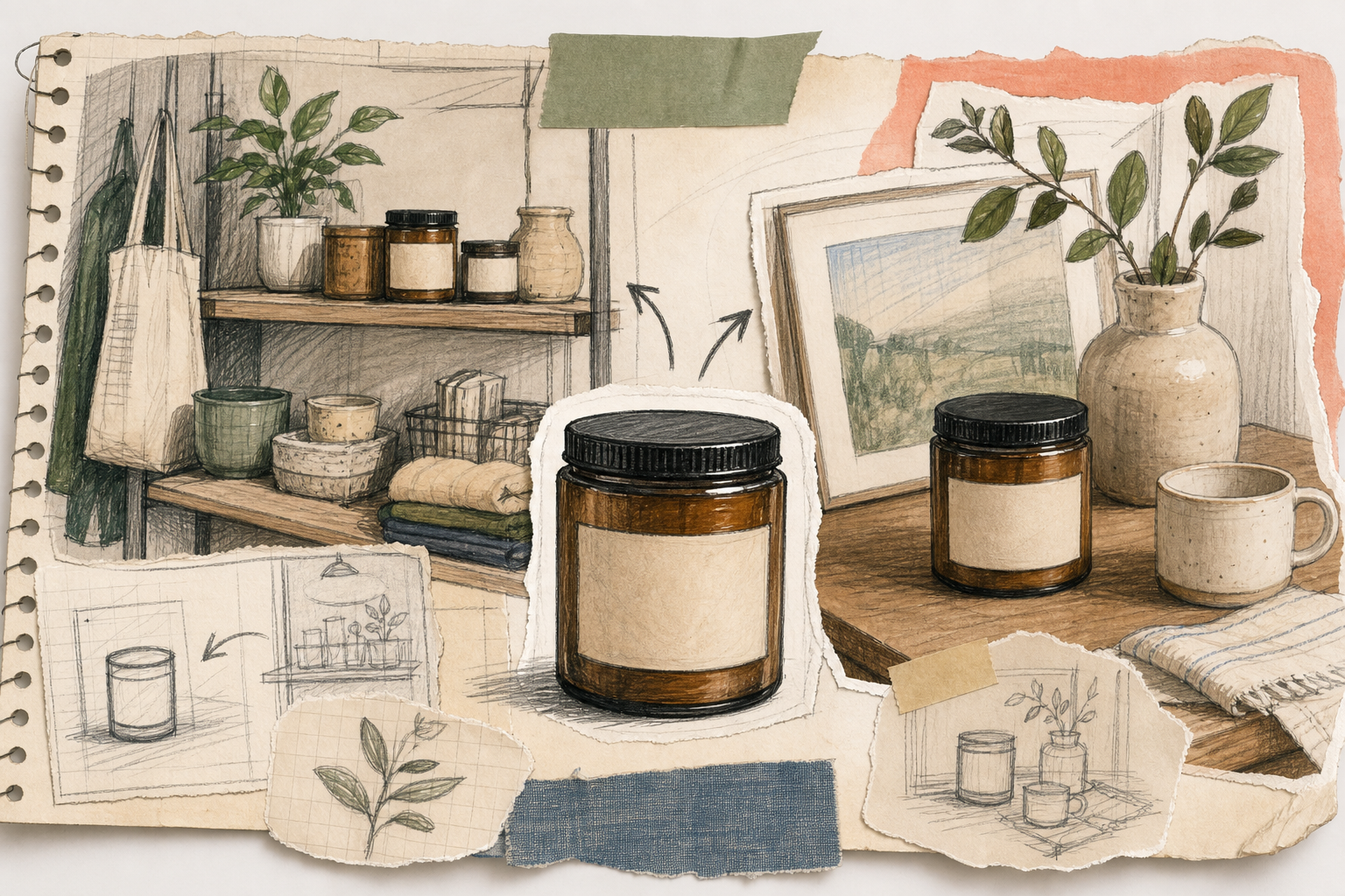
This is the same sort of decision I wrote about in How I Turn One Product Photo Into a Shopify Asset Pipeline and How I Turn Plain Product Photos Into Studio Shots, Try-Ons, and Ads. One source photo, yes. But only one decision at a time.
If I am working on a product that needs a lifestyle context, I would rather have one strong scene than a pile of weak variations. The right answer is usually smaller than the tooling makes it look.
Use Try-On Only When Fit Matters
I treat try-on as a tool for products where scale, fit, or styling cues really affect the sale. Apparel, jewelry, and accessories are the obvious cases. If the customer needs a human frame of reference, try-on can help a lot. If not, it is just extra noise.
The try-on feature is useful because it keeps the product visible. The model supports the product; it does not take over the page. That is the right balance for ecommerce.
I like that this sits in the same system as the cleanup and placement steps. It does not feel like a separate campaign. It feels like another view of the same source photo.
That same logic showed up for me in How I Build a Shopify Visual System From One Product Photo and How I Turn Plain Product Photos Into Studio Shots, Try-Ons, and Ads: if the try-on does not make the buyer understand the product faster, I skip it.
Add Motion After The Still Set Works
Only after the still images hold together do I move into motion. That is where the UGC and b-roll tools become useful. They let me turn a product image into short clips for ads or social without rebuilding the creative from scratch.
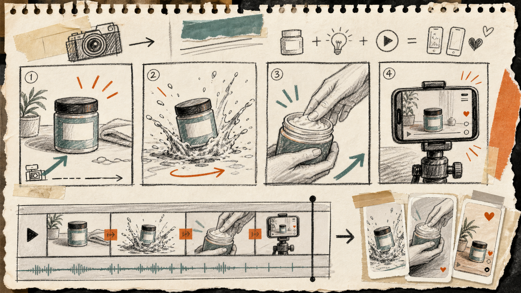
I do not want motion to rescue a weak photo. I want motion to extend a still set that already works. That is a much better use of time.
The demo trailer is worth watching here because it shows the full loop: source image, cleanup, placement, try-on, and video. Once you see that sequence, it is easier to think in terms of reusable assets instead of one-off edits.
The Checklist I Actually Use
Before I call the workflow done, I ask five blunt questions:
- Is the source image clean enough to crop and reuse?
- Does the product still look like the same product in every variation?
- Does the lifestyle scene match the store tone?
- Does the try-on image help the buyer understand fit or scale?
- Does the motion clip feel like a sibling asset, not a separate creative brief?
If one of those fails, I usually do not need a new tool. I need a smaller decision.
That is why this workflow feels useful to me. It narrows the problem instead of expanding it. It also lines up with the way I think about broader image systems in How I Turn One Product Photo Into a Shopify Asset Pipeline and How to Build a Repeatable Shopify Image Workflow From One Product Shot: keep the source stable, keep the variations intentional, and do not let every channel become a separate art project.
Bottom Line
I like this kind of setup because it gives a Shopify store more usable visual depth without forcing a reshoot every time the marketing plan changes. One plain product shot becomes a cleaner cutout, a lifestyle image, a try-on, and a short motion asset set.
If your catalog is still being held together by one decent photo and a lot of hope, start small: install the app, run one product through cleanup, make one scene, and export one motion clip. If that works, you have the beginning of a real visual system.
The easiest place to start is the Shopify app listing and the landing page.