
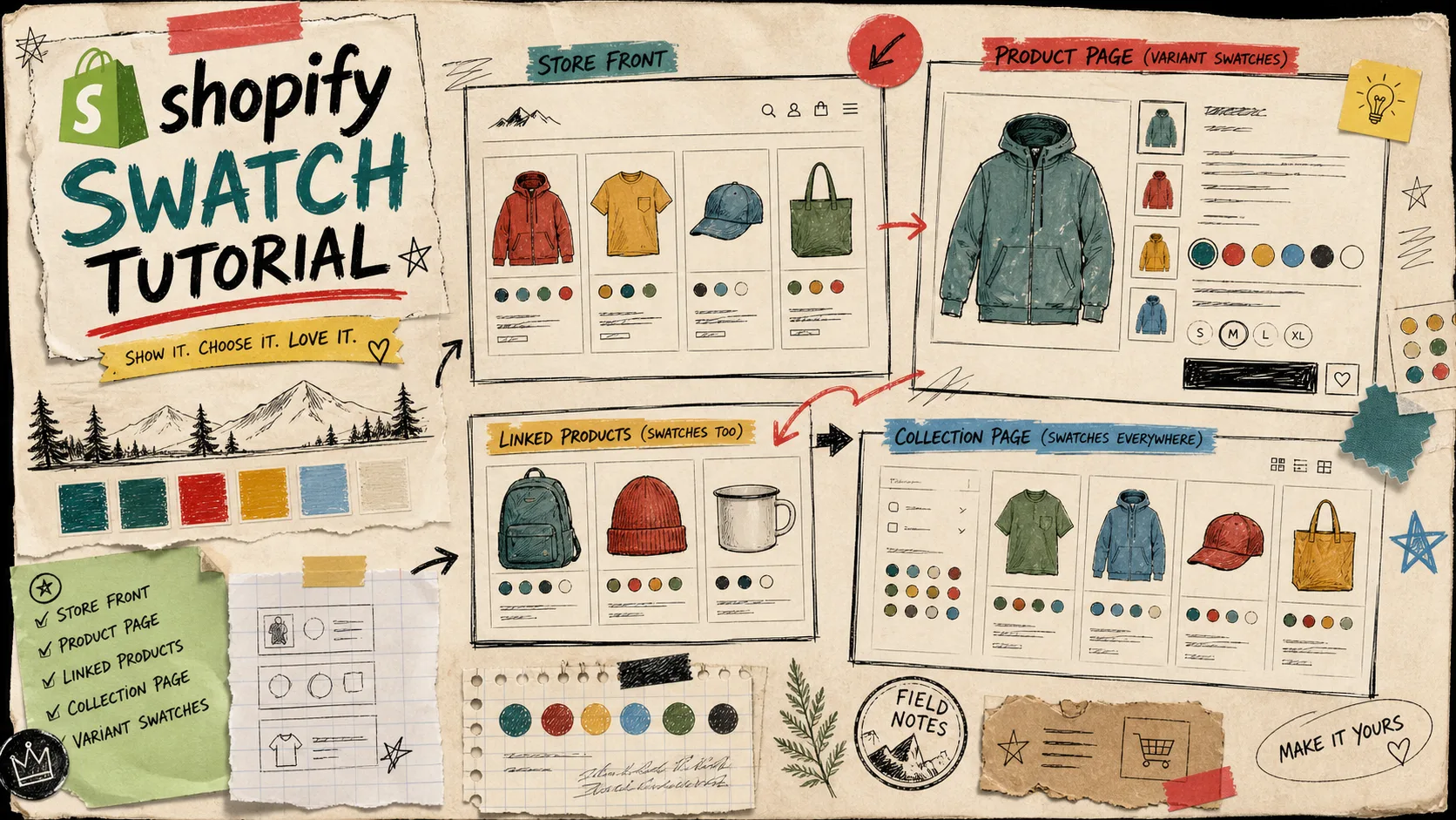
I keep seeing Shopify swatches treated like decoration. They are not decoration. They are a navigation layer, a merchandising choice, and in a lot of stores, the fastest way to make a product page feel less like a spreadsheet.
That is why I would start with Supra Swatch Colors. It handles color swatches, image swatches, linked products, variant swatches, and collection-page swatches without code, and it gives you enough control to keep the result on brand instead of generic. The app site is supra-swatch-colors.sktch.io.
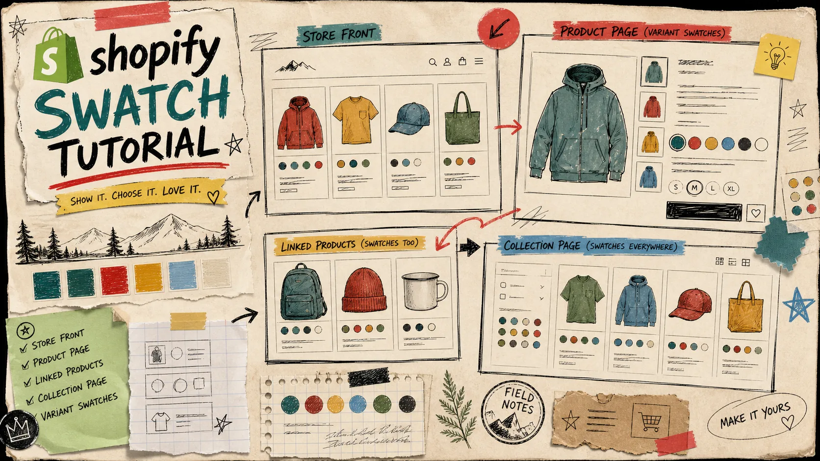
Start With The Merchandising Decision
The first question is not “what style looks nice?” It is “what is this swatch supposed to do?”
If the change is really just a different option on the same product, I treat it as a variant swatch. If the color or material points to a different product page, I link the products with swatches instead. That split matters because it keeps the customer path clean and stops you from forcing unrelated options into one product.
I like that this is the same decision in different forms. How I Choose Between Variant Swatches and Linked Products in Shopify is the tighter decision tree, and How to Build a Shopify Swatch System for Variants and Linked Products is the more practical setup guide.
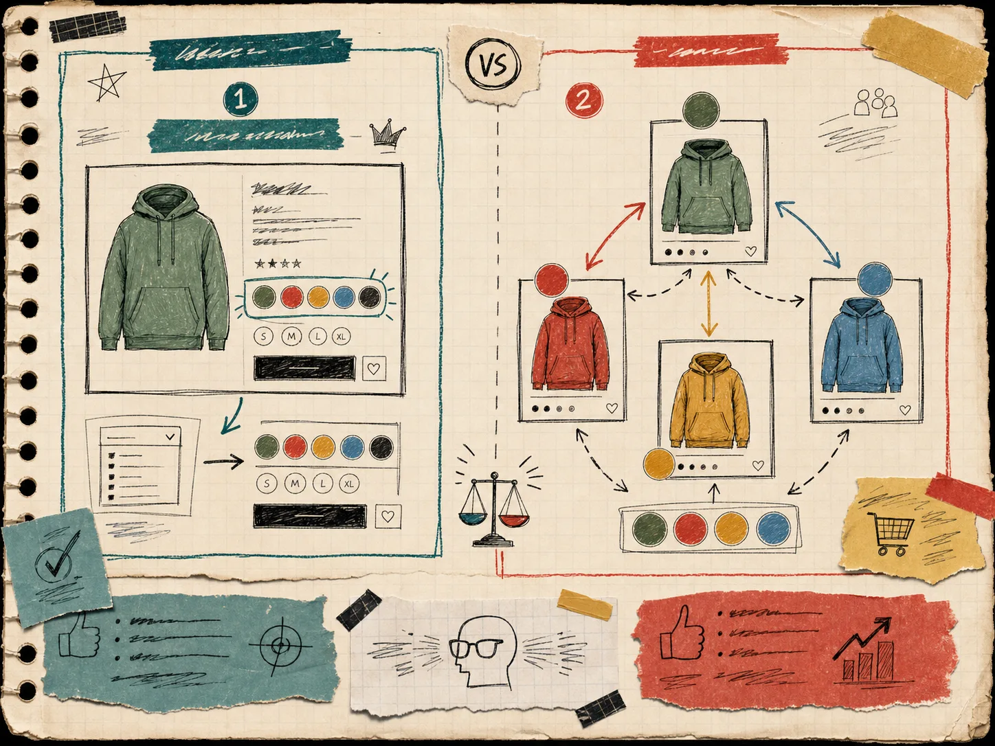
The reason I keep this split up front is simple: variant swatches are for choice inside a product, linked-product swatches are for choice across products. If you blur the two, the store gets harder to browse and harder to maintain.
Make The Swatches Match The Store
The part I care about next is visual consistency. Supra Swatch Colors supports more than one type of swatch, can auto-detect colors already used in the store, and can also use product images to set swatches faster. It also has 20+ customizable styles, which is the difference between “installed” and “actually matched to the brand.”
That is where the app earns its keep. I can tune tooltip, label, swatch size, shape, and related styling without writing theme code. If the store is loud and playful, I can lean into that. If it is restrained, I can keep the swatches small and tidy. Either way, the swatch UI should feel native to the catalog.
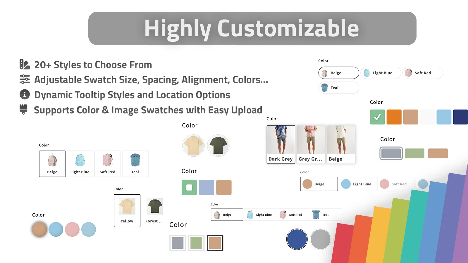
I would still keep one rule here: do not make the swatch UI louder than the product photos. The swatches should help the shopper compare options, not become the main event.
Let Collection Pages Do More Work
I think collection pages are the most underused place for swatches. A shopper browsing a grid does not always want to click into every product just to find the right color or finish. If the swatch is visible in the collection grid, the catalog gets easier to scan immediately.
Supra Swatch Colors supports swatches on collection pages, works with all Shopify themes, and supports multilingual shops. That combination matters more than it sounds. It means the same merchandising logic can survive across themes, product pages, and browsing contexts without a separate code project each time.
If you want the collection-page side in more detail, How to Set Up Shopify Swatches Across Product and Collection Pages and How I Set Up Color Swatches for Shopify Collection Pages Without Theme Code are the two closest companion reads.

That screenshot is the reason I like collection-page swatches so much: the shopper can understand the choice without opening another tab, and that usually means fewer dead-end clicks.
Keep The Rollout Boring
I do not start with the entire catalog. I start with one product group, one collection, or one obvious merchandising problem.
My rollout checklist looks like this:
- Pick one product family that already has clear color or variant differences.
- Decide whether each option belongs inside one product or across linked products.
- Set the swatch style so it matches the store instead of fighting it.
- Check that collection-page swatches help scanning instead of cluttering the grid.
- Test the multilingual labels if the store needs them.
- Confirm the swatches load instantly and do not feel bolted on.
- Expand only after the first group looks clean in both product and collection contexts.
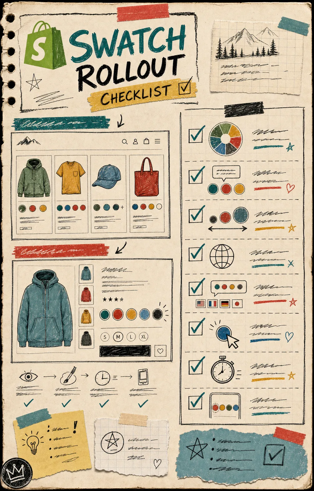
That is the whole game. If the first rollout works, you can extend the system calmly instead of rebuilding the logic every time a new product shows up.
My Short Version
If I had to boil the setup down to one note in the margin, it would be this: use variant swatches for choices inside a product, use linked-product swatches when the choice deserves its own page, and use collection-page swatches so people can browse faster.
That is also why I would keep How to Build a Cleaner Shopify Swatch System Without Theme Code open while I configure the store. It is the best reminder that the swatch layer should reduce friction, not create another maintenance habit.
If you want to try the setup, start with the Shopify App Store listing, then use the getting started video to walk through the first pass. If you prefer the product page first, the app site is supra-swatch-colors.sktch.io.
The useful next step is small: pick one collection, add one swatch group, and see whether the store becomes easier to browse before you touch the rest of the catalog.