
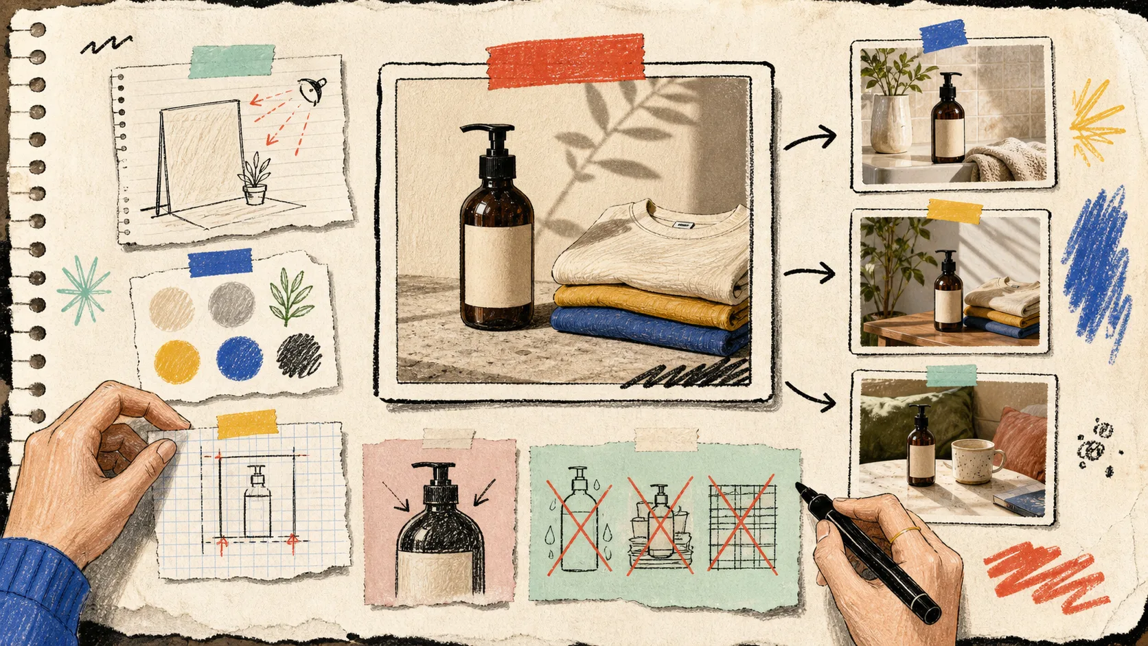
I kept seeing the same failure mode in product-photo work: the first AI lifestyle image looked exciting, the next five looked like they belonged to five different stores. The product was technically there, but the collection had no point of view.
That is why I now make one small photo direction card before I ask for a single generated scene. It takes about ten minutes, gives reviewers something concrete to react to, and stops the ‘make it nicer’ feedback loop before it starts. I use Supra AI Photo Studio for the actual edits—background work, enhancement, object placement, model try-ons, and short video formats—but the card comes first.
The Tiny Brief I Keep Beside the Product
A direction card is not a big brand deck. It is one page that says what must stay true and what can move. Mine has four boxes:
- Product truth: the SKU, the exact color, material cues, labels, proportions, and which angle is safest to start from.
- Scene rule: one environment family, one surface family, and one lighting feeling. ‘Warm morning kitchen counter’ is useful. ‘Lifestyle’ is not.
- Framing rule: hero crop, detail crop, and the amount of breathing room around the object.
- Reject rule: the mistakes I will reject immediately—wrong logo, invented parts, stretched proportions, a background that fights the product, or a crop that hides the selling detail.
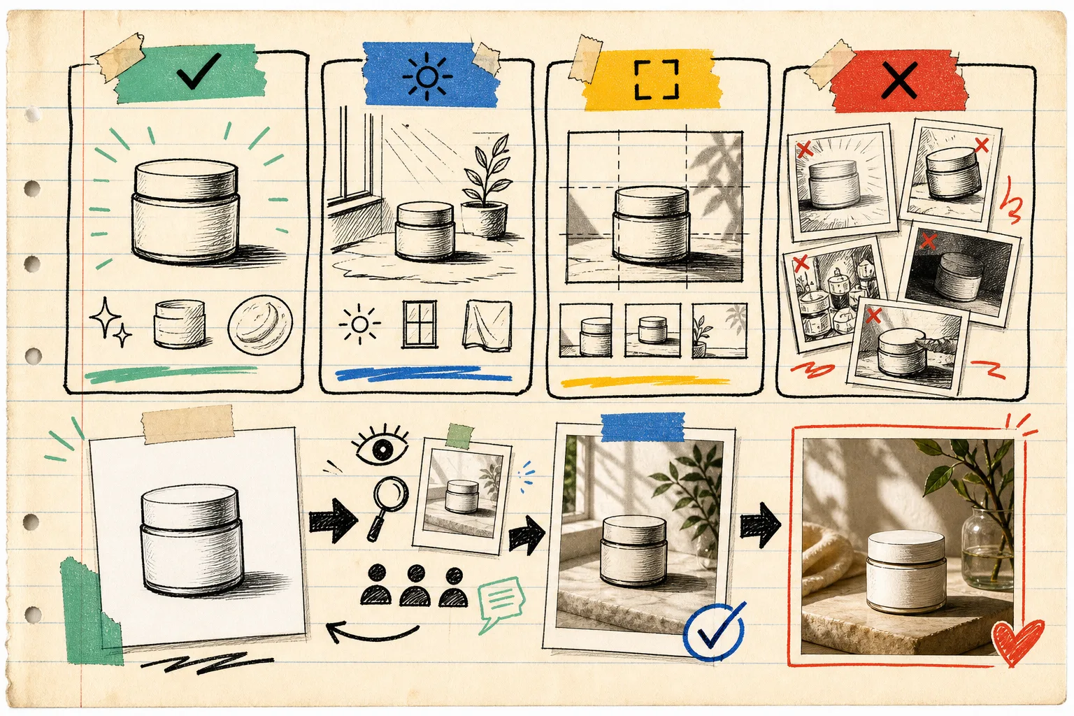
This is the part I wish I had written down when I was building a publish-safe Shopify photo decision system. A decision system tells me where an image will go. The direction card tells me what the image needs to look like once it gets there.
Start With a Boringly Accurate Source Image
The fun scene comes second. First I pick the cleanest source image: sharp enough to inspect, product fully visible, and not already carrying a confusing backdrop. In Supra AI Photo Studio, I would use the isolate/background tools before object placement when a source has visual clutter. The product needs to be legible to me before it needs to be cinematic.
For apparel, the same rule applies before a virtual try-on: write down the garment color, neckline, sleeve length, print placement, and fit clues. For a candle or a mug, I note the label face, handle direction, and scale anchor. These are not fussy details; they are the guardrails that make a generated scene reviewable.
I also keep this simple preflight from my earlier post on staging Shopify product photos before publishing: use a clean source, decide the destination, and inspect the result at the size a shopper will actually see.
Make Three Scenes, Not Ten Random Ones
Once the card is set, I make a deliberately small contact sheet. For a product that needs lifestyle coverage, I choose three jobs:
- a calm product-page scene that explains material and scale;
- an ad scene with a little more motion or contrast;
- a social scene that earns attention without changing the product’s personality.
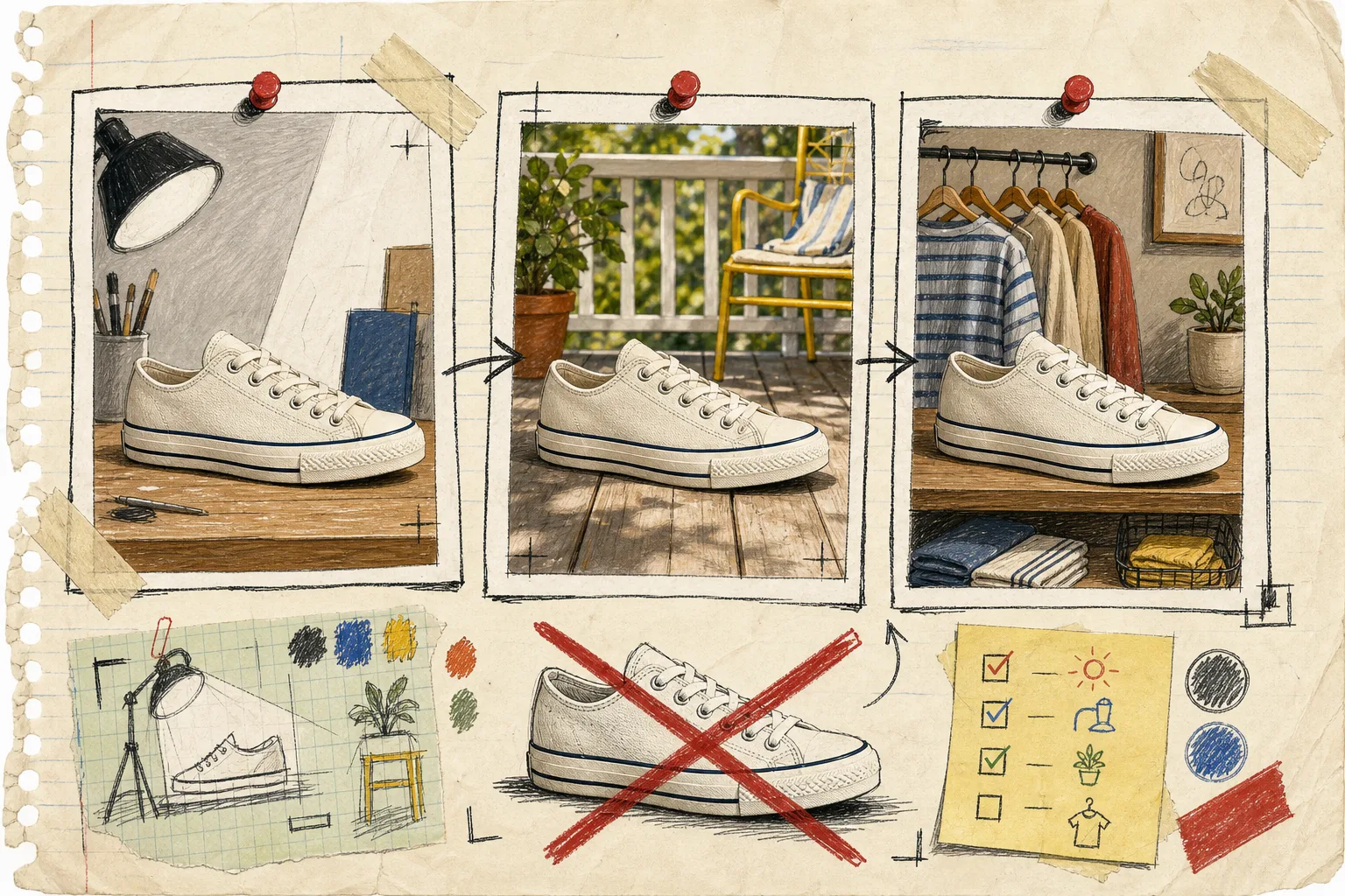
The key is that all three inherit the same rules. If the direction card says muted oak, soft side-light, close crop, and visible label, every prompt carries those constraints. I do not chase variety by abandoning the brief. I change the setting, camera angle, or use case while preserving product truth.
That division also makes later content easier. A product-page still can become the input for b-roll, while a social scene can inform a UGC concept. I use the same ‘one product, different jobs’ mindset I described when I mapped one Shopify product into three UGC video jobs. Different outputs are useful; disconnected outputs are expensive.
Review With a Short, Mean Checklist
I review at thumbnail size first. If the product does not read there, the scene is spending attention in the wrong place. Then I zoom in and ask four questions:
- Is the product shape, color, label, and key detail still believable?
- Does the background support the product’s price point and category?
- Does the crop serve the job named on the direction card?
- Could another teammate tell me why this image passed?
If I cannot answer that last one, I do not publish it. I send it back with a specific correction: ‘keep the label centered’, ‘remove the competing prop’, or ‘use a wider hero crop’. That is much more useful than ‘try again’. It also follows the QA habit from my Shopify product photo QA pipeline: separate visual appeal from publish readiness.
The Direction Card Is the Scale Trick
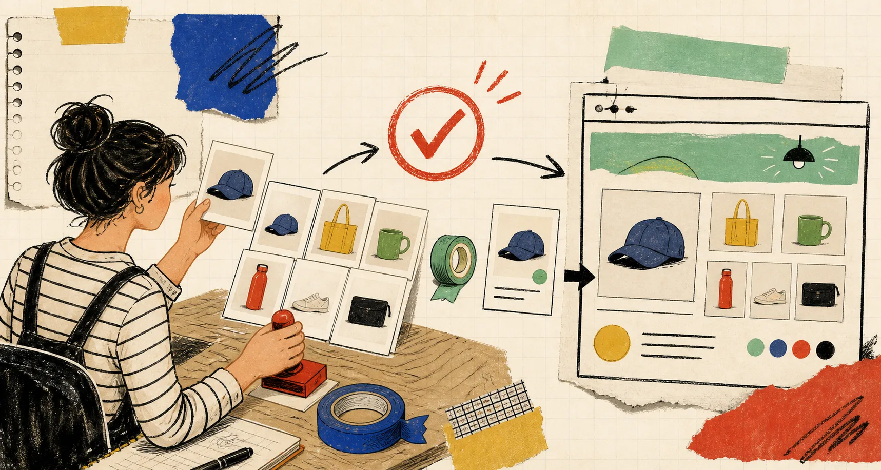
The card is small enough to repeat for each collection, but concrete enough that a freelancer, a teammate, or future-me can use it without reopening a vague creative debate. It keeps image generation tied to the actual store instead of to the novelty of whatever scene arrives next.
If your product photos have started to look like a mood board rather than a collection, make one direction card for your next five SKUs. Then open Supra AI Photo Studio, start from the cleanest image, and create three scene jobs that all obey it. Your next review will be faster—and your storefront will finally look like one place.