
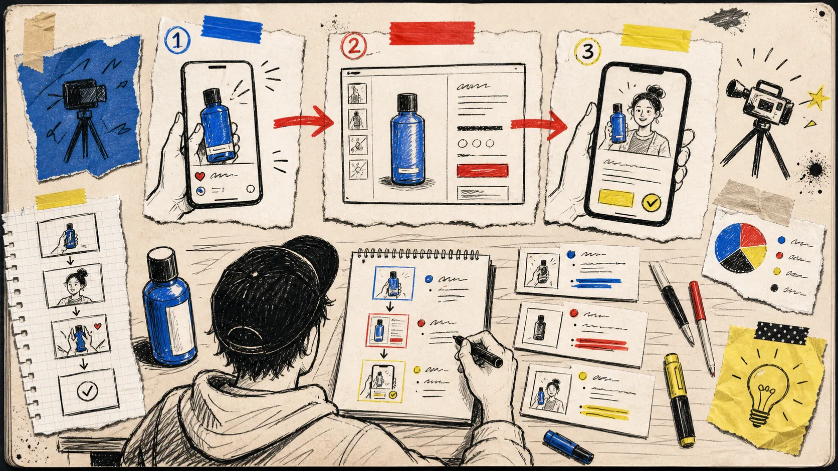
I keep seeing the same ecommerce video problem in different disguises: a team finally has a product video tool, then tries to make one heroic clip do every job. It has to stop a scroll, explain the product page, close a sale, and answer the question a customer asks after delivery. That is how a useful asset turns into a vague one.
My fix lately has been a tiny planning exercise: map one product into three video jobs before I generate anything. I use Supra UGC Maker for the production part because I can set an avatar, scene, product reference, script, voice, and tone, then keep the project around for variations. The useful bit is not the button-clicking. It is deciding what the next clip needs to earn.
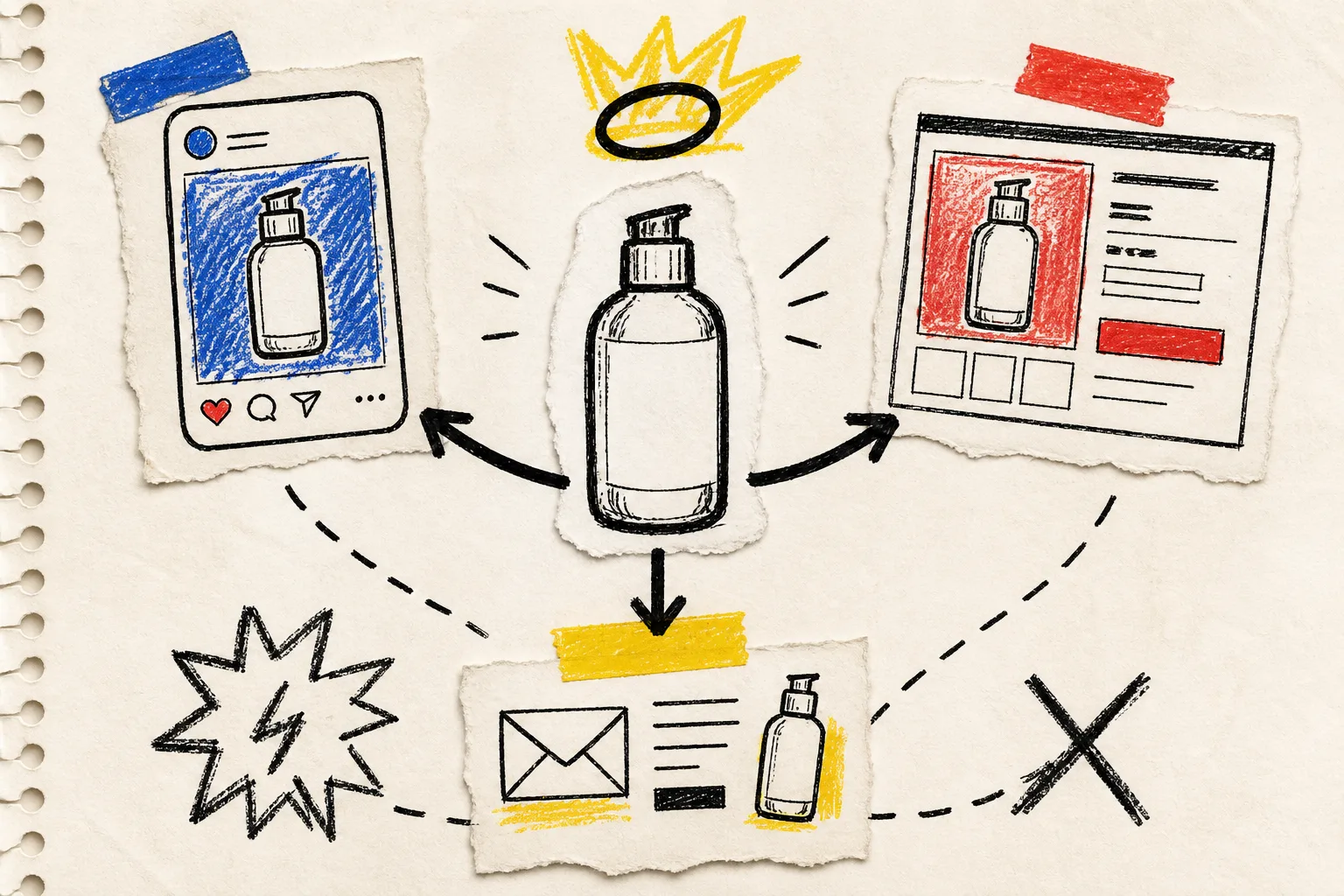
The three jobs on my messy page
For a launch, I draw three boxes. Not channels. Jobs.
- Earn the next two seconds in an ad. This clip is allowed to be narrow. It opens on a recognizable frustration, a surprising use, or a result. I do not make it explain every ingredient, spec, or variant. Its job is to make the right shopper curious enough to visit.
- Remove one buying question on the product page. This is the calmer sibling. Show scale, texture, setup, routine, or the one detail photos keep failing to communicate. If someone is already comparing options, a loud opening hook is less valuable than a clean demonstration.
- Make the first day after purchase easier. This can be a setup tip, a care reminder, or the first-use routine. It is not glamorous, but it can reduce the little moment of uncertainty that turns into a support ticket or a return.
That division has stopped me from making a generic “brand video” and hoping it travels. It also gives me a sane way to decide what to make first: start with the customer question closest to money or friction. For a deeper launch-first version of this decision, I keep this AI-avatar launch workflow nearby.
I write one spine, then change the pressure
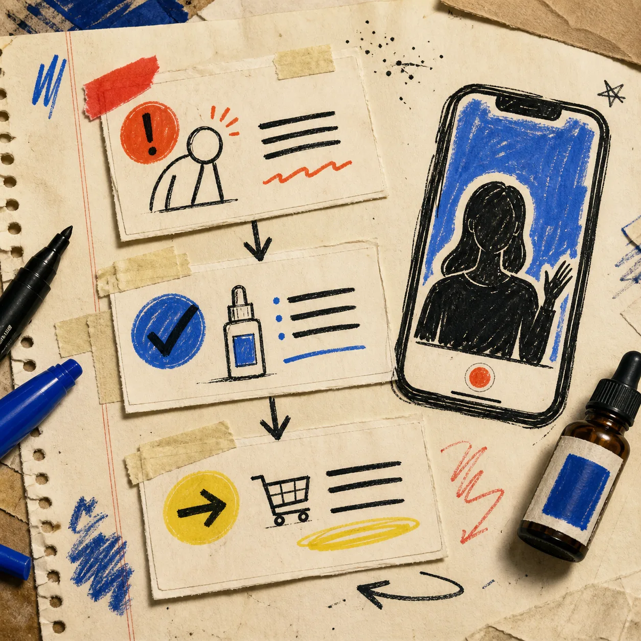
The script does not need a fresh blank page for each placement. Mine starts as three movable cards:
- Problem: what gets annoying, unclear, slow, or disappointing?
- Proof: what can the product visibly do or what detail can I safely show?
- Next step: tap through, inspect the page, or try the first-use routine.
For an ad, the problem card goes first and gets sharper. For the product page, proof goes first: show the thing in use before the narration catches up. For post-purchase, I swap the problem card for a reassurance card: “here is the easiest first step.” Same product reference, different promise.
This is where reusable scenes pay rent. In Supra UGC Maker I can keep a project, update the script or voice/tone, reorder or regenerate clips, and make a new variation without rebuilding the whole setup. I am careful with the phrase “UGC-style” here: an AI avatar is a fast creative-testing and explainer tool, not a substitute for a real creator’s lived experience or a genuine testimonial. If trust depends on a person’s actual use, I still want a real person.
My first-pass build is intentionally small
I pick one avatar, one scene that does not fight the product, and one product reference. Then I make the first three short segments. I am not trying to fill a monthly content calendar in one sitting. I am trying to find a version that makes sense without sound, with sound, and in the place it will actually live.
A concrete example: for a skincare bottle, I might make an ad about the rushed-morning problem, a product-page clip about pump texture and routine order, and an email or post-purchase clip about where it fits on day one. The product is identical. The viewer’s context is not.
If I need more test ideas after that, I borrow the discipline from my four-angle UGC test matrix: change one angle at a time. Hook, scene, voice, or call to action—not all four together. That makes a weak result readable instead of mysterious.
The two-minute QA pass I refuse to skip
Before downloading anything, I run this very unglamorous check:
- Can a silent viewer tell what the product is and why it matters?
- Does the visual match the actual product, variant, and use case?
- Is the script making a claim I can support on the product page?
- Is the next action right for this placement?
- Would this still make sense if it were the only clip a shopper saw?
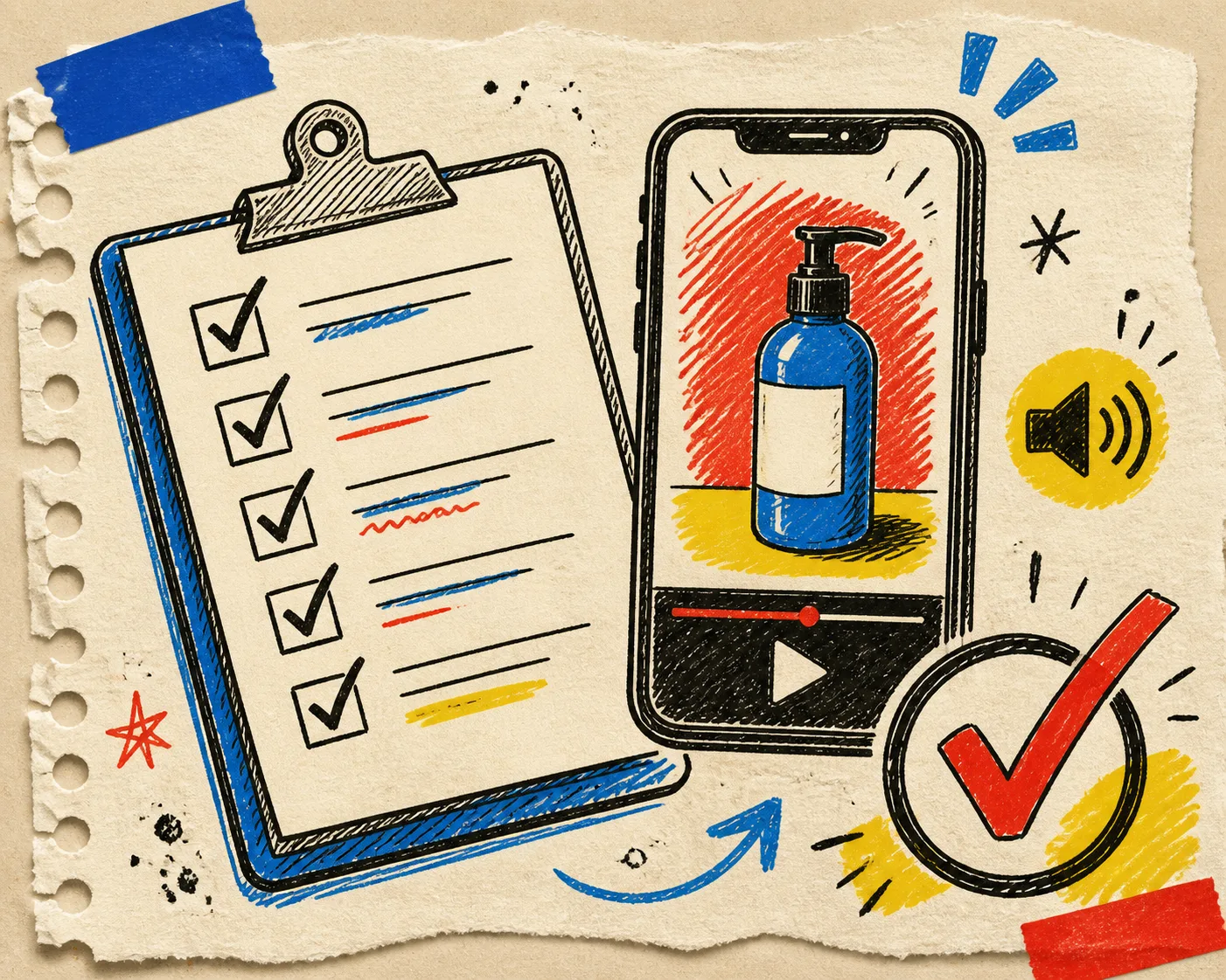
That last question catches the most trouble. A good ad snippet can be too cryptic for a product page. A careful product demo can be too slow for an ad. I would rather make three modestly specific clips than spend a day sanding one all-purpose video into mush.
Where I would put the next hour
If you already have a product image and a clear customer question, make the product-page version first. It forces specificity: the product, the concern, the proof, and the next action all have to line up. Then turn that same spine into a sharper paid-social opener and a gentler post-purchase helper.
That sequence has made my video work feel far less theatrical and far more operational. It also fits neatly with a repeatable Shopify UGC workflow and the idea of giving one product a week of focused UGC tests, rather than making one clip carry the whole launch.
My next action would be brutally small: open Supra UGC Maker on Shopify, choose one product, and write the three jobs on paper before choosing an avatar or scene. Build only the first job today. You will have a better next variation tomorrow because you know exactly what the first one was supposed to do.