
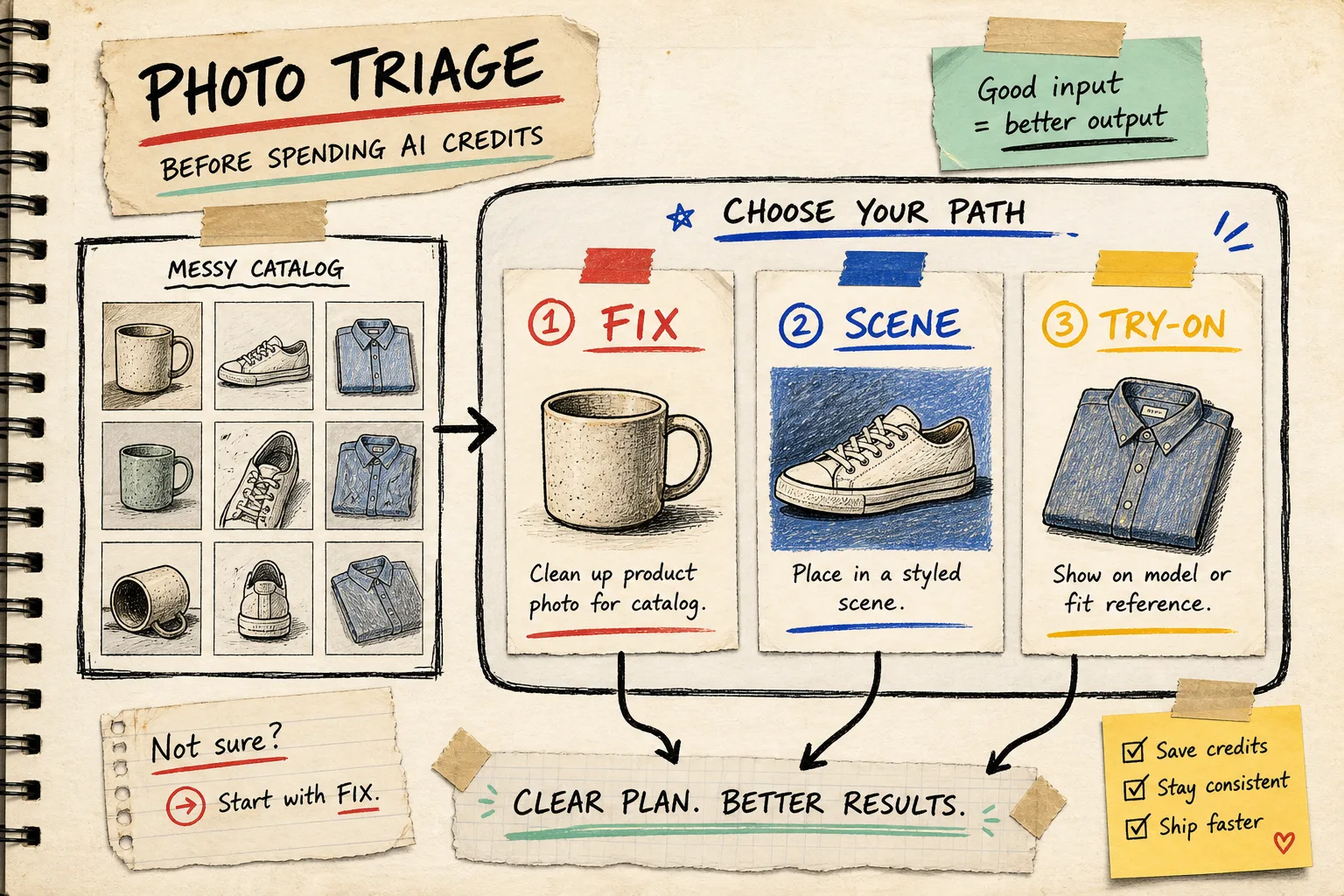
Most catalog-photo problems do not need a bigger prompt. They need a smaller decision.
That was the note I wrote after watching the same three product images get sent through background removal, a lifestyle scene, a try-on, then another lifestyle scene—mostly because nobody had decided what the picture was supposed to do. The result was a busy image gallery and fewer useful options.
I now make a tiny triage board before I spend another AI generation credit. The goal is not to make every image dramatic. It is to give each source photo one job: clean listing image, lifestyle context, on-model proof, or short motion asset. Supra AI Photo Studio is useful here because the same Shopify workflow can handle clean-up, object placement, try-ons, and AI video instead of making the team bounce among tools.
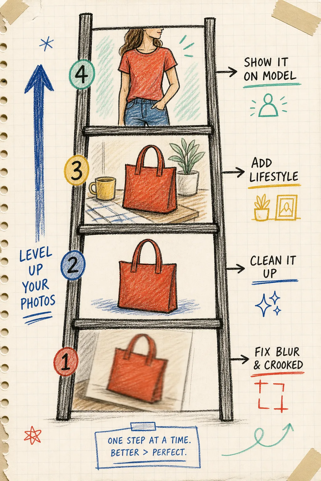
The board has four routes, not twenty
I start with the original photo, not the campaign idea. Then I ask four blunt questions.
1. Is the product itself hard to inspect?
If the product is soft, dark, cropped strangely, or fighting a messy background, it is a listing-image problem. Fix clarity first: isolate the product, correct lighting, sharpen only when the source supports it, and check that the full item still fits the frame. A lifestyle backdrop cannot rescue an unclear product.
This is the same principle behind my photo QA pipeline: validate the source before multiplying it. If the original cannot tell a shopper what they are buying, send it back to the clean-up lane.
2. Does the shopper need scale or use context?
A candle, bag, mug, lamp, or home object often needs a scene problem solved. The photo should show where it lives, how large it feels, or what moment it belongs in. That is when object placement earns its keep. Choose one environment that answers a product-page question—desk, shelf, kitchen, entryway—not a mood board of unrelated backdrops.
Before I generate, I write a direction card: product, surface, environment, camera angle, lighting, and what must remain unchanged. My earlier photo direction card is still the quickest way I know to prevent the background from becoming the whole story.
3. Does fit or wearability decide the sale?
For apparel, jewelry, and accessories, route the image to try-on when a flat lay leaves a real question unanswered: length, proportion, layering, or how the item sits on a person. Supra AI Photo Studio supports model try-ons and lets you choose or create models, but I treat it as evidence, not decoration.
Pick the garment view that already shows the important construction. Then compare the generated result with the original: logos, seams, print placement, closures, and silhouette deserve a literal eyeball check. If the item stops looking like the thing in the listing, do not publish it.
My one-credit test rule
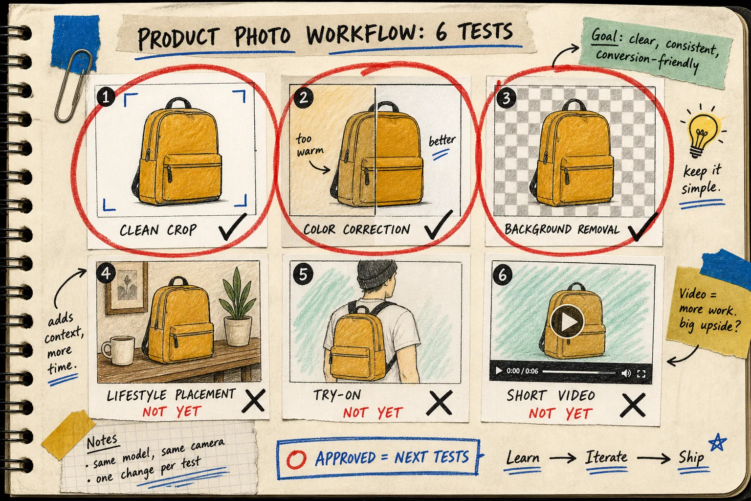
Once a photo has a route, I make one deliberately narrow test before creating a set. I do not ask for three environments, two models, and a video on the first pass. I ask for one outcome that would justify more work.
My notebook line looks like this:
text\nsource: black ceramic mug, front three-quarter view\nroute: lifestyle context\none test: morning desk, warm window light, walnut surface\npass condition: mug shape, handle, and matte finish stay recognizable\nnext step: generate two supporting angles only if this passes\n
That is cheap operationally and easy to review. It also makes a useful decision trail when someone asks why the product page has three images instead of twelve. For more structure, I use the same review-first instinct from staging product photos before publishing: decide what is safe to ship before the gallery quietly grows.
What gets approved
I mark an image ready only when it passes all five checks:
- The product is recognizable without zooming.
- The new scene explains a shopper question instead of merely looking expensive.
- The crop still works where it will appear: product page, collection, or ad.
- The edit does not invent a material, detail, or use case.
- It has a named job in the image gallery.
That last point sounds fussy, but it stops a pile of near-duplicates from becoming the catalog. If the image cannot be labeled “clean main image,” “scale scene,” “try-on proof,” or “ad experiment,” it probably does not need to be generated yet. The decision-system approach makes this a lot calmer during launch week.
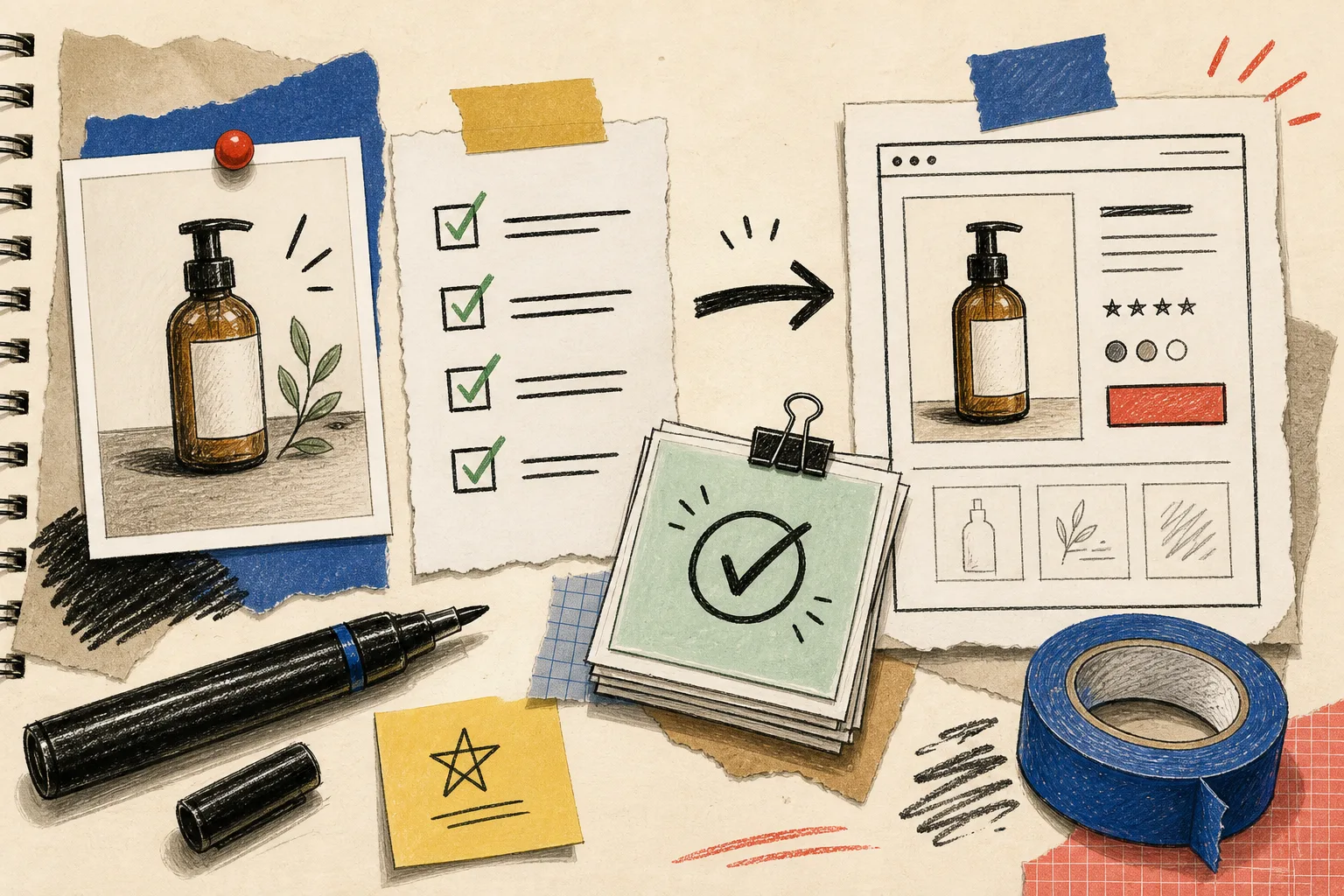
Turn the board into a weekly habit
The useful part of this board is that it works before a photo is touched. Drop five candidate products into a weekly review, give each one a single route, and reserve your generation quota for the clearest opportunities. Supra’s free plan is enough to test the workflow with a few AI image generations, and its paid plans expand the volume when the process is earning its place. The app’s overview is a good place to see the available image and video options.
My next action is always small: choose one underperforming product, write its route in a sentence, and create one reviewable test. Start there today. If the test answers a shopper question while keeping the product true, you have a system worth repeating—not just another image to sort later.