
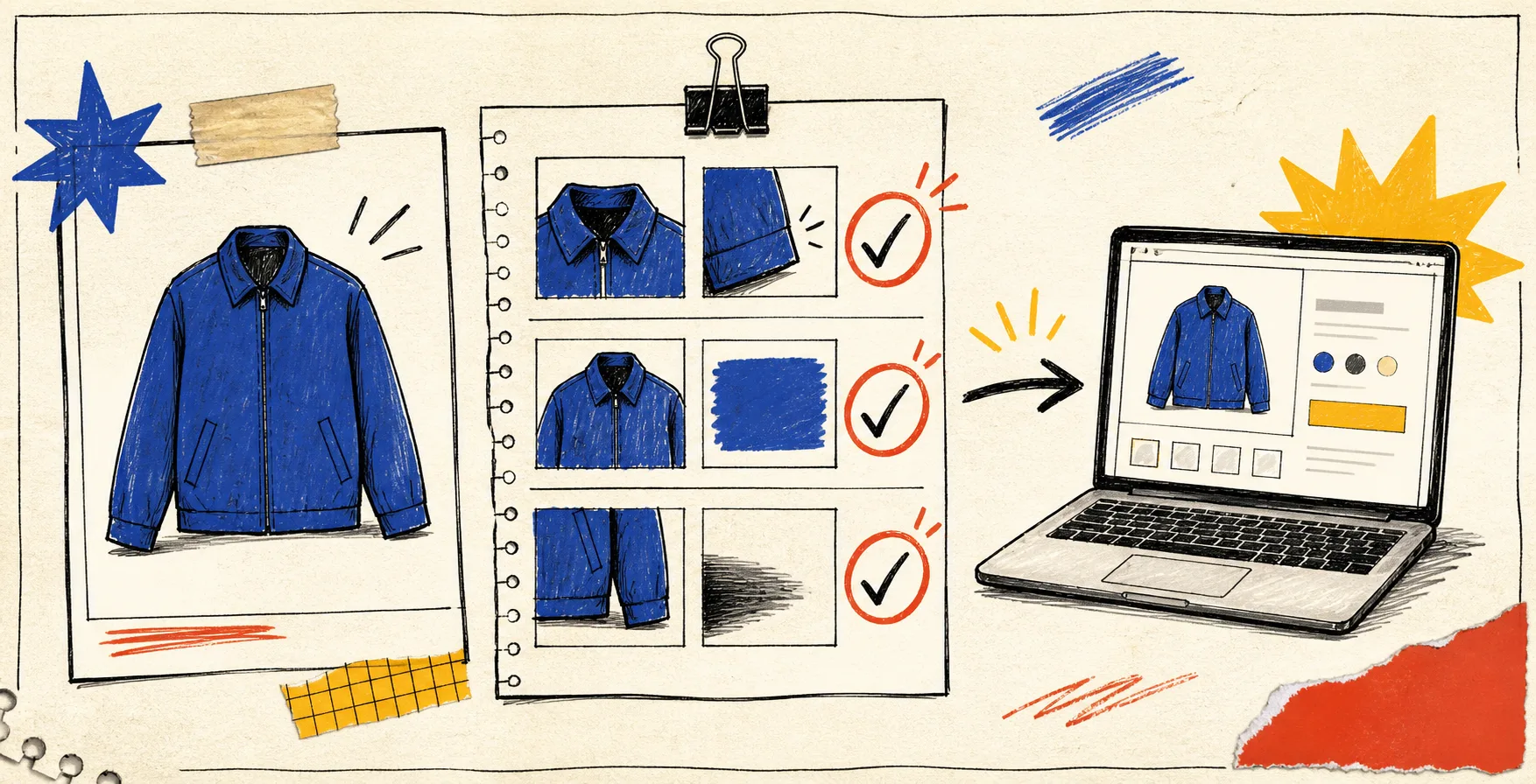
I used to look at a newly generated product image, think ‘that’s much better,’ and hit publish. The uncomfortable part was noticing that ‘better’ was not a test. A slightly soft hem, a color shift, or a shadow that floats can turn a useful enhancement into a small trust leak on a product page.
So I now do a three-pass check before an AI-assisted image is allowed into the catalog. It takes a few minutes, gives feedback a common language, and prevents the most expensive kind of cleanup: replacing images after ads, email, and product pages have all picked them up. I use Supra AI Photo Studio for the edits, but the routine is deliberately tool-agnostic.
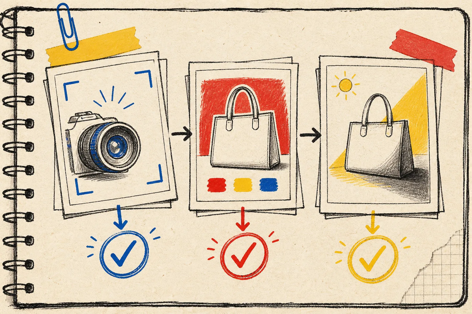
The tiny rule: assess the product before the picture
A lifestyle scene can be beautiful and still be wrong for the item you sell. Start with the source shot and name the non-negotiables: silhouette, material, finish, color, hardware, and any defining pattern. That is the reference, not the generated scene.
I keep the original and the candidate image side by side. If I cannot describe the product accurately from the candidate without glancing back, it is not ready. This is especially useful for apparel, reflective objects, and products whose color is doing real purchase-decision work.
That mindset came out of the photo triage board I wrote about in I Built a Shopify Photo Triage Board Before Spending Another Credit. The point is not to generate endlessly. It is to identify which image needs what kind of help.
Pass 1: clean the source, then zoom in
Before asking for a try-on or a new environment, I isolate the product and check the plain version at the size a shopper will actually see. Supra AI Photo Studio can remove or replace backgrounds, improve sharpness and lighting, and upscale an image; I treat those as separate moves, not one magic button.
My pass-one checklist:
- Are the outer edges clean, especially around straps, seams, handles, or transparent parts?
- Is the texture still believable, rather than blurred into plastic?
- Did the product gain or lose any meaningful detail?
- Does the color still agree with the original under a neutral background?
If the answer to the last two is no, stop there. Better prompts will not rescue a weak source. I usually pick a cleaner original rather than asking an editor to invent missing detail. For a more formal release process, the decision system in How I Build a Publish-Safe Shopify Photo Decision System is a useful companion.
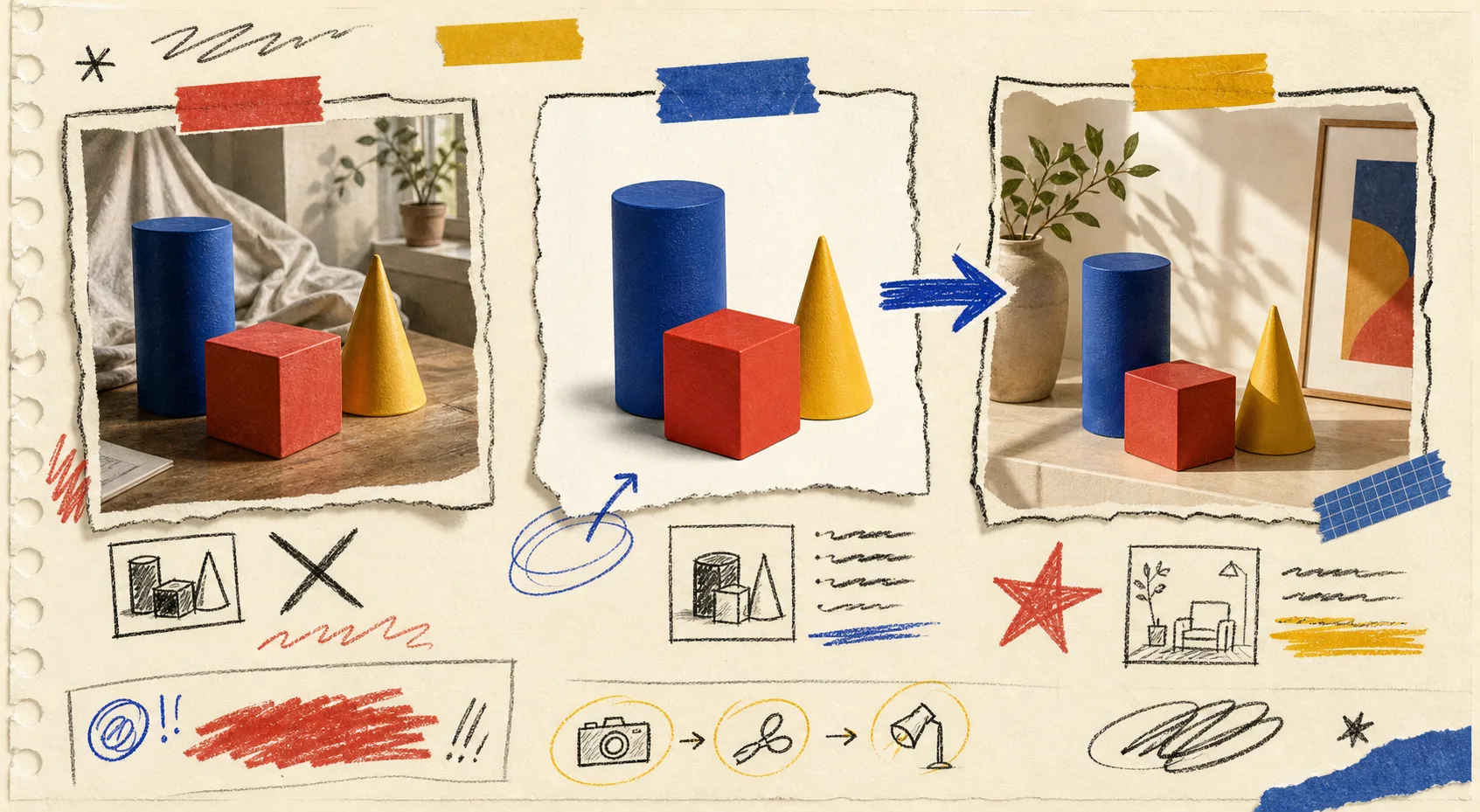
Pass 2: add context without changing the item
Once the plain product is sound, add the job-specific context. A kitchen scene, a model try-on, or a polished studio surface should answer a shopper’s question: where does this product belong, and how does it feel in use? It should not quietly redesign the product.
Write the request as if you were briefing a photographer: environment, surface, camera angle, lighting, and the one product truth that must hold. For example: ‘Place this ceramic mug on a matte oak breakfast table in soft window light; preserve its exact handle shape, blue glaze, and printed artwork.’
Then compare the output to your original for product drift. Look closely at labels, patterns, garment construction, and proportions. If there is any doubt, use the enhanced image as inspiration for another version instead of publishing it as catalog evidence. The same discipline makes a reusable one-photo shot list much more valuable: each photo has a job, so each edit has a boundary.
Pass 3: run a channel reality check
The last pass is where I leave the editor. Drop the candidate into the actual product-page layout, then glance at it on a phone. A photo that reads beautifully large can become muddy in a carousel. A very stylized scene can pull attention away from the buy decision.
I check three things:
- Clarity: Can I identify the product instantly at thumbnail size?
- Consistency: Does it look like it belongs beside the rest of the catalog?
- Credibility: Would a shopper feel misled if the item arrived exactly as the original source photo shows it?
Only when all three get a yes does the image move from an editing folder to the publish queue. That is also when I give a teammate a one-line review brief: ‘Check color, edges, and whether this scene tells the truth about the item.’ It is far easier to get useful feedback than asking whether a photo ‘looks good.’
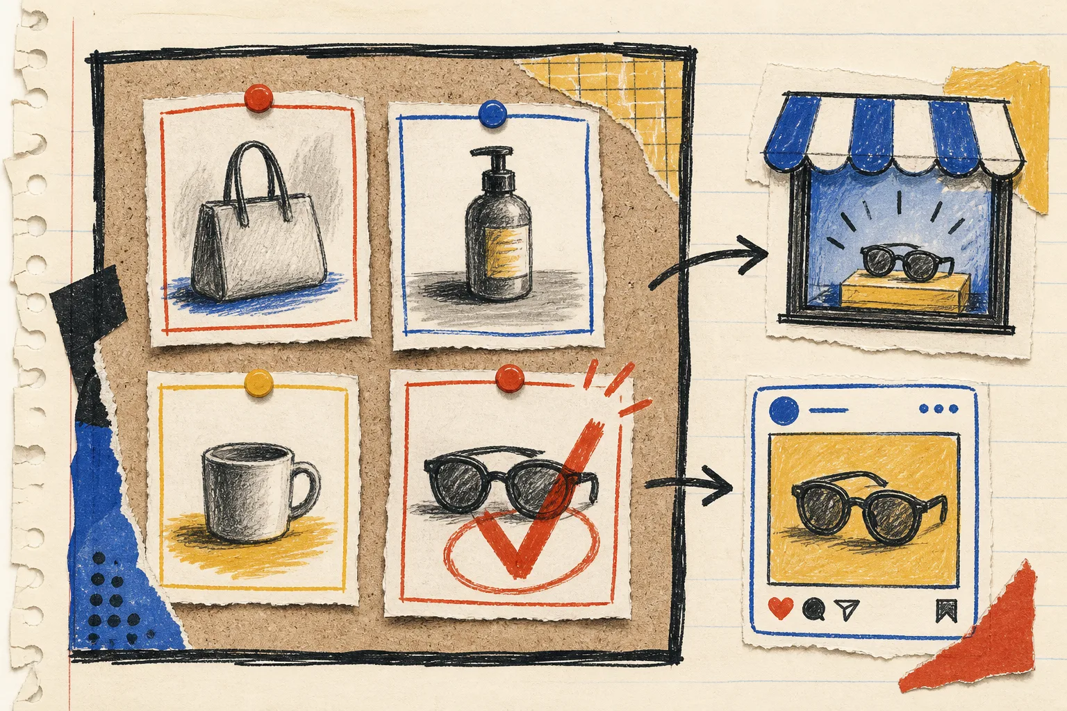
A small operating loop that stays useful
My working loop is simple: source → isolate → enhance → contextualize → compare → preview → approve. Save the winning image beside the source, plus the note about where it is safe to use. That note matters when the same product later needs a collection tile, an ad crop, or a social post.
If your catalog photos are inconsistent, do not attempt a store-wide makeover first. Pick five high-traffic products, run this check, and see where the friction actually is. You may find that background cleanup solves most of the problem, or that the real bottleneck is knowing which lifestyle scene supports the product instead of decorating it.
Try Supra AI Photo Studio on one product with a clear source image and use these three passes before you publish. The next action is wonderfully unglamorous: open your best-selling product page, compare its first image against the real item, and write down the first mismatch you see. That is your starting brief.