
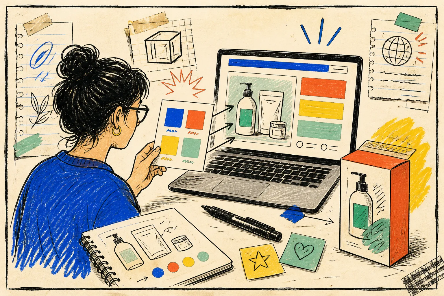
I used to treat campaign-page color as a last-mile styling job. The product image looked right, the promo banner looked right, and then—after the page was already wired—I would discover that the call-to-action was hard to read or the new accent shade had drifted from the product story.
That is exactly the kind of small mess that compounds during a launch. I now run a tiny color preflight before a Shopify campaign page leaves draft. It takes less time than reopening a theme file after feedback, and it gives the designer, operator, and developer one shared answer: these are the colors we picked, and this is the pairing we actually tested.
The whole kit lives in Tiny Online Tools: browser-based utilities with no account requirement. For this pass I use Image Color Picker, Color Contrast Checker, and, when the page uses a custom theme token, Tailwind Color Generator.
The preflight, drawn as a three-stop loop
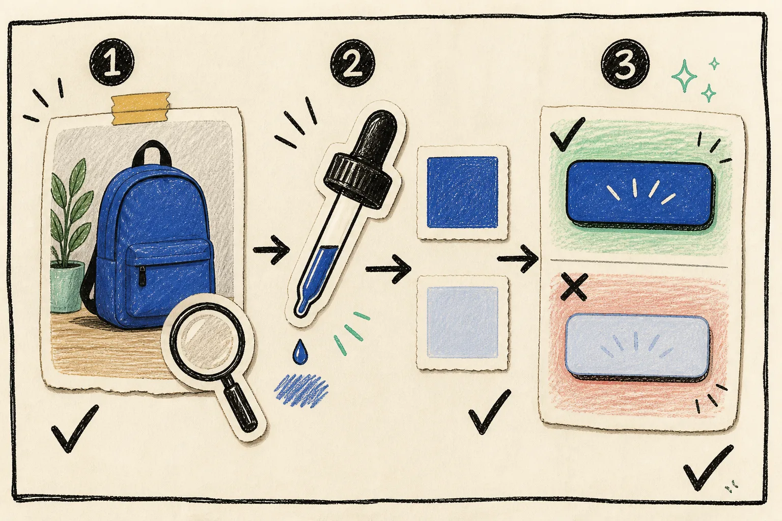
I do not start by inventing a palette in a blank color picker. I start with the actual thing customers will see: the launch product photo, packaging, or approved campaign art. Then I make the decisions in three short stops.
1. Pull a deliberate starting color
Open the approved product image in Image Color Picker. The tool can sample a pixel and show Hex, RGB, and HSL values, while keeping a history of recent selections. That is enough for the job: I sample the one color that deserves to lead the page—not every attractive shade in the photo.
For example, a bright label might supply an accent for an announcement bar, while the dark edge of the package becomes a more reliable text color. I take samples from a flat area, not a highlight, shadow, reflection, or anti-aliased edge. That prevents a beautiful but accidental color from becoming a production token.
This is the same discipline I use in my Shopify photo direction card: establish the reference first, then make each downstream choice traceable to it.
2. Test the pair where it will be used
A swatch that looks convincing beside a product photo is not automatically readable as a button, badge, price note, or small line of helper copy. I paste the foreground and background values into Color Contrast Checker. It reports the ratio and shows whether the pair passes WCAG 2.1 checks for normal and large text.
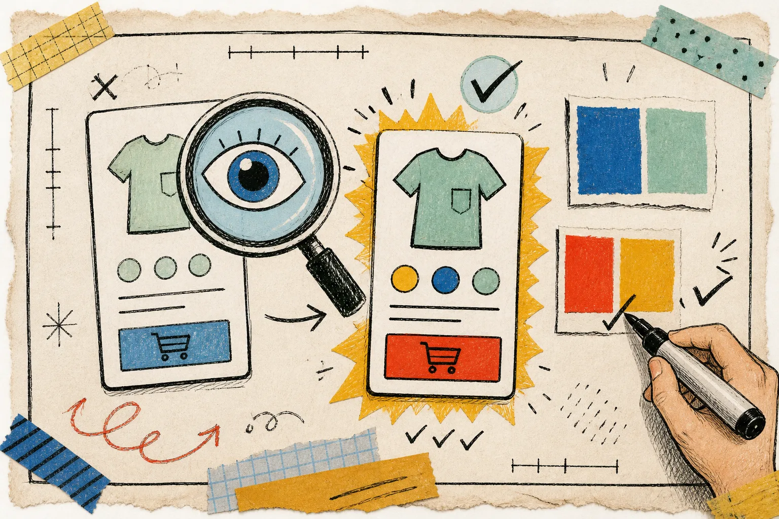
My working rule is simple: test the smallest customer-facing copy first. A hero heading can survive a softer pairing that a shipping note or add-to-cart label cannot. If a pair fails, I do not start over with the entire palette. I usually darken the foreground, lighten the background, or reserve the fun accent for decoration rather than essential information.
A passing ratio is the gate, not the finish line. I still look at the page in its real type size and against the real photo. Tiny Online Tools makes that ratio check quick; the storefront preview tells me whether the choice still feels calm and obvious.
3. Turn a one-off color into a usable implementation choice
If the team is using Tailwind or needs a documented color scale, I feed the chosen base color into Tailwind Color Generator. It produces a Tailwind-style scale and copyable config snippet, which is handy when the launch needs a darker text-safe sibling as well as the original campaign shade.
This step keeps a landing-page decision from becoming a mystery hex value pasted in three places. It also makes handoff cleaner when a campaign has to be refreshed later. The operator can point to one approved source color and a deliberately tested text/background pair.
My storefront color card
Before I ask anyone to publish, I leave a small note in the launch ticket:
- source asset: the exact product image or approved campaign visual
- selected color: the sampled Hex value and what it is for
- safe pair: the foreground/background values checked for the smallest text
- implementation: the theme token or Tailwind scale to use
- live check: a screenshot of the actual product page at normal viewport width
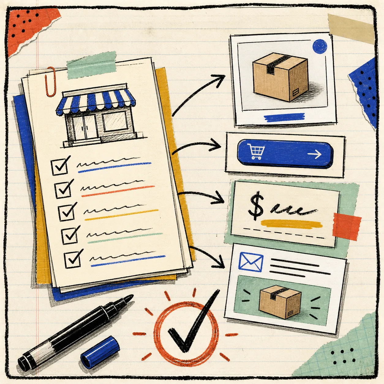
It is intentionally a small card. The goal is not to build a giant design system during every launch; it is to prevent the familiar Friday-afternoon loop where the page is technically finished but nobody can say whether the promotional button is readable.
This card fits neatly beside the checks I already use for product photo QA before launch, a publish-safe photo decision system, and the background-replacement review. Those systems ask whether an image belongs on the page; this one asks whether the colors around it help customers use the page once it is there.
A quick note on what I do not automate
I will happily automate color extraction, ratios, and token generation. I do not automate the final call. The product, the campaign moment, the surrounding copy, and the page hierarchy still need a human look. A color can meet a threshold and still be wrong for the role it is playing.
But that human review gets better when the basics are already visible. Instead of debating whether a pale button “feels okay,” the team can decide whether it deserves to be a decorative detail or a customer action.
For your next campaign, start with one approved product image, sample one intentional color in Tiny Online Tools, and test the smallest text pair before you touch the publish button. It is a tiny habit, but it makes the launch board much calmer.