
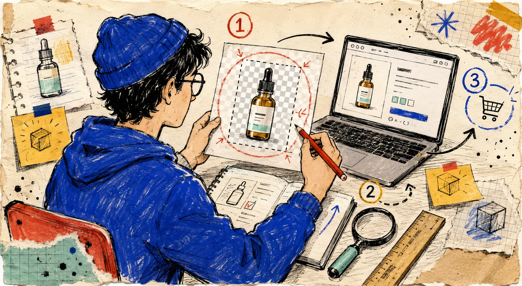
I thought a product image was done once the background was gone. Then I opened a collection page and found a row of products that looked like they had politely backed away from the customer. The files were transparent PNGs. The cutouts were fine. But each one carried a different amount of invisible canvas, so Shopify rendered one product huge, another tiny, and a third oddly off-centre.
That is the sort of small defect that is hard to spot in a folder and very easy to spot in a storefront. I now run a short transparent-PNG preflight before upload. It is deliberately boring: check the canvas, check the edge, then add space back only when I mean to. I use Tiny Online Tools for it because the image utilities run in the browser with no account, no upload, and no tracking.
The rule: crop for the product card, not the artboard
A transparent image has two different shapes: the visible product and the invisible canvas around it. Shopify mostly has to work with the latter. If two 2000-by-2000 PNGs contain very different amounts of empty transparency, their visible products will not occupy the same visual space on a collection card.
That does not mean every file needs the tightest possible crop. A tall bottle may need more breathing room than a low sneaker. The useful rule is: make the canvas intentional and make comparable products comparable. This is the same operator mindset behind my color preflight for campaign pages: decide the visible system before the storefront decides it for you.
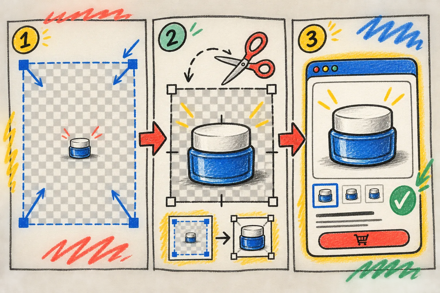
My three-stop transparent PNG preflight
1. Trim accidental empty canvas
First I open Auto Crop Transparent Pixels. It finds the non-transparent bounding box and trims the surrounding transparent border. There is an alpha-threshold control and an optional padding setting, so I can get a clean baseline without chopping too close to a soft edge.
This is a diagnostic step as much as a production step. If a cutout becomes dramatically smaller after trimming, that tells me the original export was carrying accidental emptiness. I do not upload that old export simply because its filename looks right.
For a collection of related items, I keep the trimmed versions side by side and ask one practical question: would these look like they belong to the same shelf? If not, I standardize the next step instead of trying to fix the discrepancy inside Shopify. That handoff habit builds on the three-step image handoff I use before uploads.
2. Look at the alpha, not just the white page
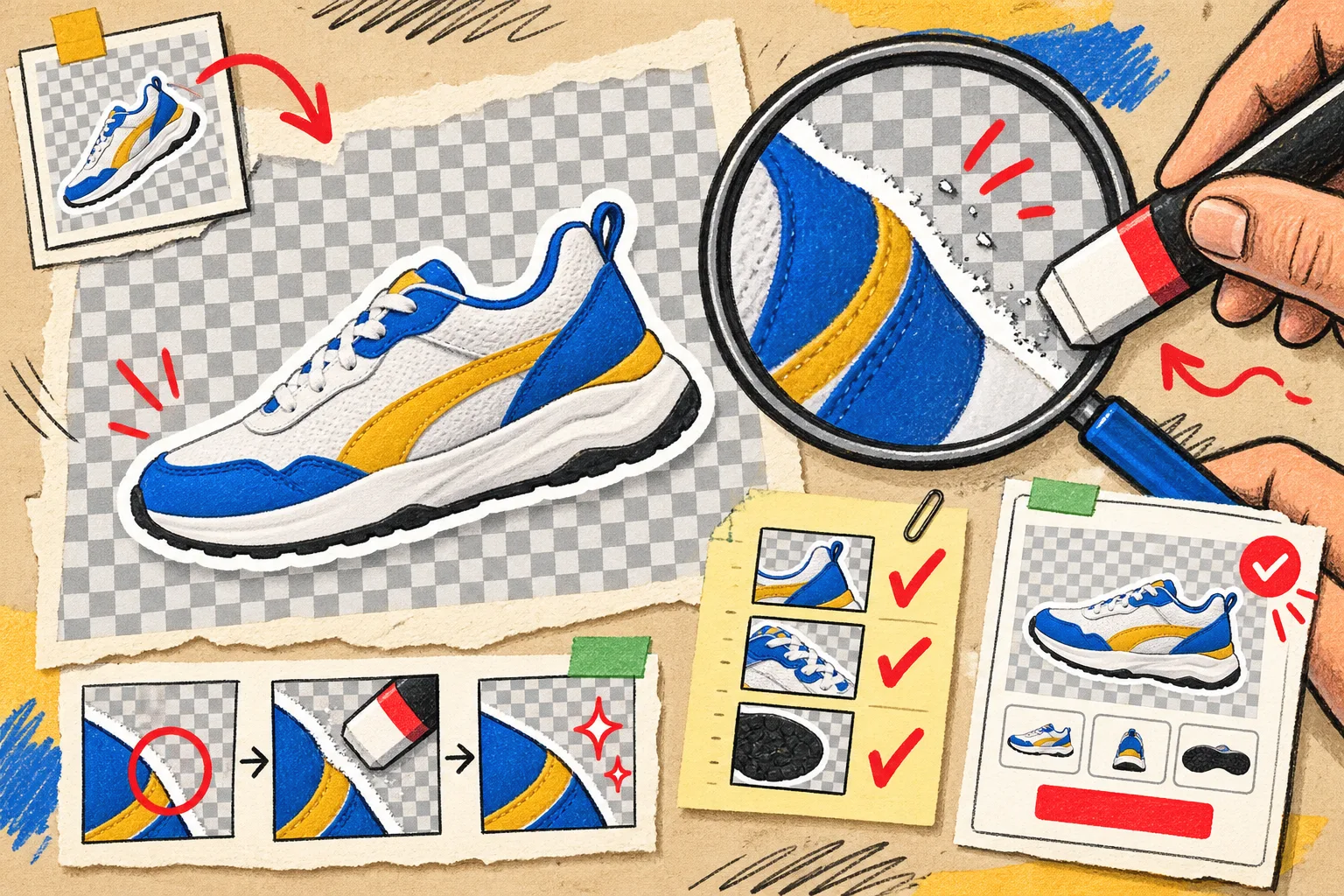
A cutout can look acceptable against a white editor background and still carry a pale fringe, speckled edge, or semi-transparent shadow. Those defects tend to become louder when a theme swaps a card background, a customer uses dark mode, or an image gets layered in a campaign.
I use Image Alpha Viewer to inspect the transparency channel as a grayscale mask. White represents opaque pixels, black represents full transparency, and gray reveals partial transparency. It also reports transparent-pixel counts, which makes it a useful pause before a batch upload.
If I can see noisy near-transparent pixels around an object, I send the file through PNG Transparency Cleaner. Its low and high thresholds turn the almost-invisible noise into either true transparency or true opacity while retaining the middle range for anti-aliased edges. I start gently; a hard threshold can make a soft fabric edge look cut out with scissors.
3. Add back deliberate breathing room
After auto-cropping, some products will look too aggressive when the theme fits them into a fixed card. That is not a reason to keep random original margins. It is a reason to add consistent margins back on purpose.
Canvas Size Extender adds independent top, right, bottom, and left padding without scaling the source image. It can use a solid or transparent fill and outputs PNG. For a product family, I use it to create the same visual gutter around each finished cutout, then review the group at the actual rough size of a collection card.
This distinction matters: auto-crop removes accidental space; canvas extension adds intentional space. Those are opposite operations, and using both is why the process stays repeatable. Once the crop is right, I can move on to file-size choices such as the PNG-to-AVIF storefront workflow without confusing size optimization with composition.
A five-minute release check
Before I upload, I put four tiny checks in my notebook:
- The product fills a comparable share of its canvas as adjacent products.
- The object is not clipped, but empty transparency is not doing layout work by accident.
- The alpha edge looks clean against both light and dark backgrounds.
- Any padding was added deliberately and consistently for the product family.

The point is not to turn asset prep into a design review committee. It is to remove a predictable source of collection-page wobble before it becomes a theme ticket. If I have a batch of cutouts, I bookmark the exact Tiny Online Tools pages and run the same sequence in a few minutes instead of opening a heavyweight editor for every one-off correction. For the broader small-tool stack, the browser tools I use before publishing Shopify images are a useful companion.
Start with one product family today: crop a representative PNG tightly, inspect its alpha, add intentional canvas if it needs it, then compare it with the live collection card. That single before-and-after will tell you whether your invisible pixels have been quietly deciding your merchandising.