
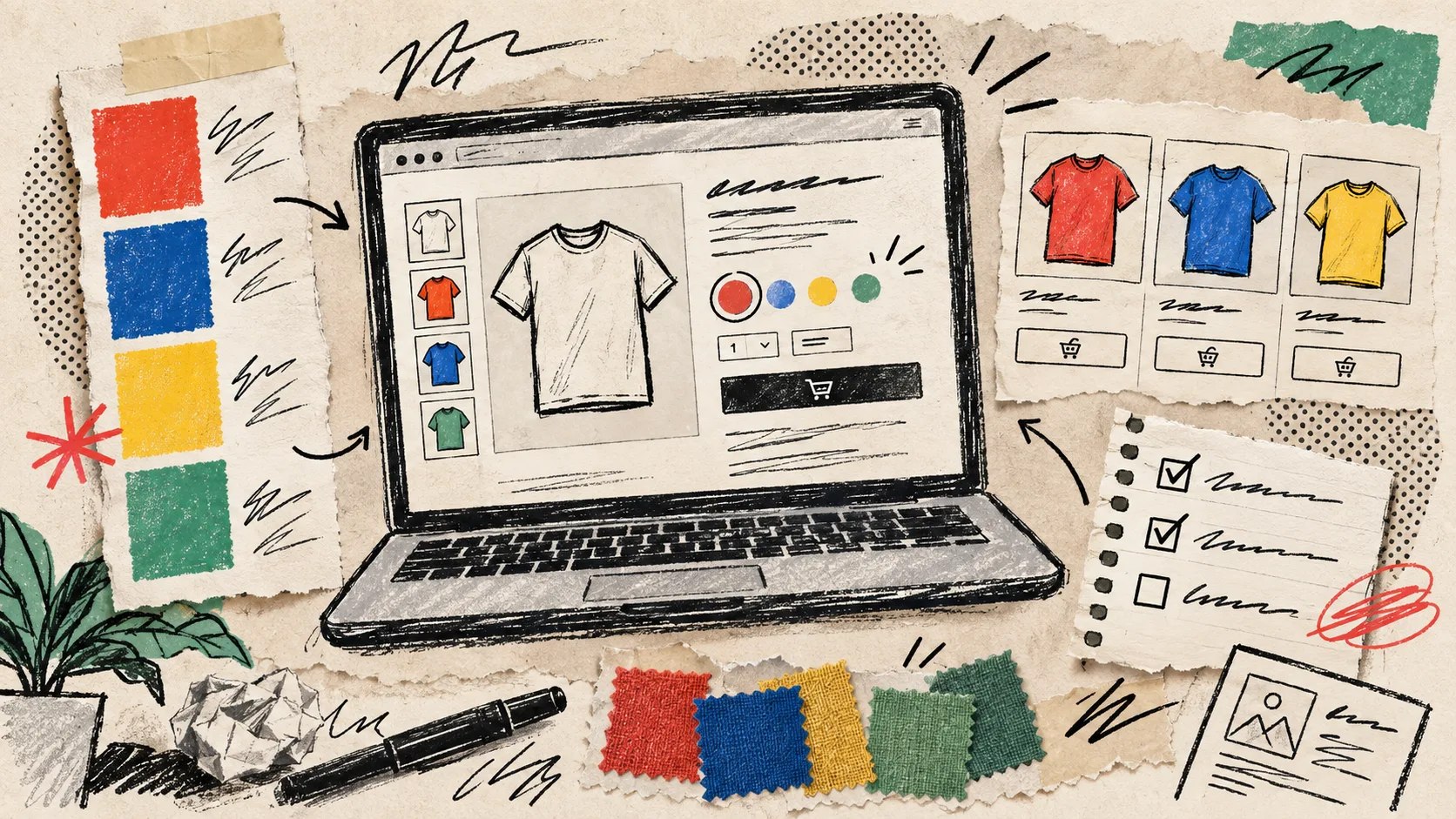
I kept treating swatches as a tiny visual polish task until the next seasonal color drop arrived. Then I had three names for nearly the same green, two products that should have been siblings, and collection cards that hid the useful choice until the shopper clicked through. That is not a design problem. It is a product-system problem.
My fix is a small swatch system that decides what each color means before it reaches the theme. I use Supra Swatch Colors on Shopify because it can turn existing variant options into swatches, link separate products, and show those choices on collection pages without theme-code surgery. The system below is the bit that makes the app stay useful after launch.
First, separate a color choice from a product choice
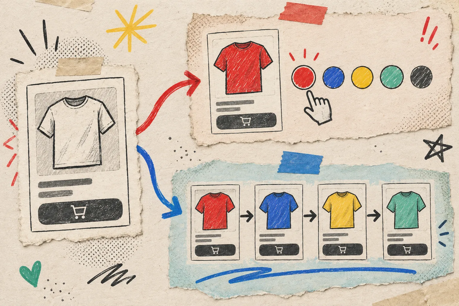
Before making a single round dot, I ask one awkward question: does selecting this color keep the shopper on the same product, or move them to another product page?
Use a variant swatch when the item, information, fit, and selling story stay the same. A tee in navy and ochre is still one tee. The swatch should change the variant.
Use a linked-product swatch when the colorway needs its own page: different photography, different materials, a distinct title, or a different merchandising story. This is especially common when a product family has seasonal drops that deserve their own inventory and content. Supra supports both paths, so I do not have to force the catalog into one workaround.
That distinction is the guardrail. If I cannot explain the choice in one sentence, I stop and clean up the catalog relationship before styling anything. It is the same principle I use when structuring product specs without editing every description: settle the underlying system first.
Make a tiny color dictionary
My notebook rule is simple: one customer-facing name, one internal key, one visual treatment. For example, ocean-blue stays Ocean Blue everywhere it appears: product title, variant option, collection filter, alt text, and campaign spreadsheet. I do not let “blue,” “navy,” and “midnight” drift into three names unless they genuinely describe three sellable choices.
For each new color, I record four things:
- the customer-facing label;
- whether it uses a hex-like color treatment or a product image;
- whether it is a variant or a linked product;
- the product families where it may appear.
This sounds fussy until the fifth color drop. Then it is the only reason your filters, collection cards, and product pages keep agreeing with one another. Supra Swatch Colors can auto-detect store colors or use product images, and it has style controls for size, shape, label, and tooltip. I set those defaults once, then only create exceptions when the product needs one.
Test the collection page before celebrating the product page
The product page is where I build the relationship. The collection page is where I find out whether shoppers can actually use it. A good swatch system should let someone scanning a grid understand that options exist before making an extra click.
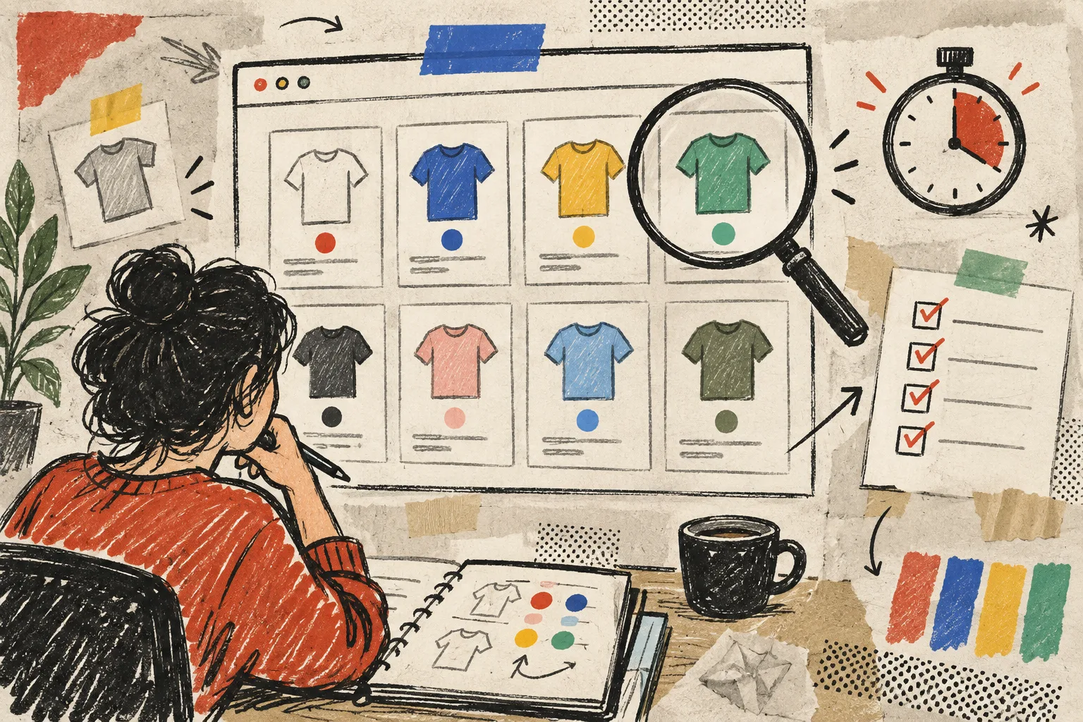
My five-minute collection check is:
- Open a collection with mixed color availability.
- Confirm every swatch renders quickly and matches its product-page counterpart.
- Click a linked color and make sure it lands on the intended sibling product.
- Check that the same color is not visually represented two different ways in one grid.
- Repeat on a narrow mobile viewport.
If this sounds familiar, it is because the same surface-level consistency matters when making product specs scannable and when testing one 3D model before scaling product media. Small decisions become expensive when they are repeated across a catalog.
Add new colors through a repeatable release note
When a new color lands, I do not just add it to the product and hope the UI inherits the right behavior. I write a four-line release note: products affected, swatch type, display asset, and pages to verify. That gives a teammate enough context to review it without reverse-engineering the app settings.
For a collection of image-led colors, I use the actual product image as the swatch. For straightforward named colors, I use a consistent color chip. Mixing those approaches within one product family makes the grid feel accidental. The app’s customizable styles are useful here, but consistency is still an editorial choice, not a setting.
My pre-launch swatch pass

Before publishing a color drop, I run this short pass:
- product-page variants are selectable and update the correct media;
- linked products lead to the intended sibling page;
- collection-page swatches are visible and behave the same way;
- labels and tooltips make sense in each store language;
- mobile tap targets are comfortable;
- the default swatch style still fits the current theme.
That last one deserves attention. A redesign should not silently make swatches smaller, lower contrast, or oddly spaced. I keep the swatch rules in the launch checklist beside the visual basics—the same habit behind my product-page decision path for sizing questions.
Start with one product family
Do not attempt a catalog-wide swatch cleanup on a Friday. Choose one product family with a clear color story, decide variants versus linked products, give every option a stable name, and test it on both product and collection pages. Then use that family as your reusable pattern.
If you need the mechanics, the Supra Swatch Colors getting-started tutorial is a good companion to the app’s Shopify listing. My next action would be even smaller: open your highest-traffic collection, write down every swatch treatment you see, and circle the first inconsistency. That is your first system fix.