
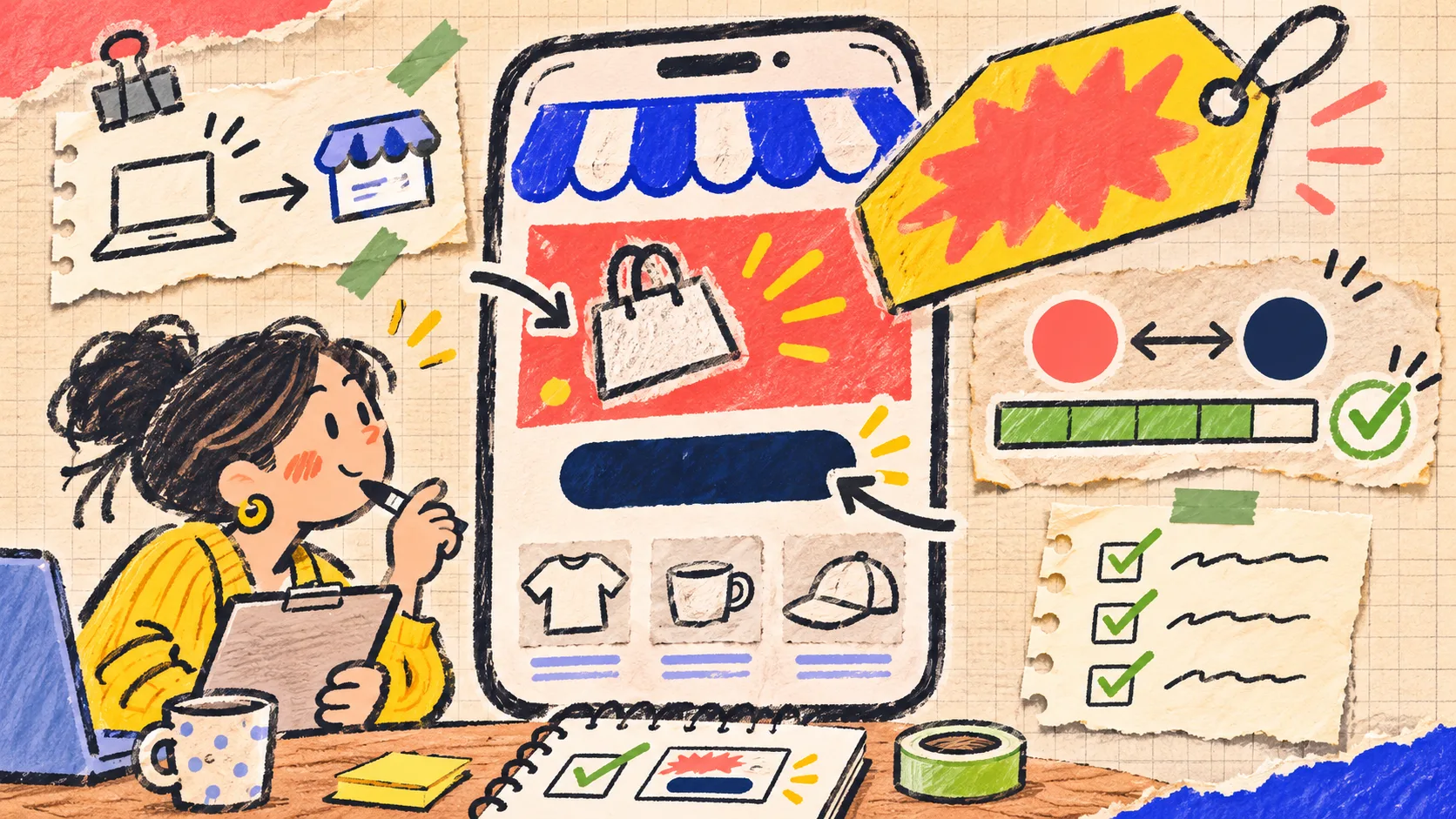
I Run a Two-Minute Contrast Check Before a Shopify Promotion Goes Live
My small promotion rule is simple: if the offer is hard to read on a phone at arm’s length, it is not ready to publish. A quick contrast check plus a real phone preview catches the most expensive kind of banner mistake—the one that technically exists but does not communicate the offer. For the ratio check, I use Tiny Online Tools’ Color Contrast Checker, then make one human decision from the actual storefront.
This is deliberately a release check, not a promise that one score makes a campaign accessible. Contrast is one useful signal; context, font size, controls, image overlays, and the words themselves still need a look.

The two-minute card I put beside the promotion
Before I open the theme editor, I write a tiny card with four fields:
| Field | What I pin down | Why it stops drift |
|---|---|---|
| Buyer moment | “Returning mobile shopper, final 24 hours” | Keeps the message from becoming a generic graphic |
| One action | “Shop the collection” or “Use the code” | Prevents two competing calls to action |
| Critical pair | Button text/background and offer text/background | Gives the contrast check an exact target |
| Failure state | What happens if the image, sale price, or code is absent | Makes empty or low-contrast states visible before launch |
That card is small enough to make in the time it takes to find a hex value, but it changes the order of work. I am no longer asking whether the banner feels exciting. I am asking whether one specific shopper can see one specific instruction.
The ratio reference matters here. WCAG 2.1’s contrast guidance describes a 4.5:1 minimum for normal text at Level AA and 3:1 for large text. Tiny Online Tools shows those common thresholds for normal and large text, including the stronger AAA reference. I treat that result as a guardrail—not permission to use tiny type or bury copy in a busy product photo.
Pass 1: test only the pairs that carry the decision
A promotion can contain ten colors, but only two or three pairs make a buyer act. For a typical Shopify sale module, I check these in this order:
- Offer text against the panel behind it.
- Button label against the button fill.
- Any code, end date, or threshold against its own background.
- Text over photography, if the design uses it.
I paste the foreground and background colors into the Color Contrast Checker. It reports the ratio and whether it clears AA or AAA for normal and large text. The useful move is not chasing AAA everywhere; it is being honest about the text’s size and weight. A full-width sale headline may qualify as large text. A quiet “ends tonight” line beside the button probably does not.
For image overlays, I do not pretend there is one background color. I sample the lightest part of the photo behind the letters and the darkest part. If either makes the copy disappear, I add a solid panel, a stronger overlay, or move the words. This is the same basic discipline I use when making size-and-fit details easier to scan: decision-changing information needs a stable place to live.
Pass 2: check the real phone, not the generous editor canvas
A passing ratio can still be a weak promotion. Theme previews often give a banner more room than an actual phone and rarely recreate glare, scrolling speed, or a shopper’s divided attention.
I open the preview on my phone and do this deliberately boring test:
- Scroll until the promotion first appears.
- Give myself one second to say the offer and next action out loud.
- Read the smallest important text without zooming.
- Tap the intended action once.
- Check the same state with the product image or merchandising art actually loaded.
If I cannot say “what is this offer, who is it for, what do I tap?” in that first glance, I mark it revise even if every number passes. That is especially helpful with holiday colors: the palette can be on-brand while the hierarchy quietly collapses on a narrow screen.
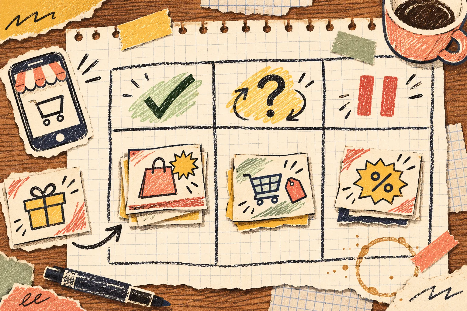
A release / revise / pause decision that avoids last-minute debating
I use this three-way decision after the two passes:
| Result | Condition | Next move |
|---|---|---|
| Release | Critical text pairs fit their intended size, the first-glance message is clear, and the tap works | Schedule or publish the promotion |
| Revise | The offer works but one pair, overlay, line break, or mobile crop fails | Change one variable, then repeat both passes |
| Pause | The offer depends on an unavailable code, unclear price rule, broken link, or a misleading product image | Resolve the source problem before redesigning the banner |
The pause lane is important. Color cannot repair an offer that has no dependable destination. I learned the same lesson when I started reconciling bulk catalog changes: a Shopify bulk edit is not done until the storefront and exceptions agree. A promotion deserves that same boundary between “looks finished” and “is safely live.”
Keep the change small enough to learn from
When a card lands in revise, I change one of these—not all of them at once:
- replace the background behind critical text;
- increase the text size or weight;
- shorten the offer to one claim;
- move the code or deadline out of the product image;
- simplify the button to one verb.
Then I rerun the checker and phone pass. This gives the revision a cause and effect. It also stops the familiar cycle where a team “freshens” a promotion and accidentally reintroduces a low-contrast secondary line. Tiny Online Tools is useful here because the checker is a narrow, no-account browser stop rather than another design file to open; its site says its tools run locally in the browser and need no uploads, accounts, or tracking.

The five-box release note
My final note has just five checkboxes:
- offer is one sentence and matches the destination;
- key text/background pairs have been checked for their real text size;
- image-overlay copy stays readable over the actual image;
- mobile preview makes the action obvious in one glance;
- code, price rule, inventory note, and link are true at publish time.
That last box is not a design requirement, but it protects trust. If the promotion touches a product catalog change, I also use a small proof mindset like the one behind a barcode proof sheet before printing labels: test a representative reality, not only the source settings.
Make the next promotion easier than this one
Save the exact passing color pairs and their role names—sale-text/on-navy, button-label/on-coral—in your theme notes or design token list. Next time, you can start with a known-good pair and spend the two minutes on the new copy, photo, and offer instead. If the promotion has a handoff or email asset too, a product-photo recovery note is a useful companion reminder: keep the authoritative source distinct from the version prepared for one channel.
Start with one promotion this week. Write the four-field card, check the critical color pairs in Tiny Online Tools, and preview the exact storefront on your phone. It is a small gate, but it makes the work in front of every campaign less speculative.