
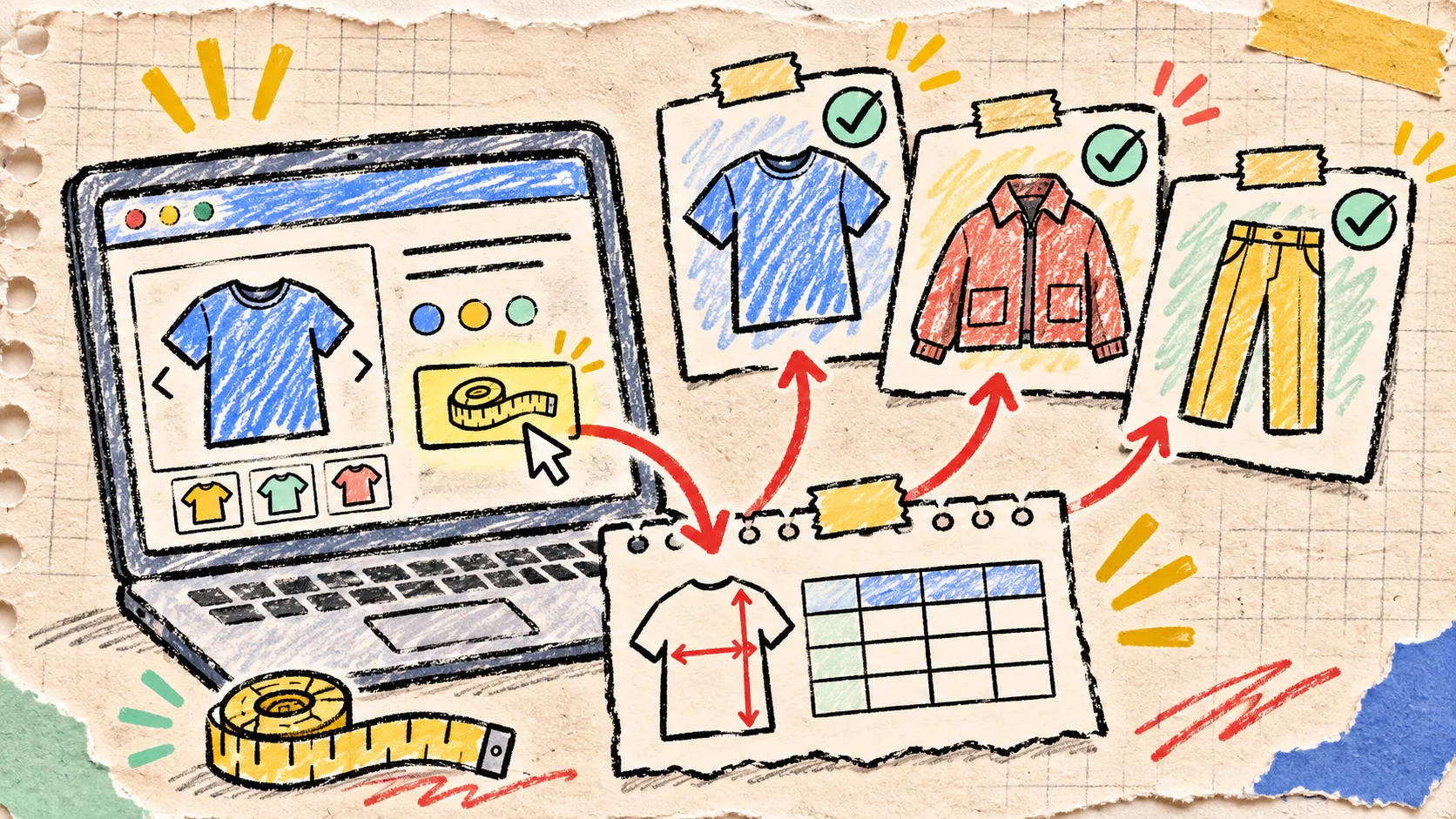
A Three-Product Sample That Catches Shopify Size-Chart Mistakes
My rule for a new size-chart setup is boring on purpose: do not judge it from the app screen. Put it on three real product pages first. That small sample catches the mistakes that a perfectly tidy spreadsheet cannot: a chart on the wrong fit family, a measurement label that shoppers interpret differently, or a mobile layout that makes the deciding row hard to find.
The goal is not a giant QA project. It is a fast, repeatable check before one rule starts serving a whole collection. Supra Size Chart is useful here because a chart can be assigned by product, collection, product type, vendor, or tag, then rendered through a theme app block. One mapping can be broad; the sample is how I make sure broad is also correct.
Pick three products that expose different failure modes
I do not pick three random SKUs. I pick one obvious match, one boundary case, and one mobile stress test. For a casualwear collection, that might be a regular-fit tee, an oversized sweatshirt, and the product page with the longest title and most variant choices. For footwear, use a core shoe, a wide-fit option, and a product sold across markets.
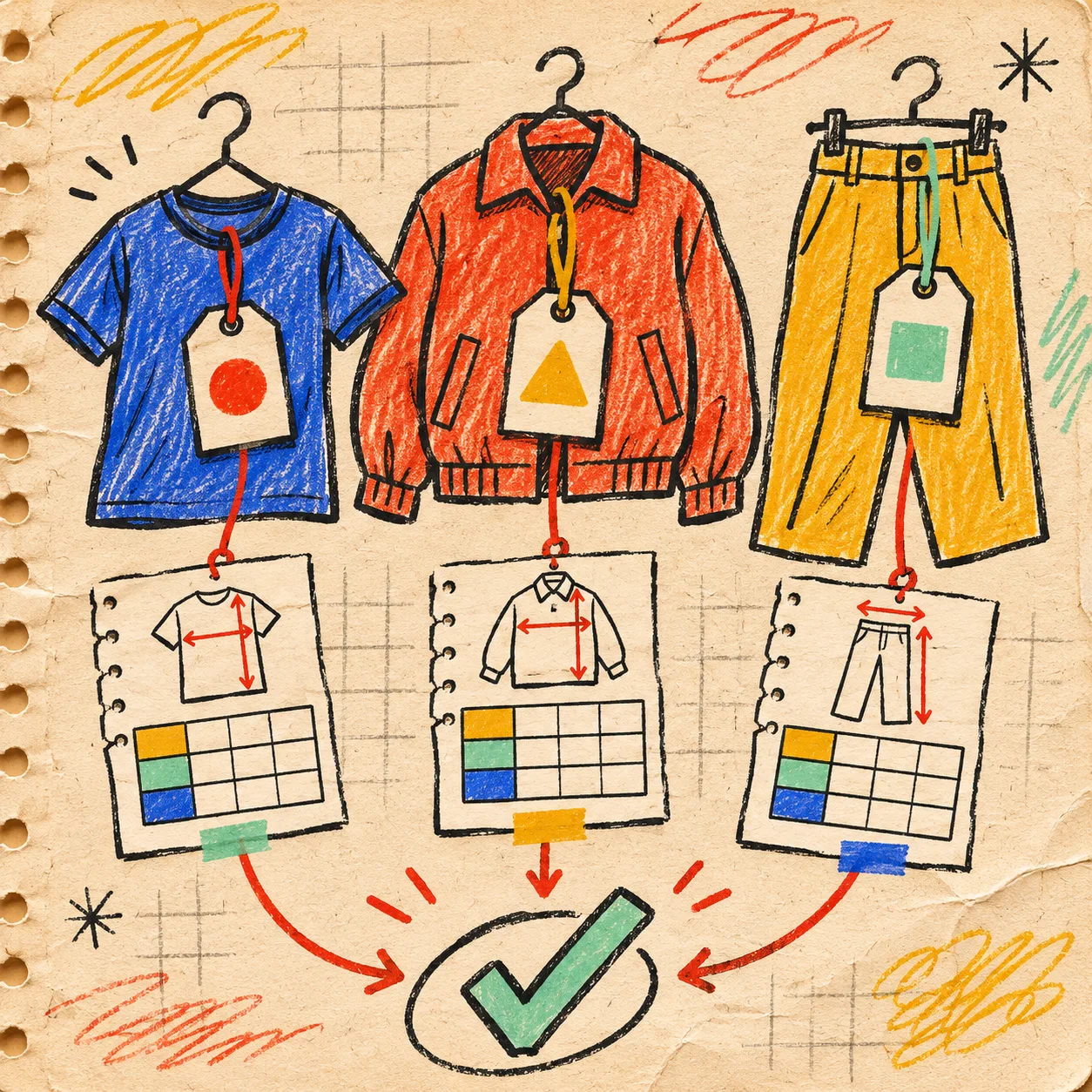
Here is the tiny sampling card I keep beside the catalog:
| Sample | What it should prove | A failure it exposes |
|---|---|---|
| Obvious match | The intended rule finds the intended product | The chart never appears |
| Boundary case | Similar products are not accidentally grouped | A slim-fit chart appears on an oversized item |
| Mobile stress test | The shopper can find and scan the guide | The trigger, table, or notes are buried below a crowded purchase area |
This is deliberately different from a full catalog audit. If you have not settled fit families yet, start with the fit-family audit. The three-product sample happens after that decision, when you need to validate what the shopper actually sees.
Check the chart against the product, not the spreadsheet
Open each sample page in an incognito window or a clean browser profile. I use this order: product title and imagery, fit language, size options, size-guide entry point, then the measurements themselves. A product described as “relaxed” or “cropped” should not silently inherit a chart written for a close-fitting standard tee.
Then answer three plain questions:
- Does the guide say whether the numbers are body measurements or garment measurements?
- Do the column labels use the same vocabulary as the product page and fit note?
- Can a shopper tell what to do when they sit between two sizes?
A size chart is structured data, but it is still customer-facing copy. Shopify describes metaobjects as reusable structured records, including size charts; that is a good reason to keep the chart central rather than pasting it into product descriptions. It is not a reason to let one generic grid override the product’s actual fit story.
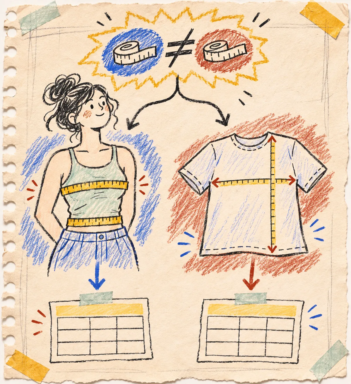
For an illustrative tee, I might label the chart “garment measurements, measured flat” and show chest width and length. For body measurements, I would instead name the body points and pair the table with a measurement guide. Do not mix these systems in the same row without explaining the relationship. The garment-measurement guide is a useful companion when the product calls for flat-lay numbers.
Test the placement as a shopper would
Supra Size Chart can show a guide inline, in an accordion, or in a modal. The right choice is the one that leaves the buying decision clear on the product page; it is not automatically the most compact option. Inline works when sizing is a primary concern and the chart is short. An accordion can keep a dense product page calmer. A modal can be useful for a larger guide, provided its trigger is obvious and the close behavior is comfortable on a phone.
On the mobile sample, tap the size selector, find the guide, scroll the chart, and return to the purchase controls. If any move feels like a hunt, capture it as a placement problem rather than adding more prose. Shopify’s theme-app extension documentation explains that app blocks are a part of a theme app extension; for a merchant, the practical takeaway is simple: preview the actual template where the block lives.
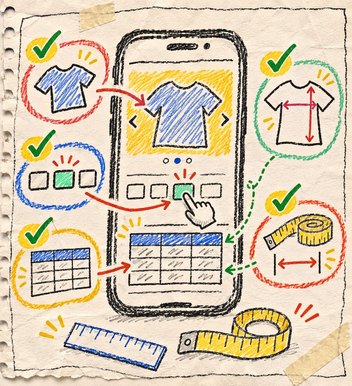
My mobile pass is five ticks:
- The size-guide entry point is visible near the size selector.
- The smallest important table value is readable without sideways guesswork.
- Measurement instructions remain with the guide rather than hiding elsewhere in the description.
- A keyboard user can reach and leave the guide; use this keyboard-navigation check as a practical follow-up.
- The return to Add to cart is obvious after reading the guide.
Roll out only after the notes resolve
Keep a short sample record: product URL, chart name, rule that matched, display mode, device, and one action. “Approved” is fine. “Split oversized layer into a separate chart” is better. This makes the next catalog change much less mysterious, especially when a collection or product tag later expands a rule’s reach.
Once the three pages pass, use the same checklist after a theme change, a new fit family, or a new display mode. If the weak spot is the decision path itself, not the chart, this earlier product-page sizing decision path is a helpful reset.
Install Supra Size Chart free when you want one centrally managed chart system with reusable measurement guides and rule-based assignments. Start with three products, write down what each one proves, and only then let the rule cover the rest of the catalog.
A small sample is not a substitute for judgment. It is the quickest way I know to make sure the size guide that looks right in admin is also useful at the moment a shopper chooses a size.