
I used to treat the QR code on a package insert as the easy bit: generate it, drop it into the layout, send it to print. That is how you get a tidy little card that either opens a vague homepage or refuses to scan once it reaches a wrinkled box. The useful approach is simpler: give the code one job, make the printed version easy to scan, and test the exact material before the full run. For a small shop, that turns a QR code from decoration into a dependable post-purchase handoff.
A QR Code Generator is enough to create the asset from a URL or text, and its error-correction setting is worth considering when the card may be scuffed. But generation is the middle of the workflow, not the end.
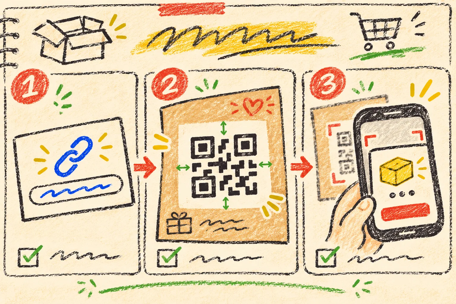
Start with one customer question
The destination should answer the question a customer has while holding the product—not the question the marketing team had while making the insert. My default choices are:
| Moment after delivery | One useful QR destination | Avoid sending them to |
|---|---|---|
| They need help using the item | a short setup or care page | a crowded homepage |
| They are checking fit or compatibility | a product-specific size or compatibility guide | a category collection |
| They may reorder | the exact product or replenishment collection | a generic campaign page |
| They need support | a lightweight support page with the order context explained | an unlabelled contact form |
One insert gets one primary destination. If the card is trying to earn a review, sell an accessory, collect an email, share care instructions, and open support, it is asking a tiny square to carry too much of the experience. Put the highest-confidence next action behind the scan and keep the other options on that page.
This is the same constraint I use when deciding whether an identifier is meaningful: a SKU is not a barcode, and a QR code is not automatically a good customer journey. The encoded string, the printed object, and the landing page each need their own job.
Build the smallest stable destination
I prefer a short permanent URL I control, even if it redirects to a product page today. That gives the printed card a longer life when products move, campaigns end, or a help page needs revision. Before generating anything, I write down these four fields in the order notes:
- Destination owner — who can update the redirect or page.
- Customer promise — the single thing the scanner will get.
- Fallback — a short human-readable URL or support route printed under the code.
- Review date — when somebody checks the destination again.
Do not put personal customer data, order tokens, or secrets directly into a broadly printed QR code. A package insert is a public object after it leaves the warehouse. If a personalised flow is required, make the authentication happen after the customer reaches your controlled destination.
The page itself can be modest. Shopify supports images, videos, and 3D models as product media, but a post-purchase page only needs the media that helps the customer take the next step. A care page with one accurate image and clear instructions beats a slow mini-catalog.
Generate the code, then protect its quiet space
In Tiny Online Tools, paste the stable URL into the QR generator, select the required size, and choose error correction deliberately. The tool notes that higher correction tolerates more damage; that can be sensible for a code on a wear-prone shipping surface, while a controlled printed card may not need it.
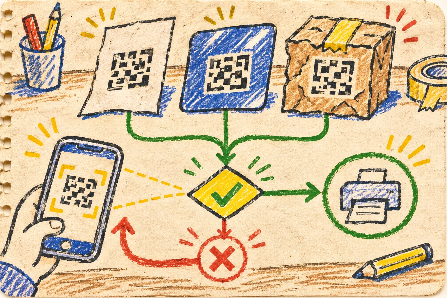
The important production rule is not decorative: leave clear blank space around the code. Do not run a border, photo, patterned paper, or coupon edge right into it. And resist recolouring the modules to match the latest campaign. High contrast, a plain background, and a square that stays square are operational design choices.
For adjacent card copy or the landing-page button, I also run the foreground/background pair through the Color Contrast Checker. It reports WCAG 2.1 contrast results, including the common AA threshold for normal text. That does not certify the QR code itself, but it keeps the instructions around it from becoming the next point of failure.
Use a three-surface scan gate before the print run
Here is the little release test that survived my last packaging revision. It is intentionally boring:
- Print at the actual final size—not a zoomed-in office preview.
- Test with two phone cameras and ordinary room light.
- Scan the intended stock, then a glossy sample, then a lightly creased or scuffed sample.
- Confirm the final URL, page title, and promised task all match.
- Try the human-readable fallback URL below the code.
- Photograph the approved card and record the destination URL in the packaging spec.
If any scan fails, do not solve it with a longer explanation on the card. Make the code larger, recover the blank margin, simplify the background, or adjust the print treatment. This is very similar to the controlled-sample habit in a Shopify bulk-edit test: prove one representative unit before multiplying the change.
Make the landing page useful after the scan
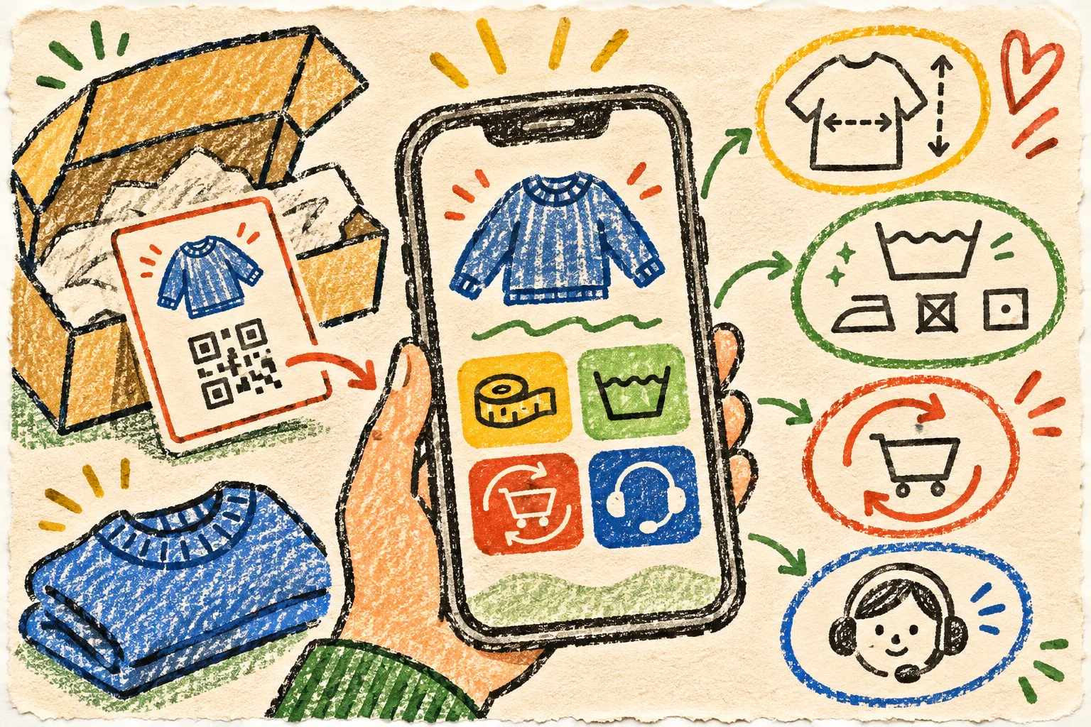
A scan that works but drops someone onto an irrelevant page still fails the customer. I sketch the post-scan page as one primary panel plus three supporting exits: use it, care for it, get help. When the item has variants, make the guidance stable across them rather than hiding essential information in a particular product description. The collection-content consistency check is a good reminder that shoppers should not get a different warranty or care answer simply because they reached a different collection.
For a reorder destination, preserve the truth of the listing and photo. A QR insert should not become a back door for a mismatched product promise; the same four-file approach to reversible product-photo edits applies to the visual evidence on the page. Keep the approved source, the web version, the working file, and a clear record of what changed.
The one-card release receipt
Before I approve an insert, I want one compact record: destination URL, QR asset filename, print dimensions, error-correction choice, tested phone models, tested stock, reviewer, and date. It takes less time than finding out later that 2,000 cards point at a retired promotion.
Start with one real customer question this week. Create the code in Tiny Online Tools, print one physical sample, and make the scan earn its space in the box.