

I used to treat a color change as the harmless part of a product-page refresh. Swap in the seasonal sage, soften a sale badge, make the swatches feel less loud—done. Then I watched a perfectly reasonable charcoal-on-olive label disappear on a phone in daylight. The collection was technically live; the decision was not really readable.
My small fix is now a contrast pass before I touch the theme. I do it while the colors are still little boxes in a notebook, not after the merch team has already signed off on the look. For that five-minute job, I use Tiny Online Tools’ Color Contrast Checker: no account, no upload, just the foreground and background pair in a browser tab.
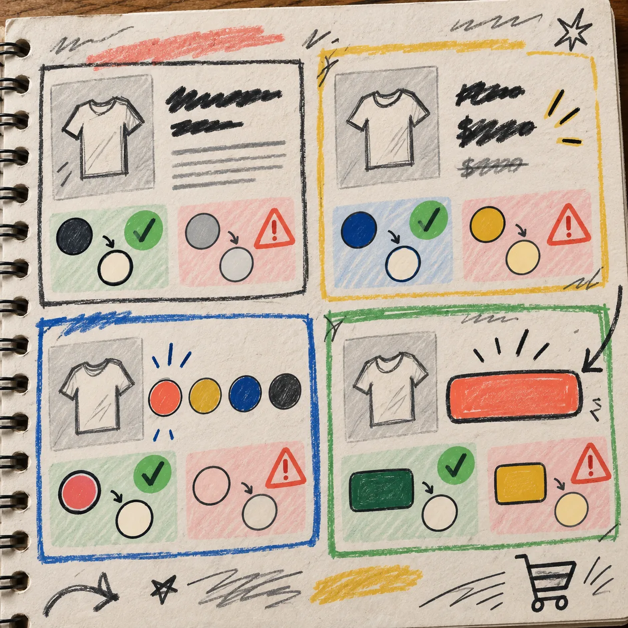
My Rule: Test the Combinations Shoppers Actually See
A brand palette is not a product-page palette. A color can be lovely on a campaign tile and still be a poor choice for 14px text on a pale product card. I do not start by testing every hex code against white. I pull the combinations that occur in the buying path:
- product title on its real page background
- price, compare-at price, and sale label
- variant names and selected-state swatches
- add-to-cart text and its button color
- stock, shipping, or low-key reassurance text
- accordion labels and the text inside open panels
That list is deliberately mundane. It catches the tiny decisions that can make a shopper slow down or misread a page. It also turns a vague accessibility discussion into a finite preflight someone can repeat.
If your options are already getting messy, I would pair this check with the naming work in my Shopify swatch system. A consistent swatch name makes it much easier to know which visual state you are testing.
The Browser Pass I Actually Run
- Grab the two live colors. I copy the foreground and background values from the theme settings, design file, or component notes. If the button has an active or disabled state, that is a separate pair—not a footnote.
- Put the pair into the checker. The Tiny Online Tools checker shows the contrast ratio, pass/fail results for WCAG 2.1 AA and AAA thresholds, and a live text preview. That is enough feedback for this operational pass.
- Check normal copy first. A label that works only when it is large, bold, or both is a fragile choice for product details. I want ordinary supporting text to survive first.
- Look at the preview before declaring victory. A ratio is a gate, not a design review. I still look at the text in a realistic size and weight, then open the actual product page on a phone.
- Write down the decision. I add a tiny note beside the component: tested pair, final pair, and whether the change was a text color, background color, or both. That note saves the next person from re-litigating the same green.

Where I Usually Find the Surprise
The usual culprit is not the primary call to action. Teams tend to scrutinize that one. The misses show up where color is doing a second job: a selected swatch, a small announcement line, a subdued compare-at price, or a tab label that only becomes relevant after someone has scrolled.
That is why I include content structure in the same pass. If a product page has a lot of detail, first make the sections easy to scan—this guide to Shopify tabs and accordions is a useful reset—then test the labels and expanded text in their real states. Contrast cannot rescue a component that is hiding its own information, but it can prevent an already-good component from becoming harder to use after a palette refresh.
I also test against the product media nearby. A quiet overlay over a bright photo may be readable on a studio image and vanish on the next lifestyle shot. My five-minute product image handoff has the same principle: check the messy real asset before the launch makes it everyone’s problem.
A Tiny Decision Tree for Failed Pairs
When a pair fails, I do not immediately crank the text to pure black. That can break the intended hierarchy. I choose one of three moves instead:
- Darken the foreground when the text needs to stay visually secondary but has room to become clearer.
- Lighten or simplify the background when a tinted badge, gradient, or image treatment is doing too much work.
- Change the component treatment when the color itself is non-negotiable—for example, give the label a solid backing or stop relying on a faint outline alone.
Then I retest the new pair and check the same component on mobile. It is less glamorous than a complete theme overhaul, which is exactly why it survives a busy launch week.
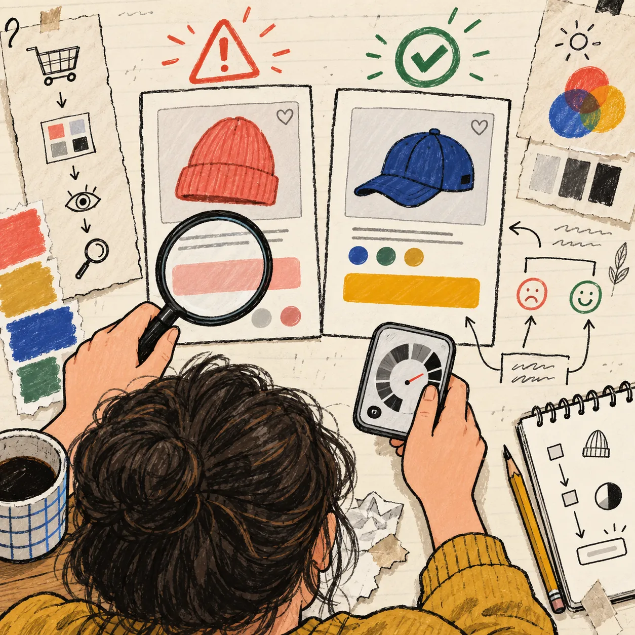
Put It Before the Publish Button
I now attach this pass to the same moment I review product images, variant labels, and final page copy. If you are changing swatches for a collection, start with making the collection page easier to scan and then run the contrast pairs on the detail page where the decision happens.
The useful thing about a tiny browser tool is not that it turns accessibility into a one-click checkbox. It gives a lean team a fast, repeatable place to ask a very specific question before a customer has to ask it for them.
Open the Color Contrast Checker, test your next product title, price, selected swatch, and add-to-cart state, and keep the four results with the launch notes. That is a small ritual worth carrying into every palette change.