
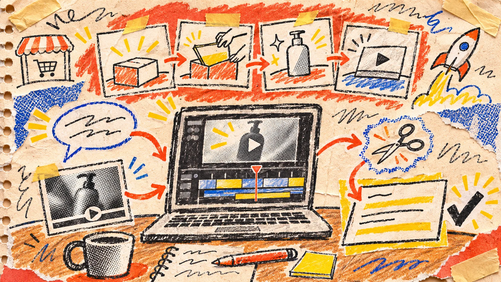
Startup Launch Video Handoff: A Message–Proof–Cut Review Card
The little handoff card I use for a startup launch video has only three lines: the message we want a viewer to repeat, the proof the film must show, and the cut we can still change. That is enough to stop a first render from being handed around as if it were a finished campaign.
This is especially useful when the film begins with a URL. VideoFlow Studio can take a startup site through planning, building, rendering, and review from the browser or your terminal; it also keeps the resulting project editable. That gives a small team a promising first cut quickly. It does not decide which claim deserves the opening ten seconds, or whether the visible product moment really supports that claim. The card does.

The problem is not “does this look like a video?”
Most launch-film feedback arrives in a lumpy sentence: “Can we make it punchier?” That sentence may mean the message is vague, the product proof arrives too late, or the pacing has buried the one scene a buyer needs. Those are different fixes.
Before I share a cut with anyone, I fill in this tiny card:
| Card line | The question | A usable example |
|---|---|---|
| Message | What should a right-fit viewer be able to say back? | “We can turn a complex weekly report into a decision in minutes.” |
| Proof | What on screen makes that statement believable? | Show the report arriving, one filter being chosen, then the concise result. |
| Cut | What is the smallest editable change if it misses? | Move the result ahead of the feature montage; keep the same assets. |
The card is intentionally smaller than a creative brief. It is a handoff test. If the message takes three sentences, the opener will probably try to carry too much. If the proof is a slogan, not an observable product moment, the video is asking the viewer for faith. If the cut is “redo it,” the team has not isolated the decision yet.
Start from one audience moment, not the whole homepage
A landing page has navigation, social proof, FAQs, pricing, and edge cases because it must serve several kinds of visitor. A 30-second launch film needs a narrower job. Pick one moment: a founder sharing a launch, an operator facing a recurring mess, or a buyer deciding whether a feature is relevant.
I make a quick narrative inventory first: one friction, one change, one credible result. That builds on the narrative-inventory exercise for launch videos, but it adds a rule for handoff: the result must be visible or honestly qualified. “Less manual work” is directionally fine; a screen that shows the manual step disappearing is evidence.
For a Studio run, paste the URL or launch it from the terminal with npx @videoflow/studio@latest, then give that audience moment as an instruction. The current Studio site says the CLI uses your Claude Code or Codex subscription and advertises eight free renders or edits per month; check the live pricing before planning a production around that allowance. The underlying VideoFlow engine is open source under Apache-2.0, while Studio is the workflow layer for creating and revising a film.
Put proof on the timeline before polish
I want the first review to answer a brutally plain question: can a stranger point to the shot that proves the main message? If not, motion polish is the wrong conversation.
My rough ordering is:
- Show the reader’s recognizable before-state.
- Name the change in a line short enough to read at normal speed.
- Show the product action or artifact that supports it.
- Reserve the product montage, logo, and CTA for after the proof has landed.
This avoids the common “feature confetti” cut: five beautiful cards, no causal story. It also keeps a review note narrow. Instead of “make scene two more exciting,” write “scene two needs the saved-report result on screen before the voiceover claims it.” That is an edit a teammate or an agent can execute without guessing the strategy.

Review the film twice: first as a buyer, then as an editor
The first pass is silent and full-screen. I ask: what is this product, who is it for, and what changed? If I cannot answer all three by the end, I mark the timestamp rather than inventing a solution immediately.
The second pass is operational. Check the product name, UI state, prices or availability language, contrast, logo treatment, and CTA destination against the current source. If a scene needs a surgical change, use an editable project and specify the scene, the thing to preserve, and the requested revision. The scene-change ledger approach is a good companion here: it prevents one useful correction from silently unpicking three approved choices.
Studio describes a rendered-frame review and correction loop, but treat that as a useful extra pass, not a substitute for product truth. An automated visual check can spot alignment or contrast; it cannot know that marketing just retired the feature shown in scene four.
Use a three-outcome handoff, not a vague “looks good”
At the end, the card should produce one decision:
- Release: message, proof, and CTA all match the current product.
- Revise: one line on the card is weak, and the next smallest cut is named.
- Pause: the product claim, brand asset, or destination is no longer current.
That is also why I keep the project editable. A launch film is often correct on Tuesday and misleading after a Thursday release note. If your team needs a broader pre-publish check, pair this card with this startup launch video QA checklist and this guide to revising a single scene without losing the editable project.
A fast first cut is valuable because it gives people something real to evaluate. The handoff card protects that speed: make one claim, show one proof, and name the next cut. If you want a URL-to-film workflow that keeps those changes available, start a small test in VideoFlow Studio with one audience moment—not the whole company story.