

A Shopify Product Question Map That Keeps Tabs Useful
My product-page notebook has one rule in the margin: a tab is a delivery choice, not a storage unit. Before you add Shopify tabs, map every shopper question to its source and its place on the page. Put repeated policy copy in one reusable source, product-specific facts in product fields, collection-level guidance in a rule-based source, and keep purchase-critical answers beside the buy button. That small map is what keeps tabs useful instead of creating a prettier wall of text.
Supra Tabs & Accordions is built for the presentation part: the same content can appear as tabs on desktop and accordions on mobile, while targeting rules let a set apply across a collection, tag, vendor, product type, or selected products. The content model still comes first.
Start with questions, not sections
I used to start with headings: Details, Shipping, FAQ, Care. It looked organized until a buyer asked a question that belonged in two headings—or did not belong behind a heading at all. A better first pass is to collect the actual questions a product page must answer:
- What is this, and is it right for me?
- What changes between this product and the next one?
- What stays true across the whole shop?
- What could stop someone from buying right now?
The last question is the trapdoor. A short delivery deadline, final-sale condition, stock warning, or compatibility limit usually needs to stay near the choice or purchase control. Hiding it in a cheerful accordion is not organization; it is misplacement.
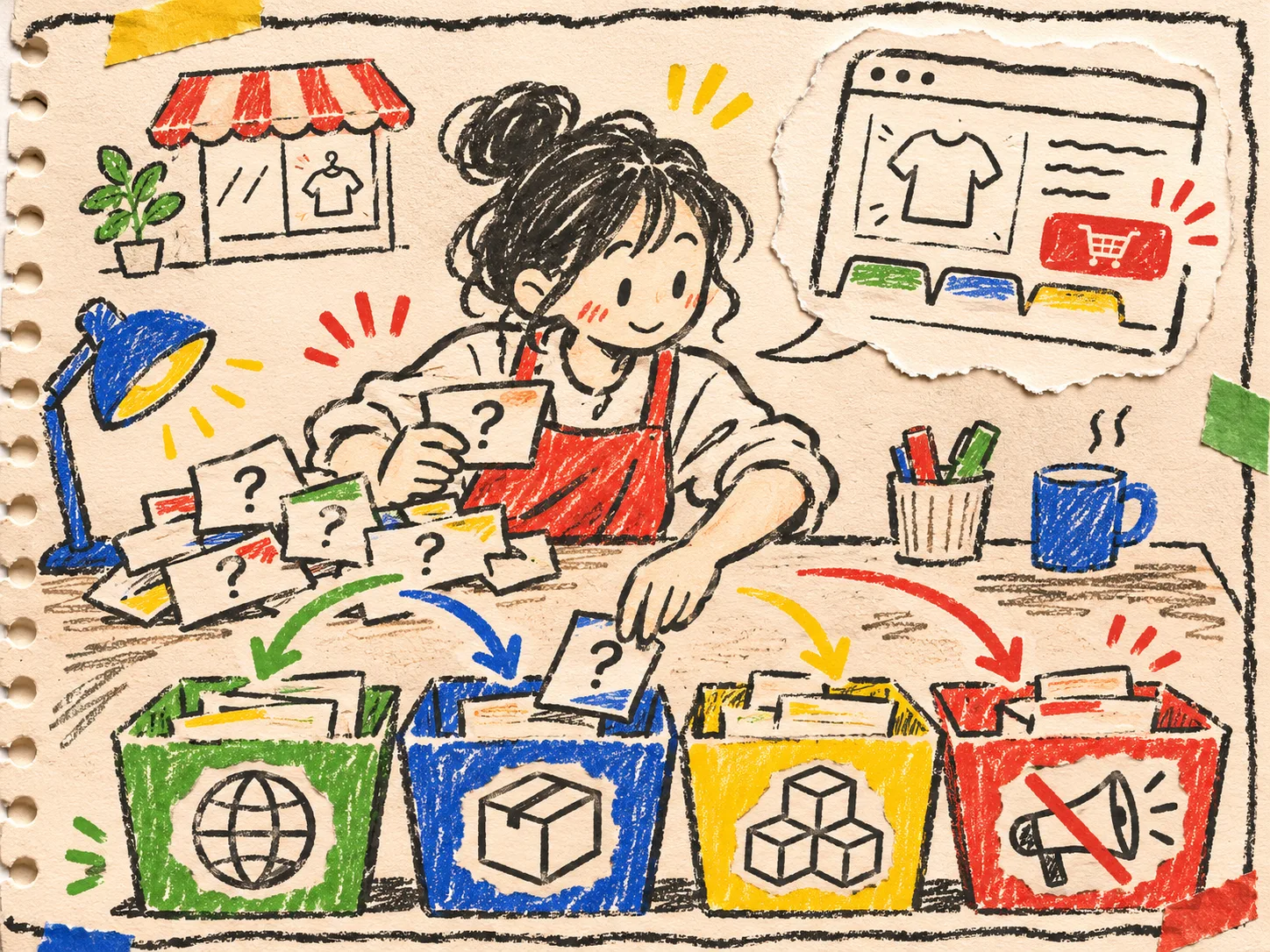
The four-bucket question map
Here is the reusable map I now sketch before configuring a tab set. It makes the source decision explicit, which is the part that saves maintenance later.
| Question type | Best source | Where it belongs | Example |
|---|---|---|---|
| Same for every relevant item | Store page or shared written content | Reusable tab/accordion | Returns or general garment care |
| Changes per product | Product description or metafield | Product-specific section | Fabric composition, dimensions, included parts |
| Changes by family | Collection, tag, vendor, or product-type rule | Targeted tab set | A collection-specific fit note |
| Needed to decide now | Product-form or page-adjacent content | Near variant/purchase controls | Compatibility warning or dispatch cutoff |
This does not mean every product gets four sections. It means every answer has an owner. If an answer has no owner, it will eventually be copied into descriptions, edited in one place, and contradicted in another. That is the exact mess a reusable product content system is supposed to remove.
Make one source reusable—but do not flatten the catalog
Shipping basics, a care method, warranty language, and a downloadable guide are good candidates for a shared source. A material percentage, fitted dimension, or included accessory is not. Those facts need to follow the product.
My useful test is blunt: would changing this sentence for one SKU make it wrong for another? If yes, keep it product-specific. If no, give it a shared home. A third category—information that changes for a product family—deserves a rule rather than a manual assignment. That is where targeting by collection, tag, vendor, or product type pays for itself when the next matching product arrives.

Supra can pull sections from product descriptions, per-product fields, store pages, files, written app content, and metaobject fields, according to its Shopify App Store listing. Its empty-tab behavior is especially worth planning around: an optional source should not leave a dead heading on products that lack that detail.
A small example
Imagine a tea catalog. Brewing instructions may vary by tea, so they belong in a product field. The shop’s shipping policy is shared. A caffeine note might apply only to a tagged collection. And an allergy statement that changes the buying decision should be visible before add-to-cart. Four answers; four locations; no copy-and-paste relay race.
This is adjacent to the product-question sorting exercise, but the additional move here is choosing a content owner and page placement for each question—not merely choosing a label.
Use desktop tabs and mobile accordions as one delivery layer
Once the sources are clean, presentation becomes much calmer. The app’s listing describes tabs on desktop and accordions on mobile from the same content. That is a reasonable default when the desktop product column has room to scan horizontally and the mobile reader benefits from vertical expansion.
The check is not “are accordions modern?” It is “can a shopper find the answer without guessing where I filed it?” Use labels that name the answer—“Materials,” “Fit,” “Care,” “Shipping”—rather than vague filing-cabinet labels such as “Information.” For more label-level scrutiny, keep this tab-label scanning guide beside the map.
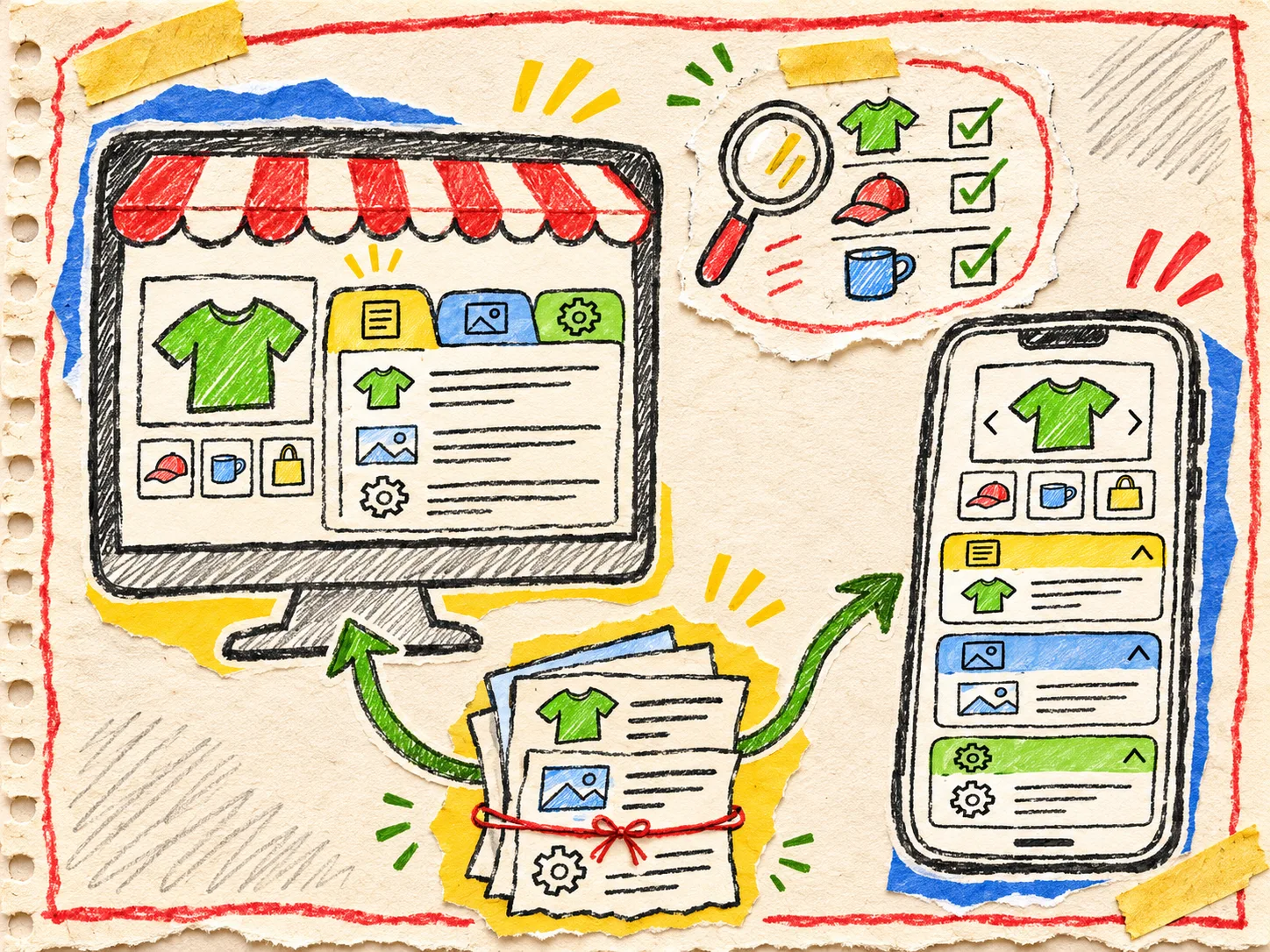
Run a three-product receipt before publishing
Before I call the setup done, I check three deliberately different products:
- A full-detail product with every expected field.
- A product missing an optional field.
- A product that matches a competing collection or tag rule.
For each one, verify the right sections appear, no empty heading survives, the unique facts are still unique, and the purchase-critical answer is not hidden. Then view the same three on a narrow screen. This is a lightweight counterpart to the rule-collision debugging pass: scope is a product-page behavior, not an admin-screen setting.
The next useful move
Do not start by building five attractive tabs. Pick one busy product page, list ten shopper questions, and put each in one of the four buckets above. Then build only the sections that have a clear source and a clear reader job.
If the map says your catalog has repeated content and product-specific details living together, install Supra Tabs & Accordions and use one tab set as the delivery layer—not as the place where product knowledge goes to disappear.