
If your swatch setup is starting to feel like a maintenance project, the fix is to design for scale instead of decoration. I’d start with Supra Swatch Colors because it handles linked-product swatches, variant swatches, collection-page swatches, and multilingual shops in one no-code workflow. The app site is supra-swatch-colors.sktch.io.
TL;DR
Use variant swatches for choices inside one product, linked-product swatches for choices that deserve their own page, and collection-page swatches to make browsing faster. Let the app auto-detect colors or use product images to seed the setup, then keep a human review pass on the catalog logic.
What Breaks First In A Large Swatch Setup
The first failure is usually inconsistency.
A small catalog can survive a few manual settings and a little theme tweaking. A larger catalog cannot. Once product families multiply, the problems usually show up in the same places: color naming drifts, linked products stop matching the right options, collection pages show different behavior from product pages, and the merchandising rules become hard to explain to anyone else on the team.
That is the point where I stop treating swatches as decoration and start treating them as catalog infrastructure.
If the source data is already tangled, How to Bulk Edit Shopify Products, Variants, and SEO Fields Without Mistakes is the cleanup pass I would do before I add another layer.
Decide What Each Swatch Should Mean
I keep the rule simple: if the choice belongs inside one product, use a variant swatch. If the color, finish, or style deserves its own product page, link the products with swatches instead.
That distinction matters because it keeps the catalog easier to browse and easier to maintain. Variant swatches solve choice inside a product. Linked-product swatches solve choice across products. If you blur those two, you end up with a setup that looks fine for a week and then becomes confusing to update.
If you want the decision tree in more detail, How I Choose Between Variant Swatches and Linked Products in Shopify and How to Build a Shopify Swatch System for Variants and Linked Products are the two companion reads I would keep open.

Match The Style To The Store
This is where Supra Swatch Colors earns its keep. The app supports 20+ styles, can auto-detect colors already used in the store, can use product images to set swatches quickly, and works with both product and collection pages across all Shopify themes. That gives you room to keep the UI restrained without writing theme code.
That combination matters more than it sounds. On a small catalog, almost any swatch treatment can feel acceptable. On a larger catalog, the wrong style becomes noise fast. I want the swatches to make the catalog easier to read, not louder than the product photos.
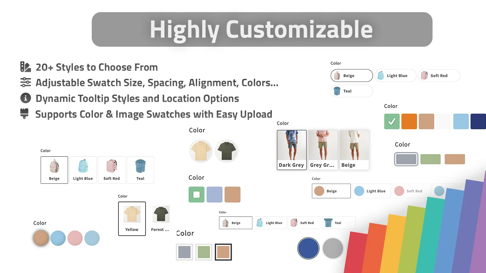
A good rule of thumb is to keep the swatch treatment visually consistent across the whole store. If one collection uses tiny circles, another uses oversized pills, and a third mixes image swatches with different spacing, the customer feels the inconsistency even if they cannot name it.
Let Collection Pages Do The Browsing Work
Collection grids are where a lot of swatch setups start paying for themselves.
If a shopper can see the difference before clicking, the catalog becomes easier to scan immediately. That is especially useful when the store has lots of near-identical products, multiple finishes, or a parent product that fans out into many options. A clear swatch row on the collection page helps the shopper choose faster and cuts down on dead-end clicks.

If you only need the collection-page side of the workflow, How I Set Up Color Swatches for Shopify Collection Pages Without Theme Code is the narrower version of this setup. How to Build a Cleaner Shopify Swatch System Without Theme Code is the best reminder that the swatch layer should reduce friction, not create another maintenance habit.
Keep Multilingual Catalogs Sane
The minute a store has multiple languages, swatches stop being just a visual choice. They become a maintenance problem if the names, groups, and labels drift between locales.
That is why I like the combination Supra Swatch Colors gives you: multilingual support, product groupings, color swatches, image swatches, and the ability to manage thousands of swatches and product groups without turning the whole setup into a spreadsheet project. The goal is not to make every label fancy. The goal is to keep the same merchandising logic intact wherever the shopper lands.

If you are starting from a messy catalog, I would pair this with How to Build a Shopify Swatch System for Variants and Linked Products and How I Turn Basic Shopify Product Photos Into Better Assets before you expand the swatch layer. That keeps the underlying product data and visuals clean enough to trust.
A Rollout That Stays Boring
- Pick one product family with obvious color or finish differences.
- Decide whether each choice belongs inside one product or across multiple products.
- Seed the swatches from existing colors or product images.
- Apply one style and keep it consistent.
- Test the product page and collection page on mobile.
- Check multilingual labels before you expand.
- Roll the same pattern into the next family only after the first one feels clean.
That sequence is deliberately boring. Boring is good when the catalog has to stay maintainable.
The Useful Next Step
If you want the shortest path, install Supra Swatch Colors, open the app site, and set up one product family first. If you want a walkthrough, the getting started video is the cleanest place to start.
The swatch layer should make the catalog easier to read, not create more work. Start small, keep the rules obvious, and expand only after the first family behaves.