

I used to compress a folder of Shopify product images at the very end of a launch, select a reassuring-looking quality number, and upload everything. The files got smaller. The page technically got lighter. Then I would spot the cost later: a knit texture that turned to fog on mobile, a small product label that stopped being readable, a hero crop that looked fine on my laptop but oddly crunchy in the collection grid.
The fix was not a grand asset-management project. I made compression a tiny reviewable step between final photography and Shopify upload. Tiny Online Tools is useful here because the job is deliberately small: open the image, make the adjustment in the browser, inspect the result, and download it. No account detour or random file handoff.
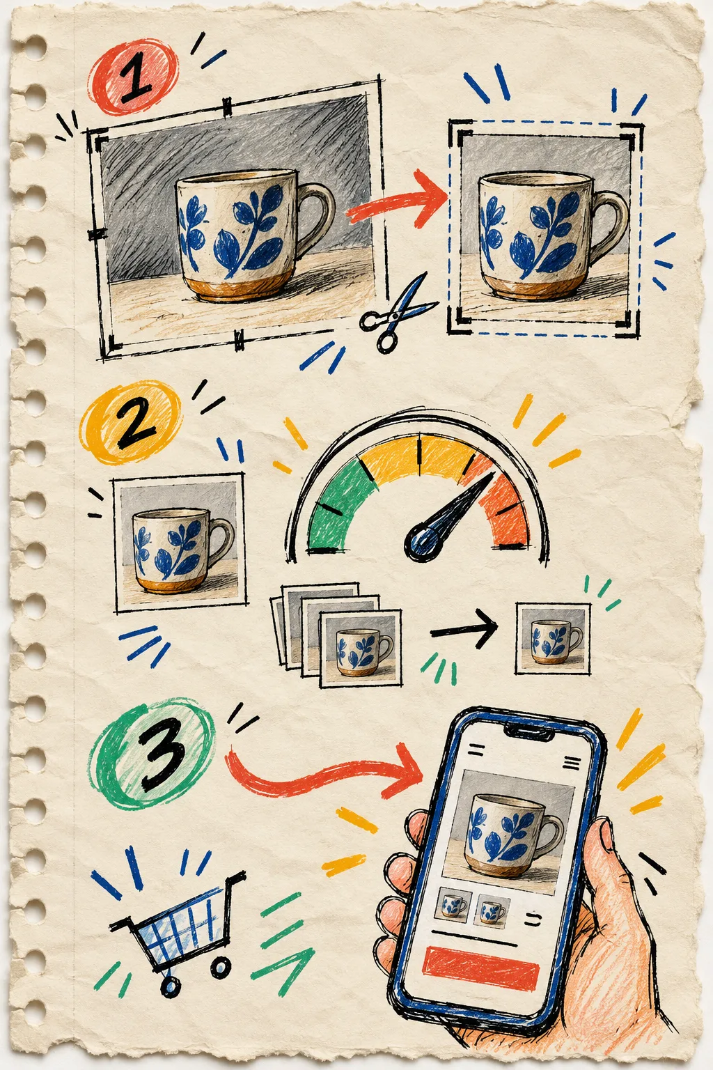
The note I added to my photo handoff
My old handoff said: “final images”. My current one says: “final images, plus a mobile-detail check.” That small change makes it much harder to confuse lower file size with a successful export.
I start by naming the image’s job. A lifestyle hero, a tightly cropped detail, and a swatch-adjacent thumbnail do not deserve the same compromise. The hero may carry a wide background with plenty of forgiving texture. The close-up has to preserve seams, finish, and material. The thumbnail has to read at an unkindly small size.
That is also why I keep source files separate from delivery files. I do not repeatedly save over yesterday’s compressed version. The original remains the reference; the web version is a deliberately named output. If the product page changes crop later, I can return to the clean source instead of compressing a compressed file again.
For a broader pre-upload sequence, my earlier five-minute product image handoff is the companion note. This post is the narrow middle step: deciding whether a smaller image is still an honest image.
My compression pass has two decisions
I use Compress Image for the first pass. The tool presents a quality control and reports the byte savings, which makes the tradeoff visible instead of abstract. The site describes the utility as browser-based and says it handles the work without an upload; that is a better fit than sending unreleased product photography through a converter I have never vetted.
First I choose a conservative setting and inspect the output. I do not begin by chasing the smallest possible file. On a product page, the useful question is: where does the image stop doing its selling work?
Second, I choose the output format according to the image, not a universal rule. The tool’s own guidance frames JPEG as a strong choice for complex photographic color and WebP as a smaller modern-browser option. That is a sensible starting point, but it is not a substitute for looking. A flat-color product shot with a hard edge, a transparent cutout, and a noisy lifestyle photograph can all behave differently.
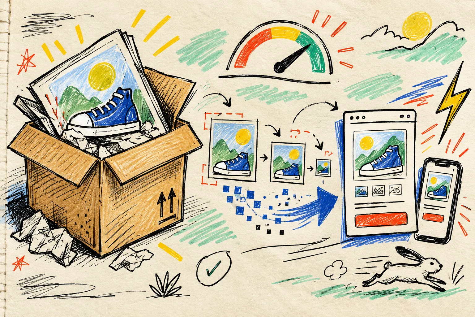
The three places I inspect before I call it done
I open the compressed output beside the original and look at only three areas. That limitation is intentional; it keeps the review from becoming a half-hour pixel hunt.
1. The proof detail
I pick the one detail a shopper might use to decide: stitching, grain, engraving, a print edge, or a small included component. If that detail becomes mushy, I raise quality or accept a bigger file. This is not decorative fussiness; it is product information.
2. The troublesome edge
Then I check high-contrast boundaries: a dark product against a pale background, text printed on packaging, or a clean silhouette. Compression artifacts love these moments. If the image has transparent areas, I also run the same kind of inspection I described in my transparent PNG preflight. It catches issues that are invisible against the wrong canvas color.
3. The actual storefront size
Finally I put the candidate into a rough mobile-sized product-card view. I do not need a production preview to learn whether the product still reads. This is where over-optimizing gets exposed: a file that looks pristine at 100% can look flat after the page scales it down.
A helpful side note: compression is not a color-accessibility check. If I have also changed an image background or badge color, I run the separate contrast preflight rather than pretending a smaller file solved a contrast problem.
A tiny batch routine that survives launch week
For a new collection, I test five intentionally different images first: the hero, the most detailed close-up, the darkest photo, the lightest photo, and the smallest product card crop. I write down the setting that survives each review. Only then do I process the similar images in the batch.
That pilot sample gives me a usable rule such as: “use the conservative setting for close-ups; the slightly smaller version is acceptable for collection cards.” It is far more practical than a document full of theory, and it gives another person a clear way to repeat the decision.

My final checklist is short:
- Keep the original outside the upload folder.
- Compress a representative sample first.
- Compare the selling detail and high-contrast edge.
- Check the image at a mobile product-card size.
- Name the delivery file so it cannot be mistaken for the source.
- Upload only after the five-image sample passes.
The useful definition of “optimized”
A product image is optimized when it arrives quickly enough and still earns its space on the page. Smaller is not automatically better; it is just one input to the decision. That sounds obvious, but I had to make the check explicit before my export routine stopped treating quality as a guess.
If your product images are currently a last-minute folder of enormous files, do one small experiment today: take five representative shots, run them through Tiny Online Tools, and review the proof detail on a phone-size view before uploading. Keep the settings that survive. That is enough to turn compression from a one-click export into a dependable part of the storefront handoff.